sorry for my English, I’m new with Bootstrap…
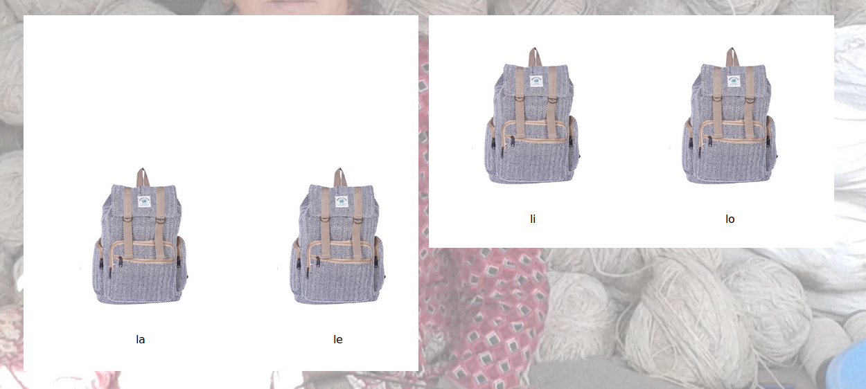
I to want to build 4 columns and because of the width from Bootstrap col-sm-3 too small or col-sm-4 too big it is, I do try as here to say, but to come as here to show
How to show are not margin between columns…
Code CSS
.container {margin-top: 13rem; }


.product-grid{
  font-family: 'Roboto Condensed', sans-serif;
  text-align: center;
  overflow: hidden;
  position: relative;
  border: 4px solid #fff;
  margin-top: 170px;
  background-color: #ffffff;
}
.product-grid:before{
  content: '';
  height: 100%;
  width: 100%;
  position: absolute;
  left: 0;
  top: 0;
  z-index: 1;
  transition: all 0.3s ease 0s;
}


.product-grid .product-image a{ display: block; }
.product-grid .product-image img{
   width: 60%;
   height: auto;

}


 .product-grid { width: 300px;}


 .product-grid .product-content{
   padding: 18px;
   position: relative;
   z-index: 2;
   background-color: white;
 }
 .product-grid .title{
   font-size: 16px;
   font-weight: 500;
   margin: 0 0 10px 0;
 }
 .product-grid .title a{ color: #000; }
 .product-grid .title a:hover{ color: #fa8231; }
 .product-grid .price{
    color: #fa8231;
    font-size: 18px;
    font-weight: 600;
 }
 .product-grid .price span{
   color: #777;
   margin: 0 0 0 5px;
   font-weight: 300;

   display: inline-block;
   }
Code HTML
<div class="container">
  <div class="row">
    <div class="col-sm-3 product-grid">
        <div class="product-grid">
            <div class="product-image">
                <a href="#">
                    <img alt=""  class="bild" src="photo/111.jpg">
                </a>

            </div>
            <div class="product-content">
                <h3 class="title">
                    <a href="#">la</a>
                </h3>
                <div class="price">

                </div>
            </div>

        </div>
    </div>
    <div class="col-sm-3 product-grid">
        <div class="product-grid">
            <div class="product-image">
                <a href="#">
                    <img alt="" class="bild" src="photo/111.jpg">
                </a>
            </div>
            <div class="product-content">
                <h3 class="title">
                    <a href="#">le</a>
                </h3>
                <div class="price"></div>
            </div>

        </div>
    </div><div class="col-sm-3 col-md-3">
        <div class="product-grid">
            <div class="product-image">
                <a href="#">
                    <img alt="" class="bild" src="photo/111.jpg">
                </a>
            </div>
            <div class="product-content">
                <h3 class="title">
                    <a href="#">li</a>
                </h3>
                <div class="price"></div>
            </div>

        </div>
   </div><div class="col-sm-3 col-md-3">
        <div class="product-grid">
            <div class="product-image">
                <a href="#">
                    <img alt="" class="bild" src="photo/111.jpg">
                </a>
            </div>
            <div class="product-content">
                <h3 class="title">
                    <a href="#">lo</a>
                </h3>
                <div class="price"></div>
            </div>

        </div>
     </div>
   </div><br><br>
</div>
Can Please someone help me und this issue to solve, Thanks!
