Hey everyone! So I just built a website for my local carpenter!
I built it for free (he’s a dear family friend and is struggling a bit during the pandemic) but technically he’s my first freelance client so I’m really excited to show this website to everyone.
He’s already approved of the design and functionality so now I’m just looking for any tips on refining the website before it’s eventually deployed to netlify (still on github pages as prototype, client is buying domain name in coming days)
The element header must not appear as a descendant of the header element.
From line 43, column 9; to line 43, column 29
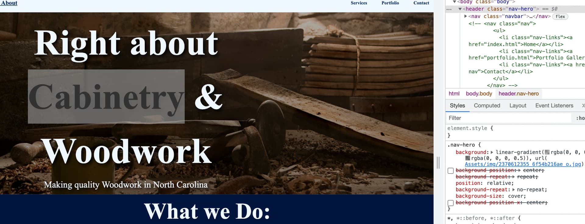
<div id = "hero-id" class="hero-container">
        <header class="hero"><h1>Right about Cabinetry & Woodwork</h1>
          <p class="hero-p">Making quality Woodwork in North Carolina</p></header>
      </div>
    </header>
Design:
I tried to click Cabinetry, General Carpentry, Design + Installation because they are orange ( later I saw the “click here” element, but is too dark).
In my cellphone the phone numbers and email are too big.
Your homepage uses a serif font but your portfolio page uses a sans serif font. keep the fonts consistent across your website. You can find more interesting fonts on google fonts which is free to use. You can add selected fonts to the top of your css file using a css import like @import url('https://fonts.googleapis.com/css2?family=Open+Sans:wght@300&display=swap'); (google fonts supplies you with the code just select the fonts you want and copy and paste it). I would go with a sans-serif font, they’re cleaner / modern.
The contact us mail link at the bottom… make this a mailto link <a href="mailto:RightAboutCabinetry@gmail.com">RightAboutCabinetry@gmail.com</a>
For the colours you might want to try https://coolors.co/, it generates colour palettes.
For design ideas use existing commercial websites that you like for inspiration. Find frontend techniques used that you think would fit your own site and try to implement them yourself.
Keep the images on the gallery page a consistent height to improve the layout, and add a margin bottom of 15px to the images - best way to do this is to crop the taller images so they are the same size as the shorter ones, that way your images aren’t squashed (as opposed to giving your images the same fixed height as I’ve done here). Also I would get rid of the text shadow on the title as it looks messy.
Definitely keep developing it, it will be a great learning experience to just focus on one real-world website like this and keep developing and improving it.
Thanks a million my dude I had researching forever now to make the email a mail to link. I did use colooors for the color palate and I will add that background thing to my css.
on a similar note my client actually wants me to keep the images at different heights so not much I can actually do there but I will try my best to put more margin
You’re welcome dude, FYI this is what a container div does, just keeps your content centered within the page rather than spreading out across the full screen width
Pattern in bootstrap should be container > row > col
You will still want to have some elements full width however so say your hero with id “hero-id”… You would want to add the container > row >col divs within that element so that the background image is still full width but the text is centered
If you look at most websites you’ll notice the content is usually contained in the center of the page rather than spanning the full viewport width
container is a bootstrap class though so will only work on the portfolio page where you have a bootstrap cdn
… Need to add the same link tag to the home page to get it to work there as well