Hey guys! I recently finished my tribute project and I am hoping to get some feedback for my coding. Its pretty basic, but its been years since I’ve coded like this so im still trying to get a feel for things.
One thing im really hoping to get feedback on is the css grid I tried using. I really struggled with the div (and .container css) for the list of accomplishments and I feel like I just butchered the entire coding. I chose the css grid option because I was trying to only use what the FCC course list had us practice since I have never used the grid coding before.
Yikes, thanks for letting me know. I haven’t looked at it on my phone. Im going back and looking through the course list, would the @media query be what I need to add and adjust? I have no idea how to make it look better on a screen the size of a phone but I’m sure I can google it if I know where to start.
Which paragraph do you mean? The “Here are just some of her accomplishments” section or the part linking her Wikipedia?
I doubt container’s grid column width is the culprit. You can say grid is my “blind-spot”. So I may not suggest you well. Please play around with it and accept my apology.
If these were id's it would make sense not to duplicate. But class names can be duplicated. Since everything within the selector is the same it would make more sense to have a single class name for each of the elements.
@Roma Thank you so much for your feedback! I keep getting confused about class vs id so thank you for the clarification. I adjusted that to one class name instead of multiples.
I tried thinking of something else to write to link the Wikipedia page but I’m struggling to think of anything else that sounds accessible. I thought including “on her Wikipedia page”. I did change ‘page’ to ‘website’ but I’m not sure how else to say it.
Im a little confused about your border coding suggestion though. I added it and it just added a red border around the entirety of my list items. Perhaps I misunderstood what you were trying to say?
Reading the second link gives good insight into accessibility. If you were relying on only hearing, would “on her wikipedia page” make sense?
Some as simple as “more about Ruth Bader Ginsburg” would be more helpful.
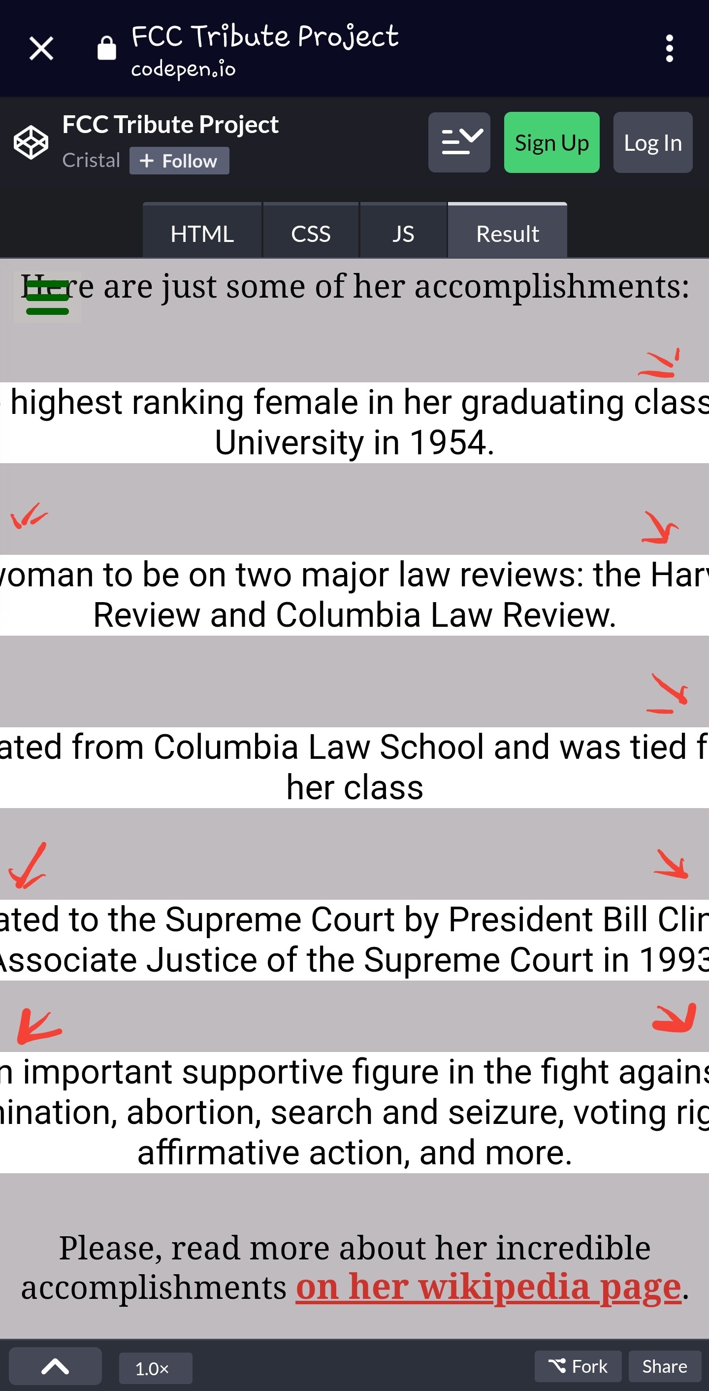
Just to be clear, adding the border is meant to be temporary and to show you how you’re styling the .container. It was pointed out that on smaller screens the .list items fall out on both sides and cannot be read. (see screenshot) There’s also a horizontal scrollbar on smaller screens. Your page should be responsive. Remember, the R in RWD stands for Responsive.
You’re styling .container but what needs to be styled is .list. What if a max-width property were added there with a percentage value. Wouldn’t the .list items then be responsive to different screen sizes?
It’s good to practice but maybe you don’t need to use grid here. This is a simple list. As a general rule of thumb, use Flexbox for a single axis (either X or Y) layout, CSS Grid for a 2-axis layout.
@Roma Thank you so much for your repeated help. I am learning so much because of your explanations!
I did add the max-width in the .list and removed it from the .container. Im not entirely sure if that was a good move but the red border only went around the list and not around the entire screen size, so I thought that was good.
I also adjusted my wording as you mentioned.
And finally, your quick rule of thumb for flex vs grid was beyond helpful. I genuinely had no idea when I would use one over the other.