Hi everyone!
I would like to have some feedback for the survey project.
Pixel Art Palette Survey
Thank you!
Hi everyone!
I would like to have some feedback for the survey project.
Pixel Art Palette Survey
Thank you!
Very original survey form and I have no idea how you did it with all those webkit, moz and ms attributes. And I am too tired to try and figure it out. Nice colorscheme by the way. The only thing that I can see is that the checkmark isn’t centered in the square representing the checkbox. Unless you did that for better contrast?
Thank you!
I did a lot of experimentation. The select had a custom arrow but I remove it. (Inside comments.) As for the checkmark it was a design choice so that when it checked a color in the same contrast the user still can see that he liked the color. I could not think about any other solution.
Unless you gave each checkmark a different color, or used at least two different colors for the checkmarks: a white checkmark for the dark colors and a black checkmark for the light colors. Would that work?
That’s actually a good idea! I would will check that later to see it in practice…
Thank you!
Hi @RMdS-GitHub!
I loved your survey form and its pixel art!
Great job!
Just a tip:
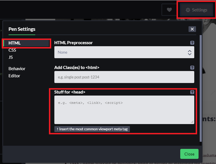
<body>, so the things like <head> , <link> , <meta> you can put in other place, like the image above:And I disagree about removing the arrow, I think it increases the usability of the page.
This is unique, nice color combination. am trying this on my design
Thank you for the advice!
In what concerns the arrow it was a custom one with font awesome… I was spending a lot of time solving a responsive issue wit. I decided to move forward.