Hello, i’m so grateful for this page, i literally started learning 4 days ago and althought there`s a long road ahead i would never imagine myself even beign able to create this, thanks for making this possible.
It`s been a long time since i ever did something i can feel accomplished for.
Please, if someone see’s mistakes my beginner eye can`t see can you tell me how to improve myself? i would really apreciate it.
Congrats. Its a great feeling when you get a project finished.
Just a few notes, maybe something to work on when you have time. This is the mobile view.
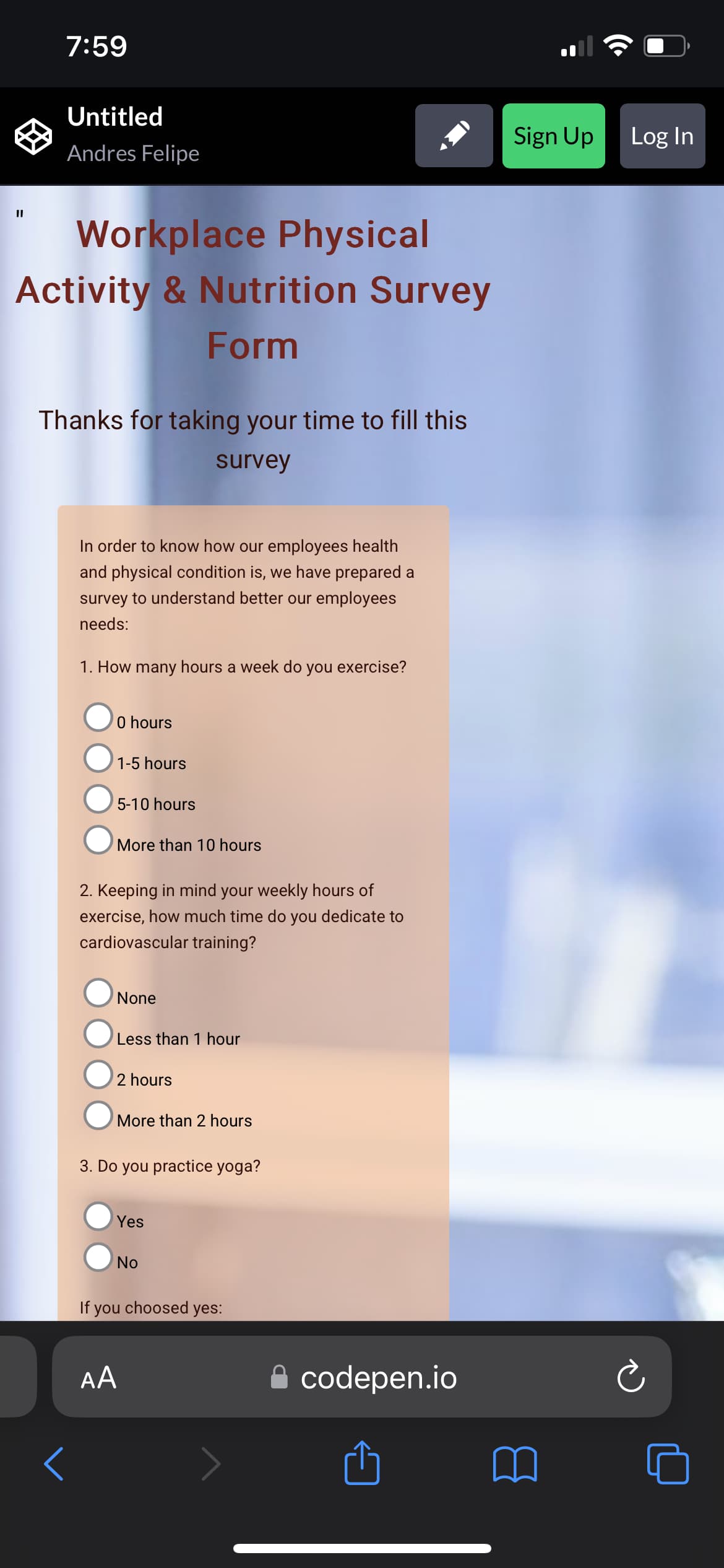
In the upper left you have a stray quotation mark that I assume shouldnt be there
I would work on making things centered as right now its more to the left.
This may just be me, but I would make the text bigger. Its a little hard to read when viewing from a phone unless I have the phone right up to my face.
Its looking good though, keep it up. This can be one of those projects you can come back and update with the new things you learn.
Thanks and also thanks for taking the time to come and comment!
I can’t find the place where those quoting marks are , i dont want to excuse myself saying its bugged but i dont know where are they haha…
I made the div tag with a margin-right of 30vw on purpose, i had the feeling having the background person on the right made it look better in that way, should i not attempt to do that anymore? or is there a way to make it center on other devices or sizes but keep it to the left on bigger screens like a monitor?
You’re completely right on this, i sacrificed readability for design, if i made the text bigger i wouldn’t get the design i had envisioned, the bigger i made the font the less the image was seen…
So, you have to think about your users that visit your websites. To be honest, they are going to care more about the functionality, and the visibility of your site. If they are having a hard time reading what on your site then chances are they are not going to stay on your site for very long. Not saying the design isnt important, but whats the purpose of this? Its for users to take a survey, not view a background image. Just keep in mind that of what you are creating, why you are creating it, and who you are creating it for
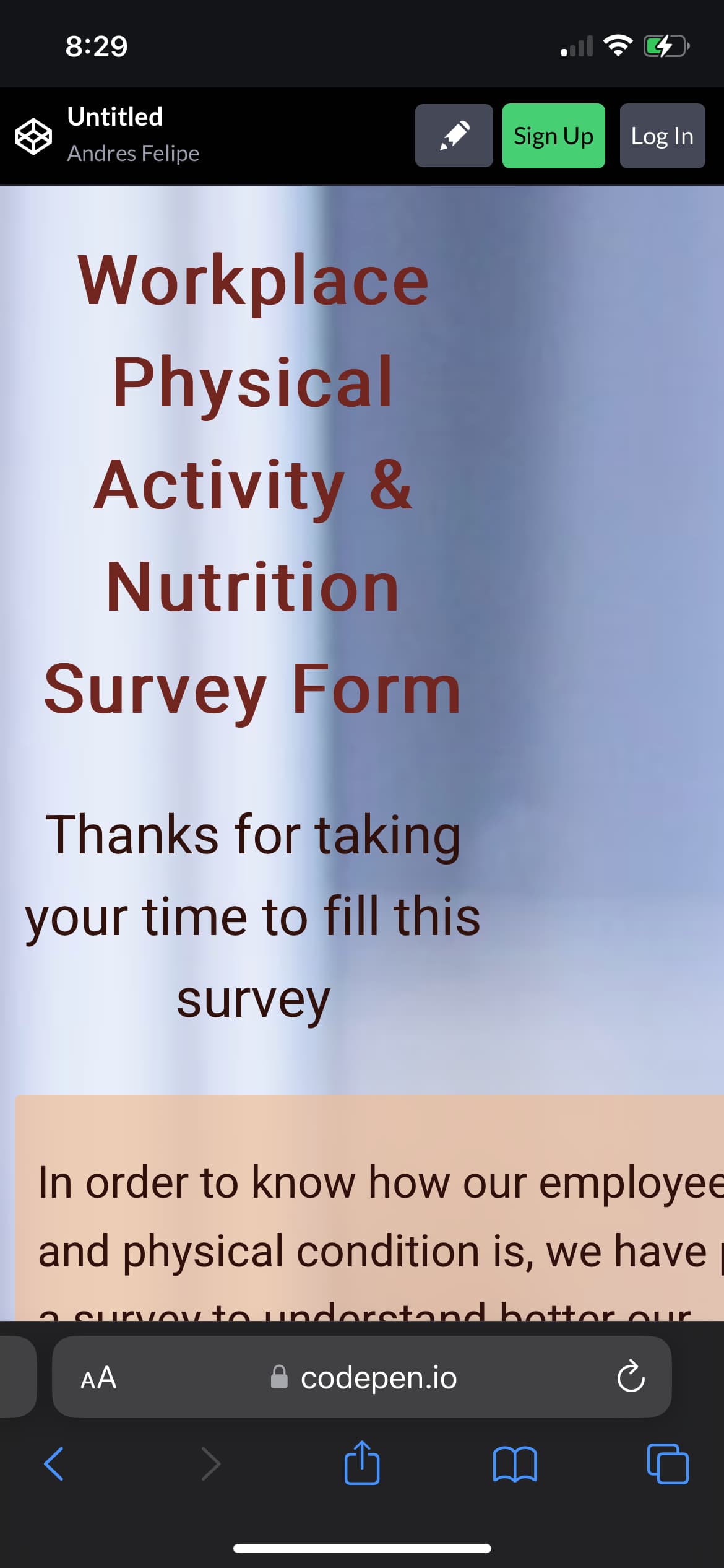
It happens, now the text is supper big. This is just one of those things that you will have to play with until you feel comfortable. I would also suggest if you are not using it already to use google developer tools. There you choose from several options to view the page. From a desktop view, mobile view, tablet view etc. I havent used codepen in a while, but from what I remember it doesnt have those options. Also, its good to get use to the developer tools now because that becomes a developers best friend