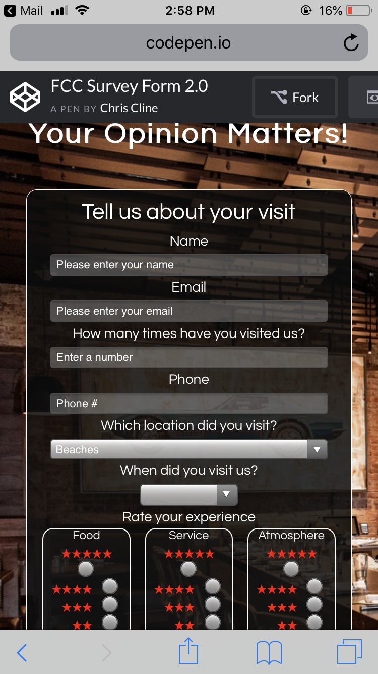
I finished my survey form, exited that I was able to incorporate a recaptcha and means to post.
You can see it live here:
http://chriscline.tk/form2/
codepen here:
Feedback would be much appreciated.
Thank you,
I finished my survey form, exited that I was able to incorporate a recaptcha and means to post.
You can see it live here:
http://chriscline.tk/form2/
codepen here:
Feedback would be much appreciated.
Thank you,
Looks great! Perfect for a Bdubs or something 
 Man, I’m hungry…
The one thing I would try to edit is your #title’s color. The white blends in too much with the background since it isn’t in the form’s transparent black background. I changed it to navy, just to see the difference, and it helped (though navy didn’t look good, so maybe do something else…)!
Also, I know you could make the Submit button cooler too.
I really like that you added the star ratings next to the radio elements. I haven’t seen that for other people’s survey’s so it was a nice touch 
Thank you,
And I agree about the tittle the problem is that since codepen does not let you upload images I have to go with the source as it is(google and linked the address). Between the lights and that pink thing, yes it just makes the tittle blend in. I tried puting a stroke on the text but that went from bad to worse. If I was using the image as a local file I would just crop that down. I think I will do that tomorrow.
I was thinking the same about the button. I didn’t do anything with it and you are right I should. At least style it to match the rest of the form, I’ll have to look into how to style that and the radio and check inputs.
Thanks again for your feedback
One more question if you don’t mind.
The stars rating 1-5 (like it is now) or 5-1 (so five stars is the first option)
I’m leaning towards the later, your thoughts?
I like it. It’s original. You did a goog job.
Thank you very much, glad you liked.
Hi Chris,
Some really positive stuff in here and some interesting ideas; really like the trip advisor style stars implementation. Just a couple of things to look at (I look at things from a design POV as that’s the industry I’m in - so take everything I say with a pinch of salt and feel free to disregard it!):
I see that some people have already mentioned the header text, which I agree with.
Playing about with the page sizes on Chrome, the position of the right hand side elements breaches the border of the see-thru grey background.
Personal thing - you have centre aligned the text of Name, Email ‘How many times…’ etc, but not done the same for the placeholder text - this imbalances the page for me. I’d look to either left justify the titles or centre the placeholder.You can just style it like this if you didn’t want to play around with the CSS:
<input style="text-align: center;" autofocus id="name" type="text" name="Name" required maxlength="50" class="input-field" placeholder="Please enter your name" >
Be slightly careful with too much transparency - overuse and your page begins to lack ‘weight’. I tried your background alpha at .88 and I think it looked much easier to read - remembering that we need to try and code for accessible users where possible:
#form-outer {
	background: rgba(13,13,13,.88);
    }
And finally, just a couple of really small things - you’ve misspelled ‘which’ as ‘wich’  and your capcha seems to be returning an error - which, even if it’s a placeholder, makes it look a bit broken.
They are all small things though and you’re obviously making good progress! Keep at it.
Dan
Thank you so much.
Good points here I will have to look into.
Never thought of centering the placeholder, good idea!
Yes captchas are site specific and it works on the server I am using to host the page. http://chriscline.tk/form2/
The form will post and send me an email.
codepen is so people can see the code.
Thanks again this helps a lot,
I really like the new background picture! It makes everything really stand out. The transparency is nicer too - a little darker, but the white text andborders stand out more. Only thing, and I know you helped me with this question before on my project, is that on my phone, the stars get a little uneven:
Idk if that’s fixable, I just wanted you to see it. Everything looks really good now tho. You made some great improvements!
Was just about to point this out to @ChrisCline1138 too. It seems to go a bit funky from 1135 px wide and stay broken until your media breakpoint kicks in at 800px.
The breakpoint has reminded me - One thing I meant to mention when I last commented, was that your stars become incredibly small at 800px or less.
And you may want to do this:
#form-outer { min-width: 330px; }
To stop the form overspill at very low resolutions. Try it and see what you think.
Yeah I saw that and it’s been corrected I think. I am testing on chrome developer tools and it looked fine there, but then when I actually used my phone I saw that issue. I fixed it on my phone galaxy 8 would you mind looking at it again to see if it is still doing it. Also you might need to clear you browser cache as that stores css files. That bit of info had me going nuts.
Thank you so much.
Feel free to send me a message if there is ever anything I can help you with.
I will have to check on that.
I really appreciate all your help.
Feel free to message me If you need anything.
And that makes a lot of sense. Will change to set a min width
I check just now on my phone and it still is the same =/ What’s weird is when I Inspect the page on full screen view, it looks fine on my laptop in iphone 8 etc. I think it just might have to do with cross os 's! I’m gunna have to look into all of that because it isn’t covered here on fCC.
Oh, one thing, when I did look on the Inspect area, and changed the view to iphone 5, the page gets a little weird. I’m not trying to add more confusion and stress to what you’re working on, so I’m sorry if I did. And yeah! I’ll definitely message or add you to a post if I need extra help. Thanks
Ok thanks I’ll have to check on that. I think Ascii’s suggestion will do the trick by keeping the outer box from getting too narrow.