Hello, I’m a student learning to build a coffee shop for a school assignment.
I’m currently working on building the product cards using flexbox. I have one issue though, I cannot figure out how to set up the flexbox to create the desired outcome.
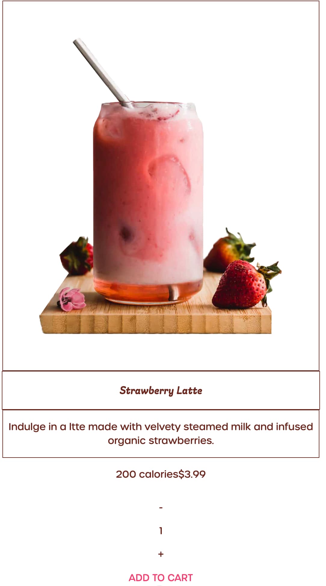
Desired Outcome

What I have right now
In separate reply.
I’m not sure how to align the calories and price boxes the way I want them to. I want them to be half of the width of the big card then placed side by side like in the desired outcome.
HTML
<!--Product Cards-->
    <main>
        <!--Strawberry Latte Card-->
        <div class="card">
            <div class="card-img">
                <img src="img/strawberry-latte.png" alt="">
            </div>
        </div>
        <div class="card-title-container"><p class="card-title">Strawberry Latte</p></div>
        <div class="card-desc-container">
            <p class="card-desc">Indulge in a ltte made with velvety steamed milk and infused organic strawberries.</p>
        </div>
        <div class="stats">
            <div class="calories-container"><p>200 calories</p></div>
            <div class="price-container"><p class="price">$3.99</p></div>
        </div>
        <div class="qty">
            <p>-</p>
            <p>1</p>
            <p>+</p>
        </div>
        <a href="" class="card-btn">ADD TO CART</a>
CSS
main {
    margin-top: 50px;
    margin-bottom: 50px;
    display:flex;
    flex-direction: column;
    align-items: center;
    margin-left: auto;
    margin-right: auto;
    text-align: center;
    justify-content: center;
}

.card-img {
    border: 1px solid #6A281F;
    padding: 60px;
    margin-right: auto;
    margin-left: auto;
}

div.card-title-container {
    border: 1px solid #6A281F;
    width: 100%;
    font-style: italic;
    font-family: giulia, sans-serif;
    font-size:larger;
    font-weight: lighter;
}

.card-desc-container {
    border: 1px solid #6A281F;
}

div.stats {
    display: flex;
    flex-direction: row;
    align-items: center;
    width: 50%;
    margin: 0px auto;
    justify-content: center;

}
Please let me know what I can do. Thank you.