Hello everyone
Here is my survey project. Any and all feedback is more than welcome. Thanks for taking the time to review it.
https://codepen.io/NBanek/pen/VOXaQX
Nathan
Hello everyone
Here is my survey project. Any and all feedback is more than welcome. Thanks for taking the time to review it.
https://codepen.io/NBanek/pen/VOXaQX
Nathan
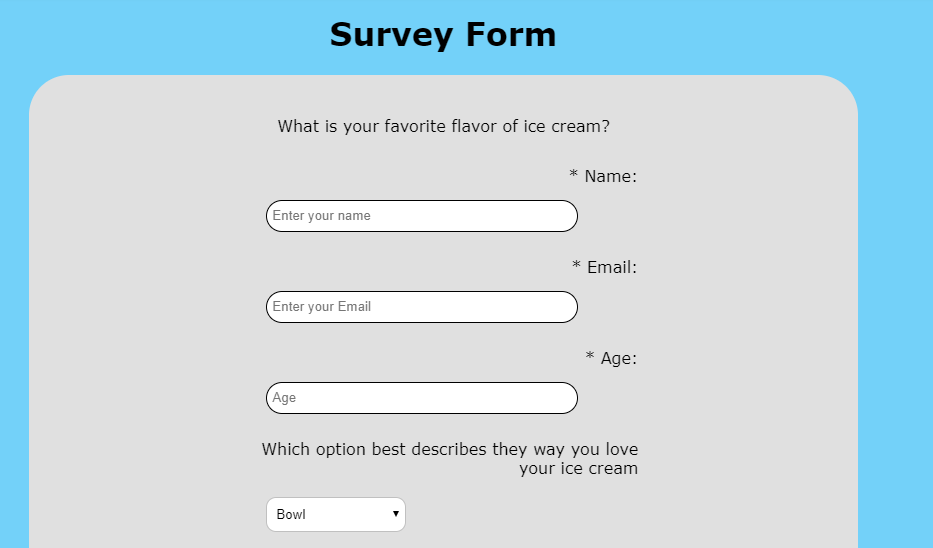
When I first go to your survey this is what it looks like:
I’m not a fan of the border-radius on the text inputs… especially when they get focus and have the light blue rectangular outline around them.
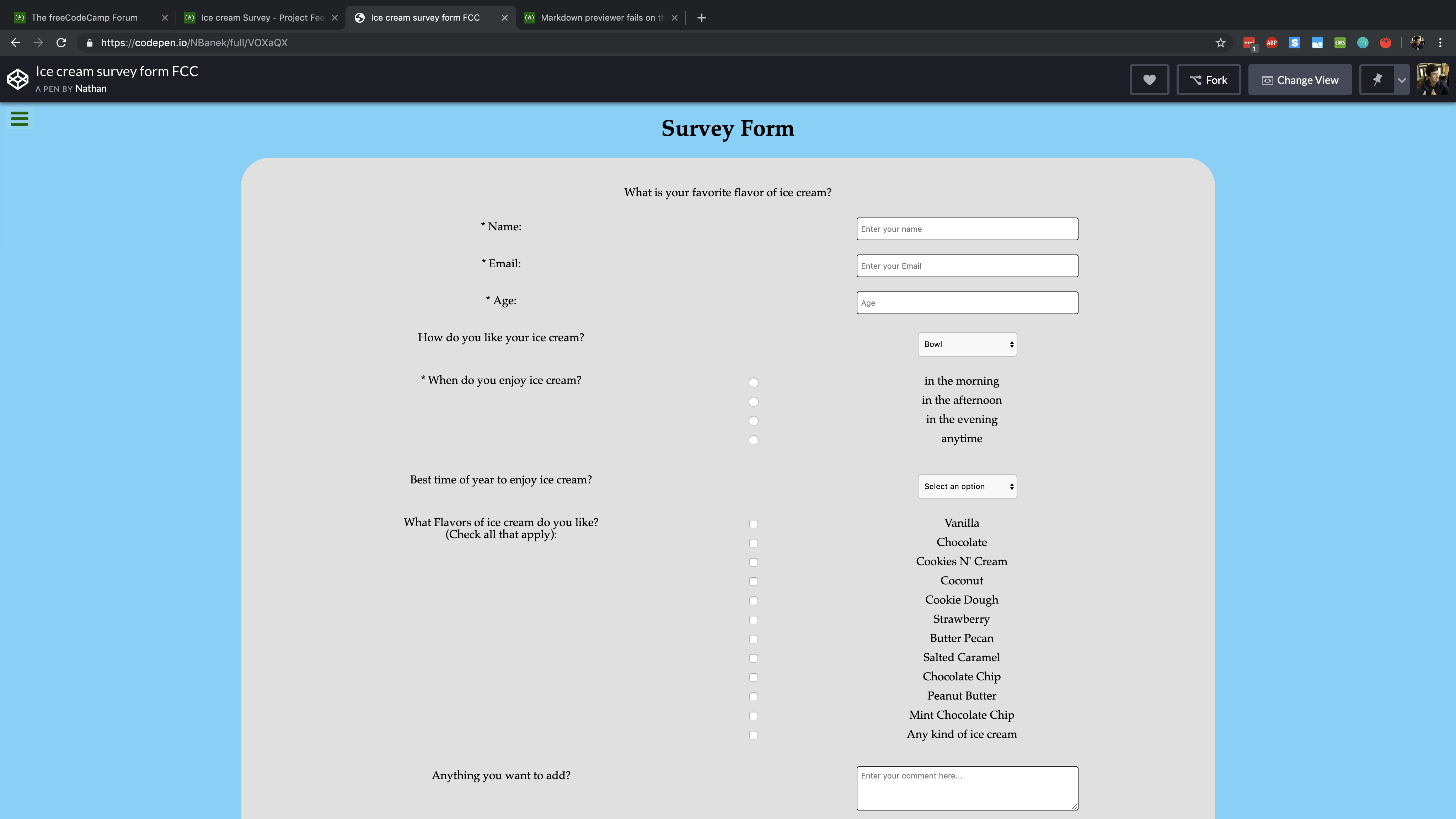
You have a very solid start!
Besides the fact you need to fix the text area because it’s not adjusting it’s width on smaller screens, I like it, great job! 
Looking a lot better now! I’d also work on getting rid of the large space between your radio button/checkboxes and the text/labels they go with. It looks a bit confused at some widths.
In big resolution screens your form it’s too wide. It’s difficult to know which label belongs to what field, the radio buttons are align in the center of the page which it’s weird and the footer is glued to the top of the bottom of the form, it needs more space to breath.
Hope it helps