Hey all,
Just looking for some help with this. I have a padding on all my sections so that they never touch the edge of the window when resizing. However, the padding doesn’t work on my intro section where I’ve used CSS grid and made one of my grid-template-columns have a value of max-content. How can I fix this? Here’s my code and a screenshot of the issue. Thanks for your help in advance!
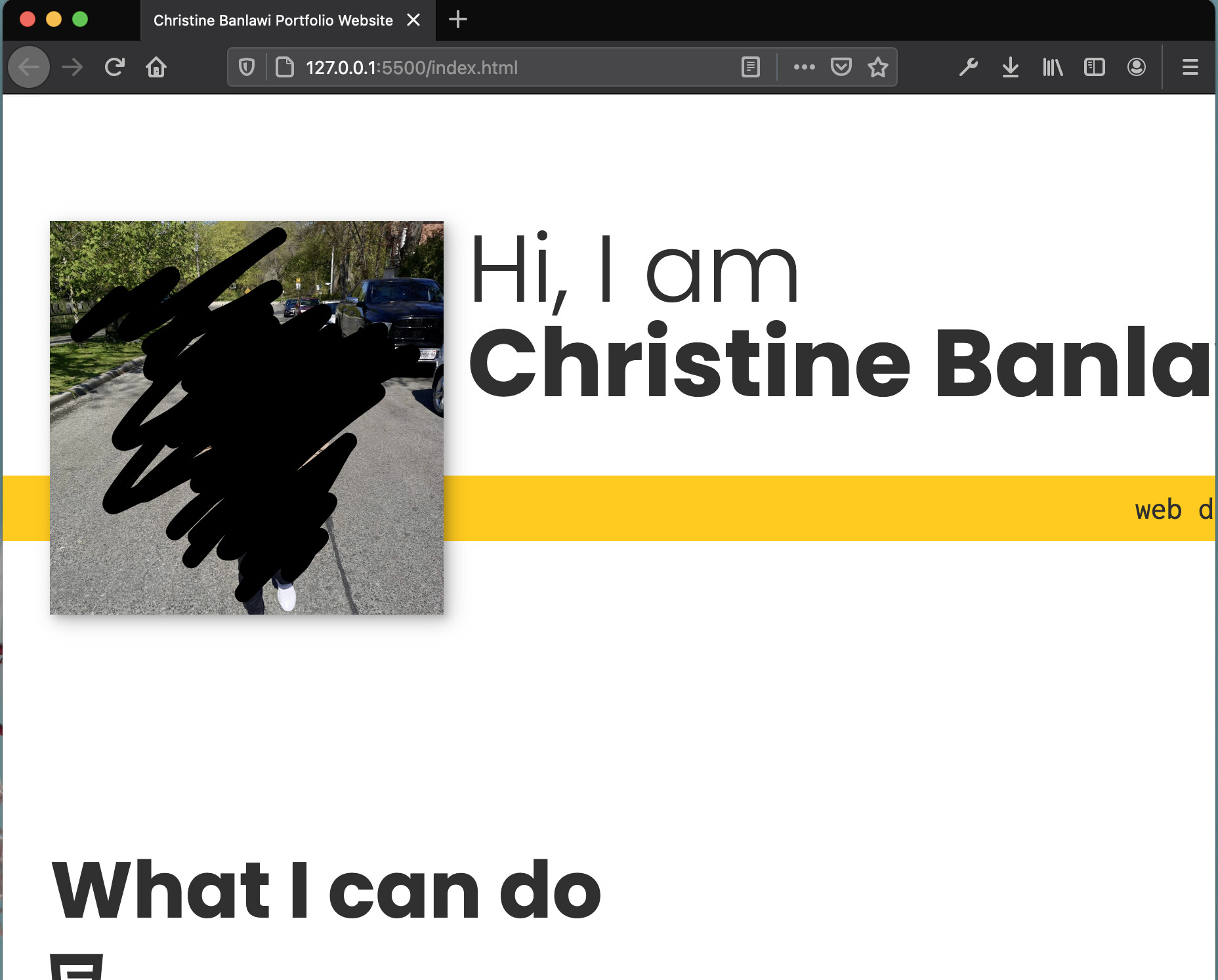
^^when I resize the window, it doesn’t shrink to fit and gets cut off 
@media (min-width: 600px) {
    .intro {
        display: grid;
        width: min-content;
        margin: 0 auto;
        grid-column-gap: 1em;
        grid-template-areas:
            "img title"
            "img subtitle";
        grid-template-columns: min-content max-content;
    }

    .intro__img {
        grid-area: img;
        min-width: 300px;
        position: relative;
        z-index: 2;
    }

    .section__subtitle--intro {
        align-self: start;
        grid-column: -1 / 1;
        grid-row: 2;
        text-align: right;
        position: relative;
        left: -1.5em;
        width: calc(100% + 3em);
    }
}
