I just recently finished my landing product page and I would like some feedback, please and thank you.
Hi SageM-19,
As a landing page, it has the main important features for your product so it’s okay and it’s seems you were practicing to code it from scratch.
Buttons are working well except the e-mail form but I assume you did it on purpose.
If you want to check on other landing pages you’ll see that they mostly follow some kind of grid to separate the whole information in the website. You could try to take some ideas in websites that are made with Wordpress or similar to help you maintain a style or proportions in images and blocks.
Hope it helped,
Cheers
What do you mean by grid? I looked at a few but nobody used grids.
Sorry if i didn’t explain it well.
What i tried to say is to follow some grid layouts to distribute the information in your site, to make sure about features like your font-size and how clean the whole website can look. It’s mostly a design thing.
For example, take a look at this:
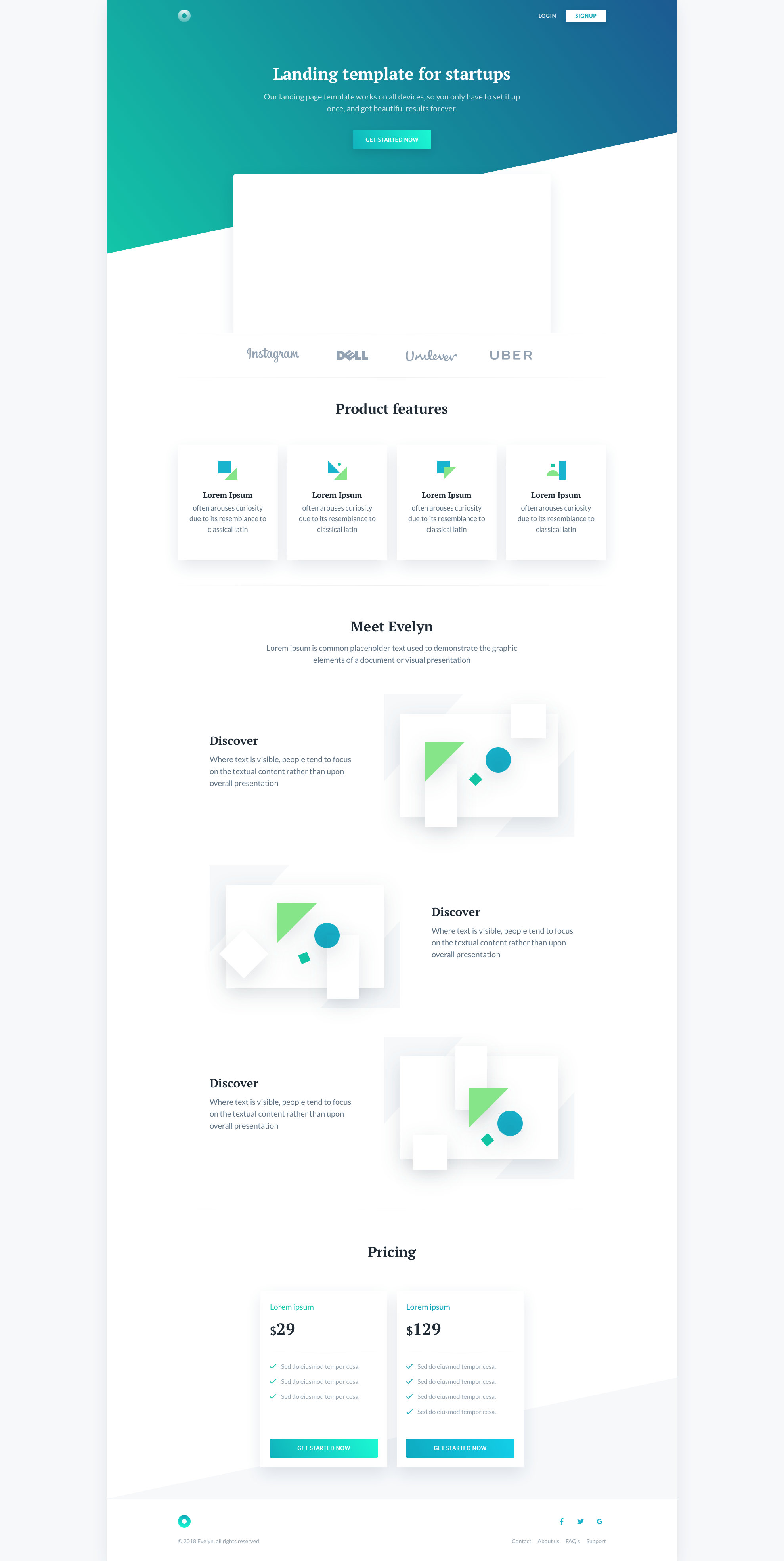
But it’s just a suggestion, It’s just to help you more about your design decisions.
Keep going!
Cheers
1 Like
Thanks for explaining that. I will start looking into layouts to distribute text my page. I still like how my product page came out so I’m going to keep it like that (just real proud of the layout of the page, even though it’s pretty basic all things considered). I will also try darkening the background-color of my containers so that it’s easier to see text since is where I should focus on. Thanks again!
1 Like