<!DOCTYPE html>

     <head>
      <meta charset="utf-8">
      <meta name="viewport" content="width=device-width, intial-scale=1">
  </head>

  <style >

    em.quote{
      text-align: center;
      justify-content: center;
      margin-top: 515px;
      margin-left: 550px;

    }
    .row {
  display: flex;
  flex-wrap: wrap;
  padding: 0 4px;
  justify-content: center;
  text-align: center;

}

/* Create four equal columns that sits next to each other */
.column {
  flex: 25%;
  max-width: 25%;
  padding: 0 4px;
}

.column img {
  margin-top: 8px;
  vertical-align: middle;
  width: 100%;
}

/* Responsive layout - makes a two column-layout instead of four columns */
@media screen and (max-width: 800px) {
  .column {
    flex: 50%;
    max-width: 50%;
  }
}


/* Responsive layout - makes the two columns stack on top of each other instead of next to each other */
@media screen and (max-width: 600px) {
  .column {
    flex: 100%;
    max-width: 100%;
  }}


   #main{

    text-align: center;
    border-style: solid;
    background-color:  #b48eaeff;

  }


  p.info{
    font-family: sans-serif;
  }


  p.link{

    text-align: center;
  }


  </style>


<html>
<head>
The img element should responsively resize, relative to the width of its parent element, without exceeding its original size. < how do i complete it resize because i use a responsive image grid did i use margin auto in the wrong class?
Hi @_manual!
It is kind of hard to tell what the problem is because so much of the html is missing.
It would help to see the full code, preferable in a codepen link.
Can you share a link to the full project?
@jwilkins.oboe
<div id="main">
<h1 id="title"> Dr.Norman Borlaug</h1>
</div>
<div id="img-div">
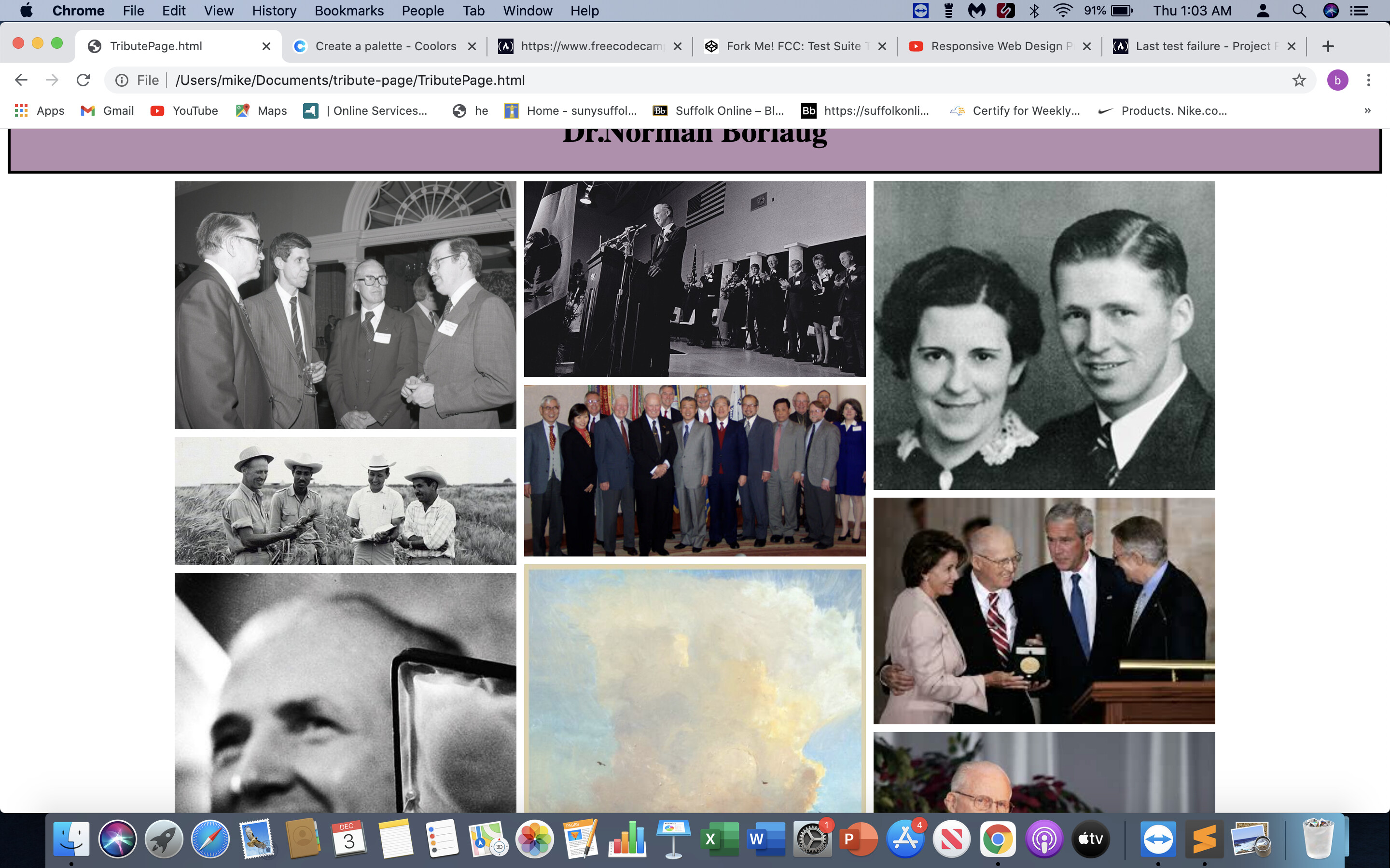
<div id="img-caption" alt=" A gallery of images of Norman Borlaug">
<div class="row">
<div class="column">
<img src="img/normanwithpeople.png" alt="Norman Borlaug having a conversion with colleuges">
<img src="img/norman-borlaug.png" alt="Norman Borlaug in a field smiling" id ="image">
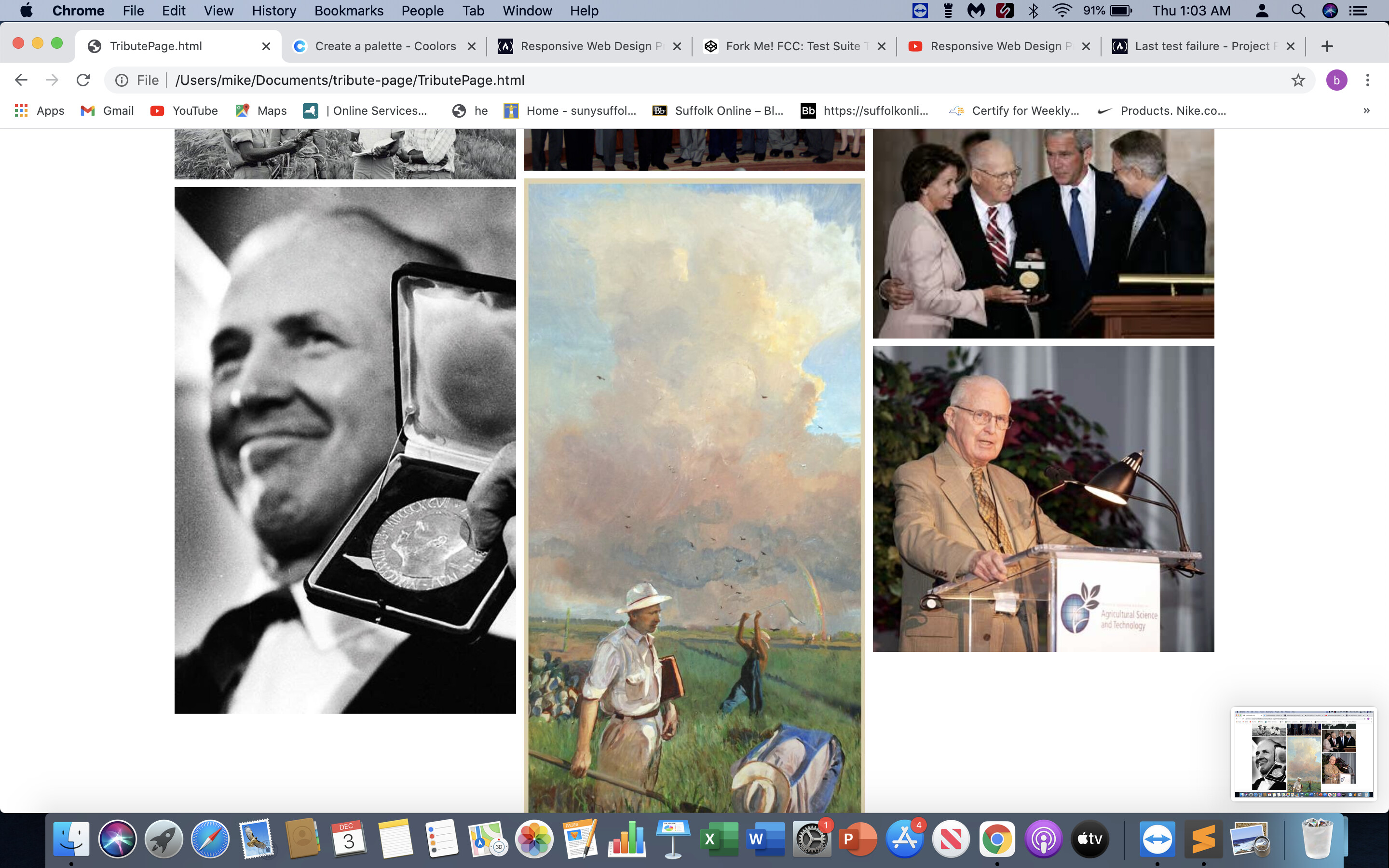
<img src="img/normanholdingnobelpize.png" alt=" Norman Borlaug holding the Nobel Peace Prize">
</div>
<div class="column">
<img src="img/normanatconference.png" alt="Norman Borlaug at a confrence">
<img src="img/normanwithjimmy.png" alt="Norman_Borlaug with former President Jimmy Carter">
<img src="img/normaninmexico.jpg" alt=" A painting of Norman Borlaug in a field in Mexico">
</div>
<div class="column">
<img src="img/norman.png" alt="Norman Borlaug and his wife">
<img src="img/normangetsaward.png" alt="Norman Borlaug receives an award from president George W Bush">
<img src="img/normanatscience.png" alt=" Norman Borlaug at a agricultural science and technology ">
</div>
</div>
<p class="important">
<em class="quote">Fathered a revolution that saved billons of lives</em>
</p>
</head>
<div id="tribute-info">
<p class="info">Norman Ernest Borlaug (March 25, 1914 – September 12, 2009) was an American agronomist who led initiatives worldwide that contributed to the extensive increases in agricultural production termed the Green Revolution. Borlaug was awarded multiple honors for his work, including the Nobel Peace Prize, the Presidential Medal of Freedom and the Congressional Gold Medal.
Borlaug received his B.S. in forestry in 1937 and Ph.D. in plant pathology and genetics from the University of Minnesota in 1942. He took up an agricultural research position with CIMMYT in Mexico, where he developed semi-dwarf, high-yield, disease-resistant wheat varieties. During the mid-20th century, Borlaug led the introduction of these high-yielding varieties combined with modern agricultural production techniques to Mexico, Pakistan, and India. As a result, Mexico became a net exporter of wheat by 1963. Between 1965 and 1970, wheat yields nearly doubled in Pakistan and India, greatly improving the food security in those nations.
Borlaug was often called "the father of the Green Revolution", and is credited with saving over a billion people worldwide from starvation. According to Jan Douglas, executive assistant to the president of the World Food Prize Foundation, the source of this number is Gregg Easterbrook's 1997 article "Forgotten Benefactor of Humanity." The article states that the "form of agriculture that Borlaug preaches may have prevented a billion deaths." He was awarded the Nobel Peace Prize in 1970 in recognition of his contributions to world peace through increasing food supply.</p>
</div>
</body>
<a href="https://en.wikipedia.org/wiki/Norman_Borlaug" target="_blank" id="tribute-link"> <p class="link"> Learn More About Norman Borlaug<p>
</html>
this is the html i don’t have it linked up yet
I would center the img tag that has an id="image".
To center an image you would use margin:0 auto; like you mentioned earlier.
Images are inline elements so you will need to set this element to block. display:block;
The failing test also tells you to use the max-width property for it to responsively resize inside the parent element.
When I combine all of those things the test passes.
#image {
  display:block;
  margin:0 auto;
  max-width:100%;
}
As you start to style your page you will run into more errors with styles not working because there are errors in your html.
Most of the errors have to deal with missing end tags. So I would carefully go through every single div tag, p tag, etc and make sure that it has a closing tag. img tags are self closing tags so you don’t have to worry about those.
Also make sure to have proper indentation so you can see the the child elements inside the parent elements.
<div id="image-div">
  <img src="my-pic" alt="text">
</div>
Hope that helps!
I also want to note that I got the test to pass with just your html that you gave me and the image styles I added.
I didn’t use any of the css you gave me. Carefully add those back in once you pass the test.