Hi there, I am tying to create media query targeting #gallery img. No matter what I try I can’t seem to get this right. Any help would be much appreciated!
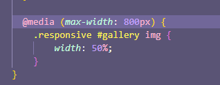
“Create a media query for screens smaller than 800px in width. In that media query, create a #gallery img rule and set the width property to 50% . This will convert your gallery to a two-column layout.”
It is great that you solved the challenge, but instead of posting your full working solution, it is best to stay focused on answering the original poster’s question(s) and help guide them with hints and suggestions to solve their own issues with the challenge.
We are trying to cut back on the number of spoiler solutions found on the forum and instead focus on helping other campers with their questions and definitely not posting full working solutions.