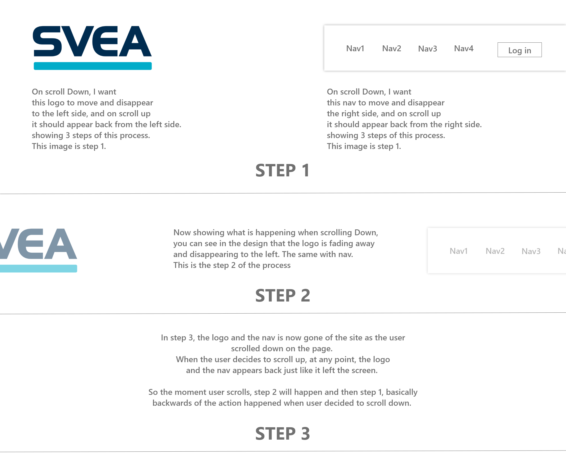
So I have logo on left and nav on right.
My wish is that, on scroll, I want logo and nav to disappear and appear from seperate direction. Logo disappear/appear from the left side, and the menu to disappear/appear from the right, instead on disappearing/appearing from the top that almost all tutorials shows.
I have added the code to the codepen, and kind of tried out myself with the nav only, but could not have it to work. If you look at javascript and scroll a bit down, I have added comment from where I need some help.
I might have done it wrong on my code. It would be a huge help if I could be guided how to achieve this. I have attached image of what I am trying to achieve.
This is for my school project delivery. We are told to make website with nav disappear on scroll down. Most of students will make it so the header leaves to top on scroll down, which is the most common one, but I want to know how I can make them leave/appear horizontal.
You need to look at the window.scrollY for the vertical scroll.
I would suggest using transform: translateX() for the logo and nav instead of offsets and use some classes to toggle the transform using classList.add() and classList.remove() instead of setting inline styles.