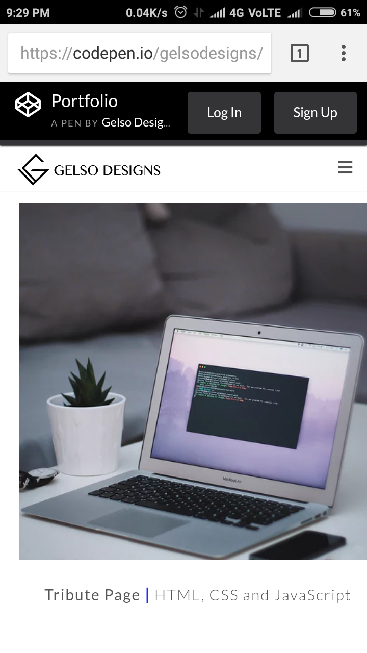
This is my portfolio website (sec project after the tribute page). Some of the social links don’t redirect to the actual pages because I am still setting them up, same goes for the contact form. Also, the current projects are just placeholders until I can add some of the new ones.
I had a quick question does anyone know how I can make it so that when you click on one of the nav links it stops a couple of px above the anchor points?
Any type of feedback is appreciated.
Thanks
you have not provided any link of your project 
You are a genius man!!! WOWWW!!!
Great job.
Thank you @bestdesign. =)
wow, this is pretty cool! One of the best i’ve seen so far. Much cooler than mine!
Btw, You have Survey spelled wrong under Creative Work.
great work keep up the good work
Thank you for your feedback.
1 Like
Hi, @snowpear thank you so much for your feedback. I fixed the spelling as well.
I just looked at yours and the story about the snow pear is so cute.
When I tried to open the Tribute Page link it showed an error message thou.
Thank you for looking at my silly page! And thank you so much for pointing out about tribute page! I know exactly what happened. I created it before they had test, so when test was implemented I re-created my tribute page but never updated the link. I will fix it! I really appreciated your feedback!
1 Like
It looks amazing. I am not a fan of the strong blue you used, but somehow, you made it look cool. Great job.
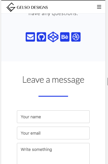
The only thing that I would suggest changing is the blue line dividing the “Get in touch” and “Leave a message” parts. I would shorten it to at least 70% of its original size and move it to the middle, leaving some space on top and bottom.
Others might disagree with my opinion, but that line caught my eye as soon as I saw it and to me it just seems out of place considering the style you used in other parts.
Images are not fit in my mobile screen. You should check that.
@SumanKisku, thank you for the feedback I will check that now.
Hi, @RonArnor thanks for the feedback much appreciated. I am playing around with the contact section do you thing this version would look better? I removed the blue line completely and changed the background of the two sections.
Yeah, it looks much better now.
Also I wanted to add that this really is one of the best portfolios I’ve seen so far here in FCC.
1 Like
@RonArnor thank you so much. =)