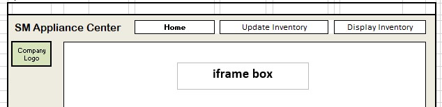
Hey guys I really would love to know if this is a recommended approach to getting a prescribed design using HTML and CSS. Is there a better way to do this if I am wrong?
I don’t think you want to put all those anchor tags inside the h1 heading. The h1 heading should just be the text of the heading (SM Appliance Center) and then the links would be a separate block, perhaps wrapped in a <nav>?
To get the heading and links to line up horizontally you could wrap them all in a <div>, or perhaps a <header> and then apply display: flex on that.
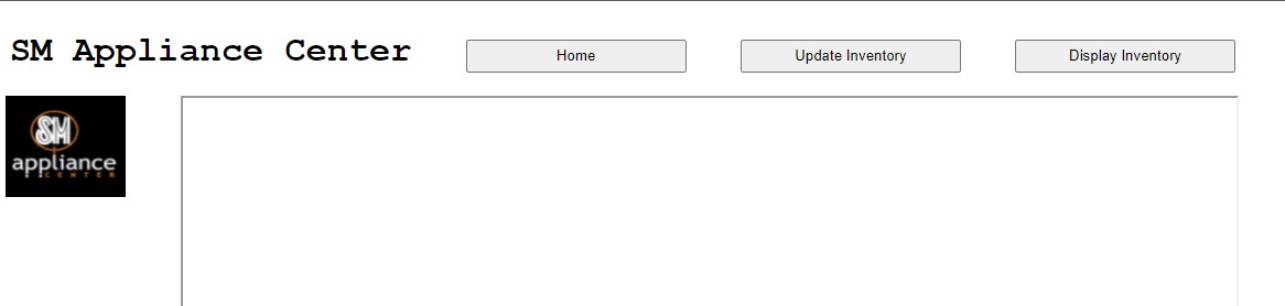
Thank you @bbsmooth I tried all the suggestions but it alters the expected design.
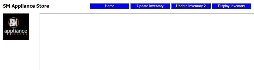
Using the <nav>, <header> and <div> and styling in CSS (I didn’t use any two at the same time, header, nav is purely for illustration):
Even if I try using the margin attribute to style I can’t get the buttons inline with the <h1> element SM Appliance Center. My main concern is how to get the buttons inline with the <h1>
You’ll most likely want to wrap the <h1> and <nav> in an element (maybe a <header>) and then put display:flex on that element and use other flex properties to get them to line up the way you want.
Also, you should not have a <button> inside of an <a>. Those are links and should just be <a>'s.
To be honest, not good. Tables should be used for tabular data, not layout. There is no reason you shouldn’t be able to use flex/grid to do what you want to do.
To be honest I’ve been pretty lazy to learn how to properly use the flex/grid display properties. I guess it’s time to take a dive and explore its wonders. I’ll study hard and get back to you on that.