I have built my tribute page. I am not going to lie, I went a little out of scope on this one. I dedicated to the one and only Joe Rogan. I am in the beginning stages of building my portfolio. Let me know if you see anything that is off or could use improvements. My plan is to use pure scss on my next project to show my ability to work on different technologies. Let me know if you recommend another approach to look hire-able.
here is a link to my codepen
I was playing with your nav menu and thinking the animation of the shapes of the menu items is a bit distracting but wouldn’t it be cool if the animation linked in with the theme somehow? (for eg. if a blinking eye would show up when people hovered on the menu or maybe like a round circle shape that looks like a spotlight) Just some thoughts. Your page is inspiring me that way!
(if you’re going to animate, you might as well do it for real!)
1 Like
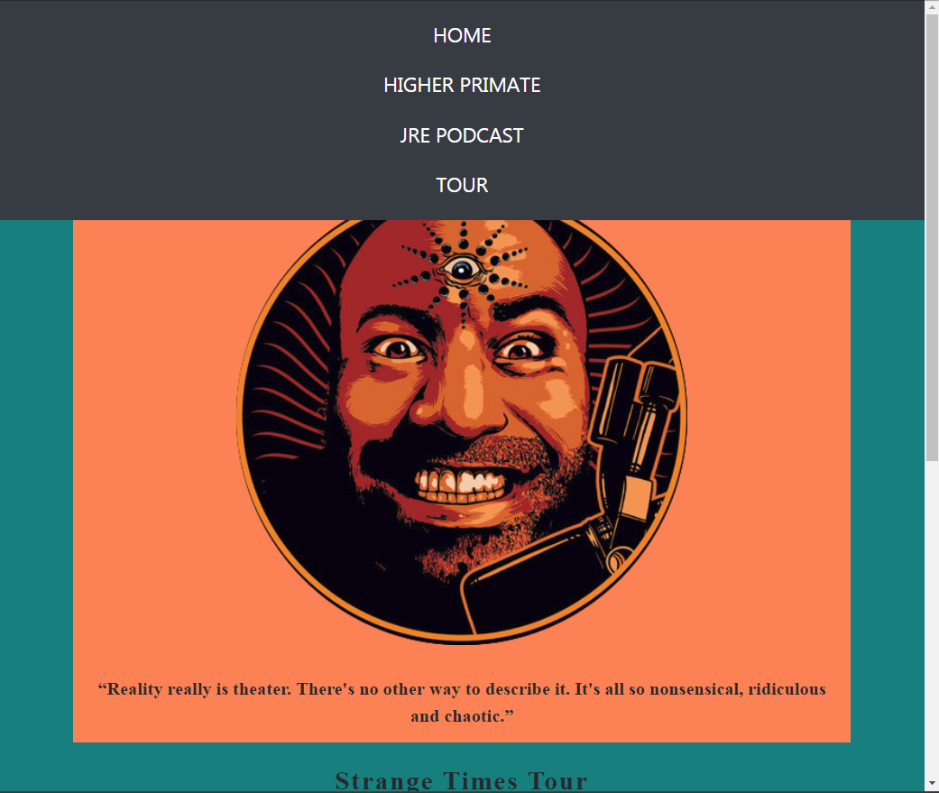
Well, the first thing that made me scratch my head was: what is the purpose of the top navigation menu if items in there don’t hold what’s in the project itself? Now it is a menu with some links that don’t correspond well with your project. You should definitely change that and put them somewhere else explaining what they’re for. The navigation should help users navigate your project.  tour link is the one that fits it but why did you opt for opening it in a new tab instead of just “pushing” you down there? Other than that, it looks really great.
1 Like
That was an issue I faced earlier in the day. For whatever reason on safari that page does not jump down like it does on chrome(at-least on mobile devices.) The inspiration for the navlinks come correlates what company he is actually involved with. He has a company called Higher primate that sells shirts and stuff. I figured why not put it in there.
My inspiration came from this https://www.joerogan.com/
Ok, well I thought it’s confusing a bit.
For that link to work properly, just remove target="_blank" from <a> element. 
I wish by css skills were that good. lol. I did make an eyeball once with css. maybe I could make it in a much smaller scale and put it in t he nav, Thanks for the help earlier.
I tried that. On my IPhone 5 using safari. the tour button acts as a dead link IN THE NAV . Or at-least it acts like it.
Looks cool, yes, not the common! good work.
I like the color scheme, the colours you selected indeed have good contrast, but they could be a little lighter to bring better contrast with foreground color(black), but it looks very good for white text.
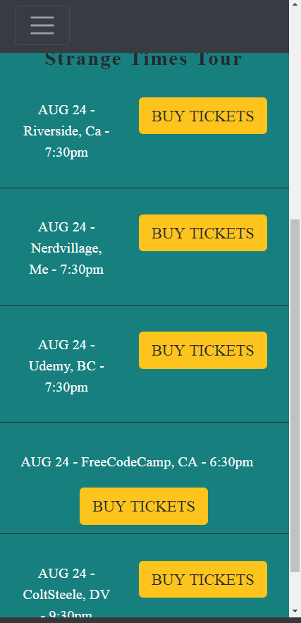
A very small issue, when layout is for tablet maybe (screen width 768 to 900), the manu goes with more height and overflow over content. the bad stuff is the content could not be scrolled to be displayed, please check(top scroll):
Another very small issue(not critical) is the buy ticket buttons, they have different base line with the text at left.
I just realized you applied a very small absoloute constant top margine for buttons which causes different baseline for button, please don’t.
If you like to to bring some element space for button, you may div it by parent either padding or margin, not one child element.
The buy ticket section(table like) is also need some work for better layout for mobile and small devices. check:
I suggest for small devices, the buy ticket button goes to next line all the time (like the aug 24-freecodecamp record)
overall looks good.
keep going on great work, happy programming
1 Like
Thank you for having a look. And opening my eyes to these issues. You are the best