Hi there everyone
I have now completed the Page View Time Series Visualizer challenge and handed my code in.
There are a couple of sections of my code however that I think could possibly be improved upon, both within the draw_bar_plot() function. The code for which is here:
def draw_bar_plot():
# Copy and modify data for monthly bar plot
df_bar = df.copy()
df_bar = df_bar.reset_index(level=[‘date’])
df_bar = df_bar.assign(year = lambda x: (x[‘date’].dt.strftime(‘%Y’)))
df_bar[‘month’] = [get_month(x) for x in df_bar[‘date’].dt.strftime(‘%m’)]
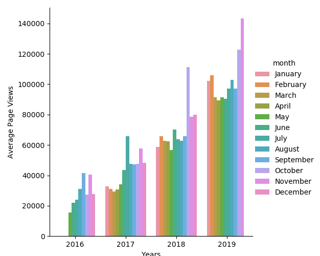
df_bar = df_bar.drop(columns=[‘date’])# Create dataframe for monthly average values column_names = ['year', 'month', 'average'] df_aver = pd.DataFrame(columns = column_names) year = None month = None first = True # Flag to indicate if this will be the first row in our dateframe total = 0 # Total number of page views in the current month count = 0 # Total number of days parsed for the current month for row in df_bar.itertuples(): if (row[2] == year) & (row[3] == month): count += 1 total += row[1] else: # New entry in df_aver dataframe if first is True: # So we initialise first entry year = row[2] month = row[3] count += 1 first = False else: # We have a new month, append previous month to df_aver average = round(total / count, 1) df_aver = df_aver.append({'year' : year, 'month' : month, 'average' : average}, ignore_index=True) # Reset variables for new month year = row[2] month = row[3] count = 1 total = row[1] # Draw bar plot fig = sns.catplot(x="year", y="average", hue="month", kind="bar", data=df_aver, hue_order=['January', 'February', 'March', 'April', 'May', 'June', 'July', 'August', 'September', 'October', 'November', 'December']).fig plt.legend(labels=('January', 'February', 'March', 'April', 'May', 'June', 'July', 'August', 'September', 'October', 'November', 'December'), loc='upper left', bbox_to_anchor=(0, 1)) plt.xlabel("Years") plt.ylabel("Average Page Views") # Save image and return fig (don't change this part) fig.savefig('bar_plot.png') return fig
The first section I think could possibly be optimised is the part beginning with the comment Create dataframe for monthly average values, to do this I iterate through each row in the df_bar dataframe using itertuples() and create a new dataframe containing a row for each month/year and an average for that month. My question being, is there a more efficient or succinct way to do this? I have read comments stating that it is best not to iterate through dataframes if at all possible, however I have not been able to think of a functioning alternative at this point.
The second section is where the actual plot is drawn. I used sns.catplot() to do this and originally I did this without using the legend() method.
fig = sns.catplot(x=“year”, y=“average”, hue=“month”, kind=“bar”, data=df_aver,
hue_order=[‘January’, ‘February’, ‘March’, ‘April’, ‘May’, ‘June’, ‘July’, ‘August’,
‘September’, ‘October’, ‘November’, ‘December’]).fig
plt.xlabel(“Years”)
plt.ylabel(“Average Page Views”)
which creates what I think is a nice plot that closely resembles the example (although the legend is in the wrong place).
In this state however it failed one of the tests because it doesn’t have a specific legend. By adding a legend I was able to pass the test but the plot no longer looks nice.
plt.legend(labels=(‘January’, ‘February’, ‘March’, ‘April’, ‘May’, ‘June’, ‘July’, ‘August’,
                             'September', 'October', 'November', 'December'),

            loc='upper left', bbox_to_anchor=(0, 1))
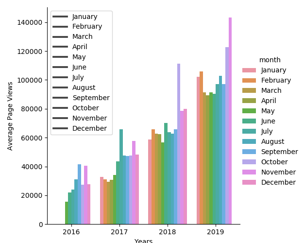
By passing the test in this manner I feel I have ‘hacked’ it somewhat, any advice on how I could tidy up the plot yet still pass the test would be greatly appreciated.
My apologies for the long post but I thought these would be interesting questions for the community.