Hi all.
I just finished my Portfolio page project. I would appreciate any feedback.
Here is my Portfolio Project
Thanks in advance. 
1 Like
Very elegant! Like it. One suggestion, simply because you did the semantic thing so well everywhere else: Where you have div id="profile-img-div", I might suggest you use a figure tag rather than a div. You don’t HAVE to use a figcaption with a figure tag, but the figure itself is far more semantic.
One of the greatest advantages of the semantic web are alternative readers: screen readers for the blind are better at handling figure tags than they are div tags containing an image…
2 Likes
- It’s too empty with too much space around the content. It’s not a good combination.
- The opening animation is way too slow. Wouldn’t be terrible for a more complex animation, but it’s not a good length for just sliding out a picture and a few lines of text.
- Not bad colors choice.
- Very unnecessary animation on the list items. Also, it messes up the alignment and the list bullets are acting up.
- Not responsive. You’ve included some styles for narrower devices which is good, but the spacing in sections are inconsistent, navigation is overlaying the first section and the first/second section doesn’t have enough height for its content.
- Project cells are very unresponsive.
1 Like
@Gigusek
Thank You for your feedback it really helped me. I tried to fix what I can fix, somethings I didn’t know what to do with them.
1/ about the emptiness of the page, I didn’t know what to add, that is why I was adding animations even if they are not necessary specially the about section list items, Idk what to do actually  … please if you have suggestion tell me .
2/ I fixed the duration of the opening animation
3/ thanks 
4/ I removed it and replaced it with borders
5/ I fixed the height issues making it more erspnosive
6/ I fixed this
It will be nice if you check it again
It’s way more responsive now 
The list also looks better this way IMO.
The animation still is a bit long, I don’t actually remember how much longer it was earlier, but I’d keep it in 1.5 - 2 seconds range.
As for filling the page, there are different ways to do that. You could add some background elements, but I’d do that only if you feel very confident about your skills in there, it’s not easy to get right.
Other option would be changing the layout and I would focus on the projects section in particular. You can try changing the layout to 2 columns, with one column for the project details (title, description, links). The second column for the project picture. It might feel silly to describe projects like tribute page or a survey form, but once you get into more advanced projects it’ll become less silly and you’ll have a pretty cool layout.
I think it beats having a grid gallery since projects should probably be the more emphasized element of the page.
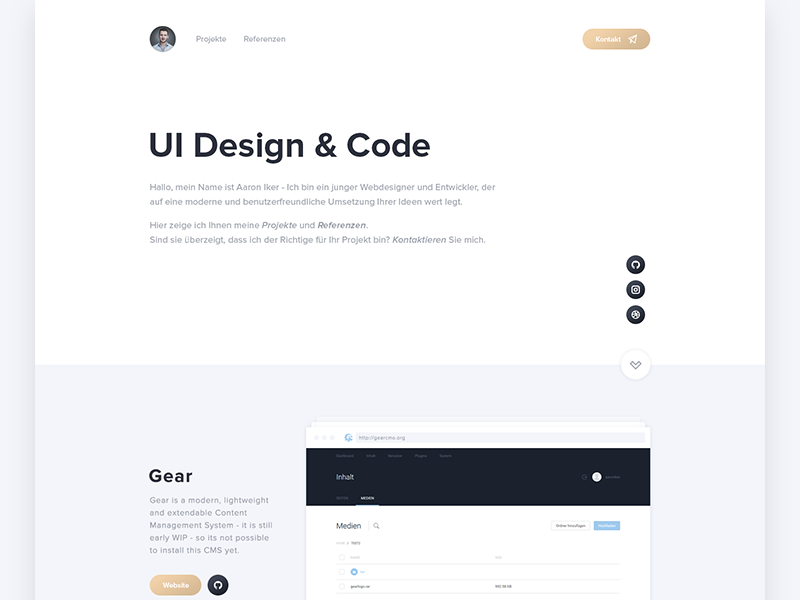
Here is pretty much what I have in mind (the project on the bottom).
Keep in mind that you’d need to make your projects section a bit wider though (at least 1000 pixels I’d say).
Also, I wouldn’t do this for every project, it’d draw for too long. I’d make a carousel instead - if you’re not using javascript it can be easily done with CSS animations - and have the projects keep sliding horizontally on auto-repeat.
1 Like
I like the idea, I will try to create it … really thanks I appreciate your reply ![]()
Sure thing! Good luck ![]()
1 Like