I know the design and layout is horrible but I just want to know what you guys think.
2 Likes
Forgot to add them. I’ll do that now
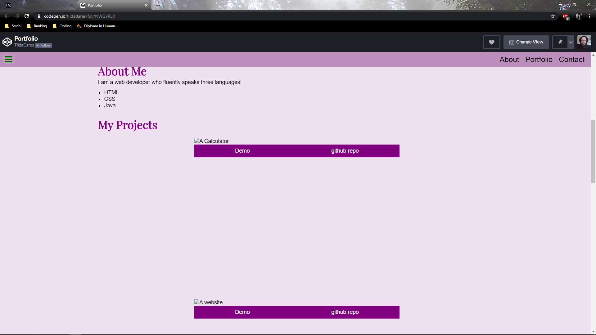
Good job on the design. Unfortunately, the images doesn’t load. Here’s a couple feedback:
- The nav bar can be spaced out a little bit and try to make it look appealing by changing its font family or font weight.
- You can try to put links to your social media or your github on the footer
- On the about me, you can try to make the font size bigger and try to change it to a font that is easier to read.
Thats all. Overall, the website looks nice, except for the images that didn’t load
Thank you I’ll fix that
i think that you’re on something you just have to think more on the design i mean how you think your portfolio should be maybe you didn’t heard about “website wireframing” just google it and good luck
1 Like
Just googled it. I think it’ll help with my non-existent design skills. Thank you
Looks good @TildaDares. Some things to revisit;
- Make links to your pages open in a new tab.
- Don’t use
<br>to force line breaks in your form. Use CSS- Did you intentionally leave off the submit button?
Hi Tilda. I think this is a great start! I actually like the nav bar the way it is. Once you get the images to load and change the links to open in new tabs, it’ll be great. The only other thing I would say is to maybe make your header image fixed? Would add some depth to the page. Otherwise, looks great! Keep up the good work. 
Hi Tilda, a good first effort to be sure.
The first thing that stands out to me is that I can’t read your name at the top of the page because it is directly over a busy background image. That is one of the most important pieces of content on the page so you definitely want it to stand out. To be honest, I’m not sure if there is a color that will work here since the background image is a mix of white and black. You might need to add an opaque background to the header so the you can get a better color contrast with the text.
1 Like
Yikes I’ll forgot to add a submit button. I’ll make changes.
I thought so too. Thank you
Thank you . I’ll work on them
I’m having trouble with adding the pictures on codepen so I’ll post the GitHub page here.
https://tildadares.github.io/portfolio/
All the pictures show here and I adjusted the colours.
The nav bar seems to get behind some elements on this one. You can fix this by changing the nav bar z-index to something high. ex:
nav {
  z-index: 500;
}
Thank you I’ll do that
@Mer7in
Hey mate,
I didnt know about website wireframing until i read your post!
Every day is a school day!
Thanks for sharing.
1 Like
it’s a pleasure man 
@TildaDares Good job on your portfolio! I looked it over and here is what I came up with that can help you improve your website in my opinion.
-
Move your portfolio to Netlify or Surge. Get a domain name like tildadares .com. Codepen has that border at the top that cannot be removed. It will look more professional.
-
The aboutme section could have a dark purple background while the text has a very light purple color to increase the contrast of the page and separate the sections better.
-
The portfolio images are too blurry due to the low resolution. Start out with a high resolution images and shrink the size of them on the tinypng website.
-
The links are not working. I was eager to see the calculator demo.
-
The text area needs font-family: inherit and a little padding.
-
The name text blends into the background too much. It is hard to read.

Thank you so much for the feedback
I’ll work on everything you said