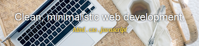
Hello and welcome! I would love to see what you guys have to say about my portfolio that I have been slaving away at for the past week or so. I just wasn’t satisfied at each deadline I set for myself and found myself squirreling away my time into this project. BUT, I’ve decided that enough is enough and I would love to hear some feedback. Link here: portfolio
Also, I had some issues with my work section where I could only stretch the div to contain everything if I made overflow auto. However this caused a scrollbar to appear, and I would rather it just be a solid div that matches its height to its contents with no scroll. Any thoughts?
This post might actually be my way of getting back into the project haha.
Ooh pretty, I love the colours you chose! I agree with the previous comment that a text-shadow should do wonders.
Also, I had some issues with my work section where I could only stretch the div to contain everything if I made overflow auto. However this caused a scrollbar to appear, and I would rather it just be a solid div that matches its height to its contents with no scroll. Any thoughts?
Hm, I’m not sure if I’m understanding you correctly, but I removed height: 500px; on the #work div which was causing the scroll bar and maybe your content getting cut off. Is this what you were wanting?
More comments:
Don’t forget to add in the meta tag that indicates that you website is responsive. (On CodePen you can do that by just clicking the “insert most common meta tag” button on the pen settings.)
Somehow Bootstrap is setting the font-size of your entire page to 10px. Accdg to their docs their default font-size is 14px so I’m not sure why this is happening but this should probably be looked into, because 10px is kind of hard to read.
You can condense some of your CSS by comma separating elements that have the same styles