I’ve just finished my portfolio and the only thing I can say for sure that it wasn’t easy at all but it was fun. A lot of false starts, re-thinking the design too much, spending a huge amount of precious time doing research… another day without opening VS Code… I guess I’ve learnt to not procrastinate that much and go for it. Once I had some sort of Figma design I was happy with then I started to enjoy (finally!). So here’s my tip for everyone that faces these great challenges, go for it and have fun! don’t overthink it that much, rock n roll!
Hello!
Your page is looking good and responsive! i just have one remark
The remark is when i’m seeing the page as a full page i cannot see the contact me button till i shrink the page, as well as your first words about yourself,it’s not showing as everyone may expect , i mean ,as a computer user,cannot see it all.But the mobile user would be very satisfied about your work!
Thanks! About being unable to see button and the text I´m not experiencing the issue, what browser are you using? I tried Chrome and Firefox and it works on both
i’m using opera that’s why. when you said that you’ve checked and it works in both Google Chrome and Firefox , all i can say now is keep up the good work and good luck for the rest of this curriculum!
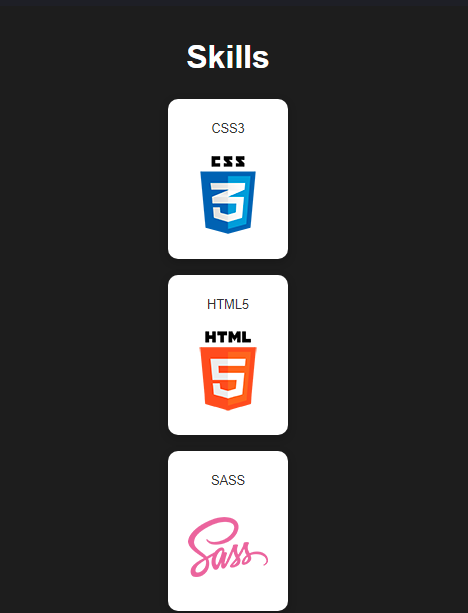
Which in my suggestion is wasting some space and it makes the skills section alot more longer to scroll through it would look better if there were at least 2 tiles in a row.
Everything else looks cool. Great Job!!
Oh thanks @mdshariq ! I think I switched to flex instead of keeping the grid i was using when i mas building the media queries, just to safe myself some more troubles. I’ll do some work on that section, you’re totally right, too much space and scrolling unneeded
Looks really good. I agree about the skills section needing to be two tiles wide on smaller screens. Other than that it looks really good. Keep up the great work. I also really liked the color scheme you used. Two of my favorite colors right there. So that was really awesome.
Mine ? Hey @dj2020 Welcome to forum you accidently replied to my post and complimented the author of the topic you can learn more about how to use forum from our friendly bot @discobot . And color scheme of MY portfolio page is not that great its just balck and white. I agree @eldave has a great color choice.
Awesome page!
I just remarked that your portfolio still uses the test bundle and produces a message on the user’s browser each time you access them, may be commenting them is a good idea
Hey thanks @juanalbglz ! Do you mean the fcc´s script? I think we are suppose to leave those as a prove we are passing the test. What sort of msg are you getting?


 its just balck and white. I agree