Hello,
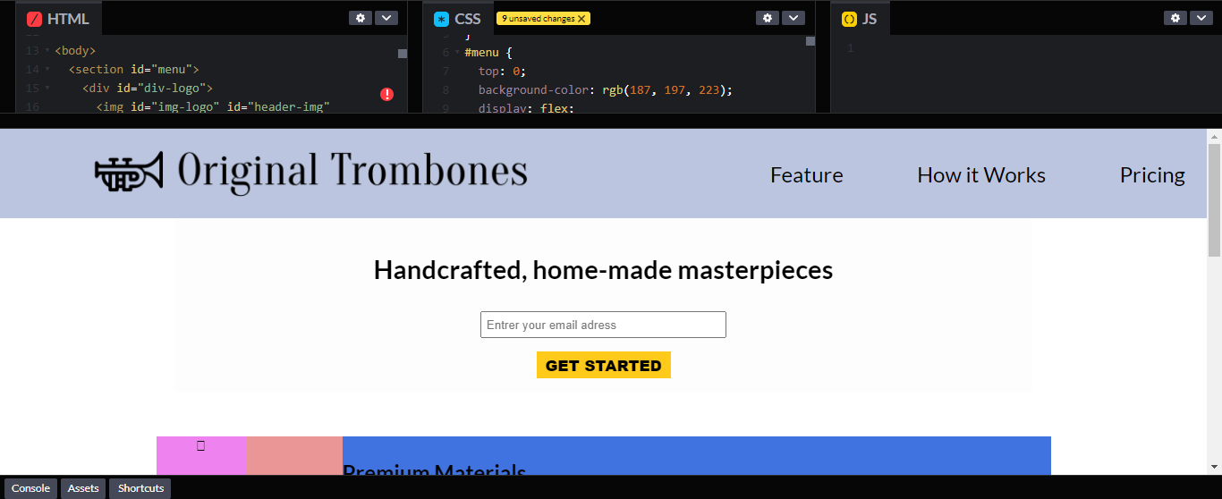
This is my top page a with grey menu:

I want a fixed menu, so I put in the id “menu” the position “fixed”. Problem: the page go up behind the menu:

I said myself… "I will put a margin top equal to the height of the menu to the id “hero” , but it’s the menu which go down:

I don’t understand why, what I have to do to fixe this problem and have a correct fixed menu?
This is my code:
<!DOCTYPE html>
<html lang="en">
  <head>
    <title>product a landing page</title>
    <meta charset="utf-8" />
    <link rel="preconnect" href="https://fonts.googleapis.com" />
    <link rel="preconnect" href="https://fonts.gstatic.com" crossorigin />
    <link
      href="https://fonts.googleapis.com/css2?family=Lato:ital,wght@0,300;0,400;0,700;1,300;1,400&display=swap"
      rel="stylesheet"
    />
    <script
      src="https://kit.fontawesome.com/4d720cea97.js"
      crossorigin="anonymous"
    ></script>
    <style>
      body {
        font-family: 'Lato', sans-serif;
        margin: 0px;
        padding: 0px;
      }
      #menu {
        background-color: rgb(187, 197, 223);
        display: flex;
        justify-content: flex-end;
        align-items: center;
        height: 100px;
        width: 100vw;
        position: fixed;
      }
      #div-logo {
        display: flex;
        justify-content: center;
        align-items: center;
        max-width: 800px;
      }
      #img-logo {
        width: 80%;
        height: auto;
        max-height: 75px;
      }
      #nav-bar {
        margin: 0 0 0 auto;
      }
      #ul-flex {
        display: flex;
        justify-content: space-around;

        width: 40vw;
      }
      .nav-link {
        list-style-type: none;
      }
      a {
        text-decoration: none;
        color: black;
        font-size: 1.5rem;
      }
      #hero {
        width: 70vw;
        background-color: rgb(253, 253, 253);
        margin: auto;
        text-align: center;
        margin-top: 100px;
      }
      h1 {
        margin: auto;
        padding-top: 39px;
        padding-bottom: 30px;
        font-size: 1.83rem;
      }
      #submit {
        width: 150px;
        height: 30px;
        margin: 15px 0px;
        border: none;
        background-color: rgba(255, 196, 0, 0.897);
        font-weight: 800;
        font-size: 1.05rem;
      }
      #email {
        width: 275px;
        height: 30px;
        padding: 0px 0px 0px 5px;
        box-sizing: border-box;
      }
      .feature {
        max-width: 1000px;
        background-color: rgb(235, 150, 150);
        margin: 50px auto;
        text-align: center;
      }
      #how {
        width: 70vw;
        background-color: rgb(253, 253, 253);
        margin: auto;
        text-align: center;
      }
      #grid {
        display: grid;
        grid-template-columns: 1fr 4fr;
        grid-template-rows: 1fr 1fr;
        grid-gap: 10px;
      }
      .iconp {
        width: 100px;
        height: 100px;
        background-color: violet;
        /* display: flex;
        justify-content: center;
        align-items: center; */
        /* font-size: 4rem; */
        grid-column: 1 / 2;
        grid-row: 1 / 2;
      }
      .iconf {
        width: 100%;
        height: 100px;
        background-color: rgb(173, 64, 224);
        grid-column: 1 / 2;
        grid-row: 2 / 3;
      }
      .iconq {
        width: 100%;
        height: 100px;
        background-color: rgb(173, 64, 224);
        grid-column: 1 / 2;
        grid-row: 3 / 4;
      }
      .dicribep {
        display: flex;
        flex-direction: column;
        justify-content: center;
        align-items: flex-start;
        width: 100%;
        height: 100px;
        background-color: rgb(64, 115, 224);
        grid-column: 2 / 3;
        grid-row: 1 / 2;
      }
      .dicribef {
        display: flex;
        flex-direction: column;
        justify-content: center;
        align-items: flex-start;
        width: 100%;
        height: 100px;
        background-color: rgb(64, 115, 224);
        grid-column: 2 / 3;
        grid-row: 2 / 3;
      }
      .dicribeq {
        display: flex;
        flex-direction: column;
        justify-content: center;
        align-items: flex-start;
        width: 100%;
        height: 100px;
        background-color: rgb(64, 115, 224);
        grid-column: 2 / 3;
        grid-row: 3 / 4;
      }
      h2 {
        margin: 0px;
      }
      p {
        margin: 0px;
        text-align: left;
      }
    </style>
  </head>
  <body>
    <section id="menu">
      <div id="div-logo">
        <img
          id="img-logo"
          id="header-img"
          src="https://cdn.freecodecamp.org/testable-projects-fcc/images/product-landing-page-logo.png"
          alt="original trombones logo"
        />
      </div>
      <nav id="nav-bar">
        <ul id="ul-flex">
          <li class="nav-link">
            <a href="#feature">Feature</a>
          </li>
          <li class="nav-link">
            <a href="#how">How it Works</a>
          </li>
          <li class="nav-link">
            <a href="#pricing">Pricing</a>
          </li>
        </ul>
      </nav>
    </section>
    <section id="hero">
      <h1>Handcrafted, home-made masterpieces</h1>
      <form id="form" action="https://www.freecodecamp.com/email-submit">
        <input
          id="email"
          type="email"
          name="your-email"
          placeholder="Entrer your email adress"
          required
        /><br />
        <input id="submit" type="submit" value="GET STARTED" class="btn" />
      </form>
    </section>
    <section class="feature">
      <div id="grid">
        <div class="iconp"><i class="fa-duotone fa-car"></i></div>
        <div class="dicribep">
          <h2>Premium Materials</h2>
          <p>
            Our trombones use the shiniest brass which is sourced locally. This
            will increase the longevity of your purchase.
          </p>
        </div>
        <div class="iconf"><i class="fa-duotone fa-car"></i></div>
        <div class="dicribef">
          <h2>Fast Shipping</h2>
          <p>
            We make sure you recieve your trombone as soon as we have finished
            making it. We also provide free returns if you are not satisfied.
          </p>
        </div>
        <div class="iconq"><i class="fa-duotone fa-car"></i></div>
        <div class="dicribeq">
          <h2>Quality Assurance</h2>
          <p>
            For every purchase you make, we will ensure there are no damages or
            faults and we will check and test the pitch of your instrument.
          </p>
        </div>
      </div>
    </section>
    <section id="how">
      <iframe
        width="560"
        height="315"
        src="https://www.youtube.com/embed/y8Yv4pnO7qc"
        title="YouTube video player"
        frameborder="0"
        allow="accelerometer; autoplay; clipboard-write; encrypted-media; gyroscope; picture-in-picture"
        allowfullscreen
      ></iframe>
    </section>
    <section class="feature"></section>
  </body>
</html>