Hello fellow coders, I’ve just completed my Survey Form challenge, and I’d love to hear some feedback from you.
Thank you
Hello fellow coders, I’ve just completed my Survey Form challenge, and I’d love to hear some feedback from you.
Thank you
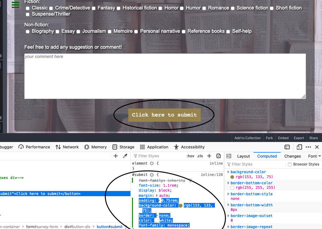
I think if you like you can design the button element like : color, size and more…
here is an exemple:
#submit  {
padding: 0.75rem;
background-color: rgb(153, 133, 75);
border: none;
color: white;
font-family: monospace;
}
Thank you, @abdulrahman.mhd.anas. I didn’t think about it because it looks good on my browser. Even so, it’s probably a good idea to explicitly stylizing it, for different browsers render that kind of element differently, so it will always look the same.
What do you guys think about overall design? Is it good or bad, and why?
Thank you
Your form looks good @Marco16168. Some things to revisit;
<br> element to force line breaks or spacing. That’s what CSS is for.Hi there @Marco16168.You did a nice job in your Bookstore Survey Form.Keep up the good work.
That’s weird, CodePen didn’t find any error…I guess the W3C validator is more reliable. Also, the attribute (size, for an input element of type=number, for the curious) was actually ‘working’, but I see the point and I’ve found a better solution.
Got it, thanks for pointing that out.
Done (nice this one) and done.
Well, thank you @Roma
@adaezebaby: Thank you, I appreciate it