this is my version of the Tribute Page project. I tried to keep it simple and clean. Front End and especially CSS as always been a struggle for me. I am more a backend kinda person . However, I am trying to overcome this weakness and master CSS, one step at a time.
Please leave some feedback if you a chance. Every insight is welcome.
You have a scroll setup to see the rest of the content but I think it might just be better to choose a smaller font size and get rid of the scroll all together. The scroll could work for phones but I don’t think it is necessary for a larger device like a laptop.
Hey @camillacab. Very good project! It’s very clean and minimalist! But, some suggestions:
Making the body text italics is a bad UX. Some people find italics text irritating. So, using it for body text (not header and titles) would not be good.
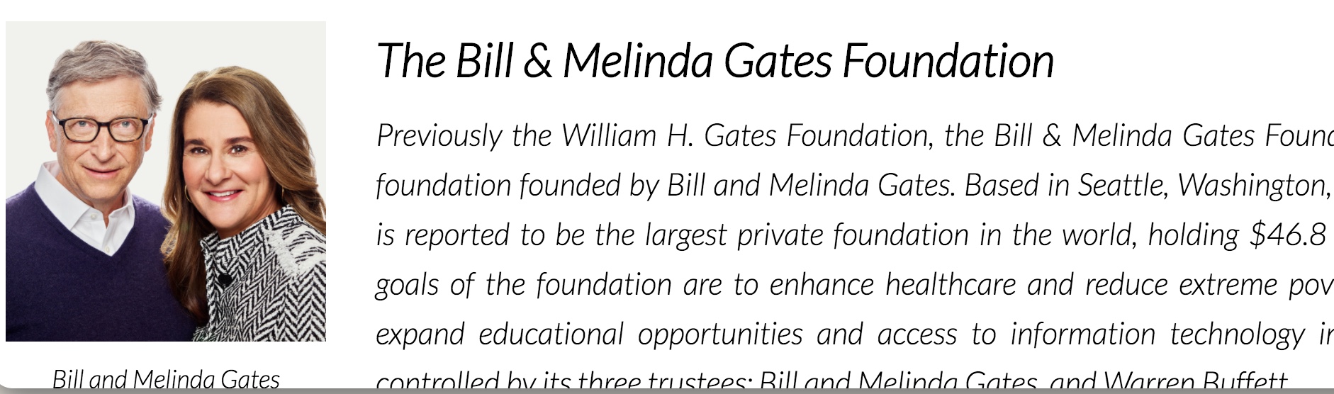
On smaller screens, the image is so small and is on the left side. If I was you, I would keep it on the top of the text so that it’s more viewable. Screenshot attached:
Anyway, you did a great work! Best of luck for next project.
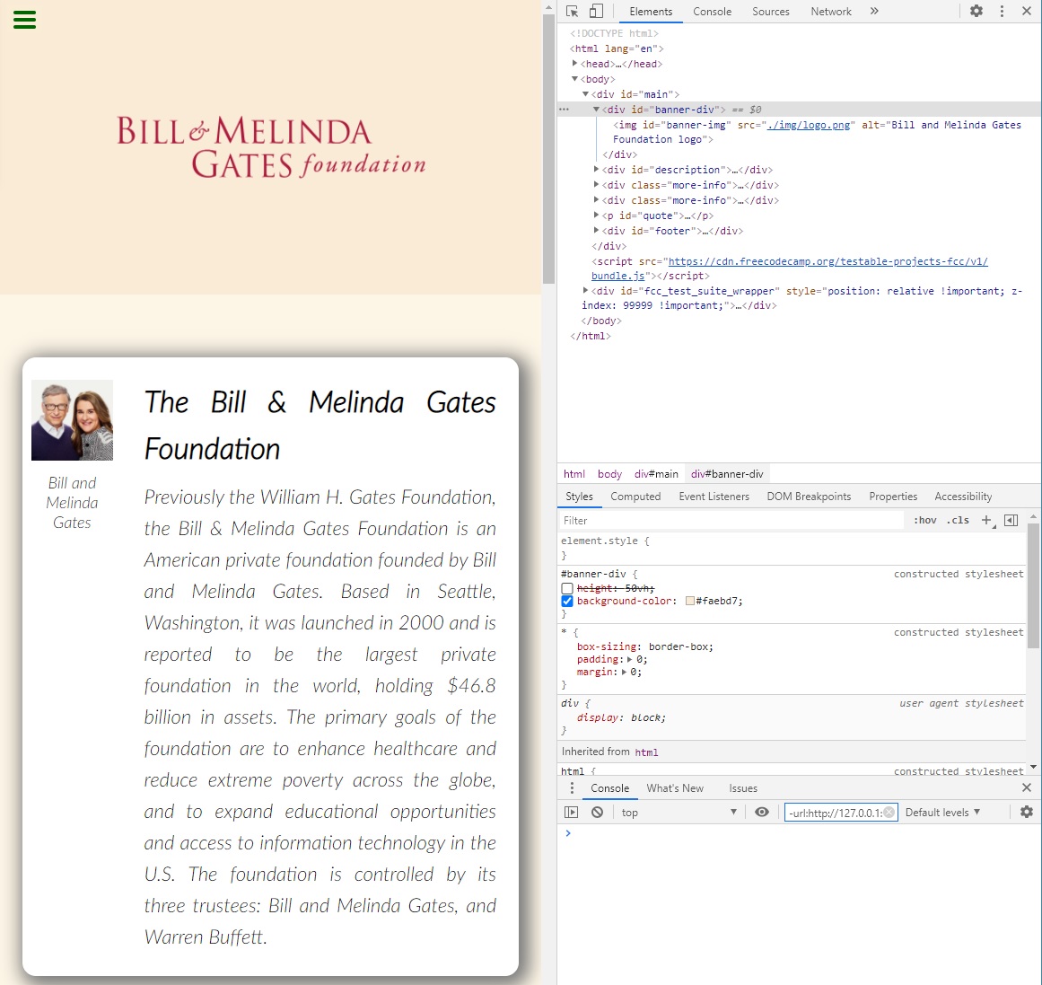
Thanks a lot for your feedback. I fixed the top banner, added media queries to moved the photo above the description, decreased padding and font size for smaller screens. Also changed the font from italic to regular.
Thanks again, guys. Your comments made my project much better, although still simple.
 . However, I am trying to overcome this weakness and master CSS, one step at a time.