Below is my codepen link. I made it somewhat mobile friendly too.
1 Like
Hi Cesar,
3 quick touch-ups:
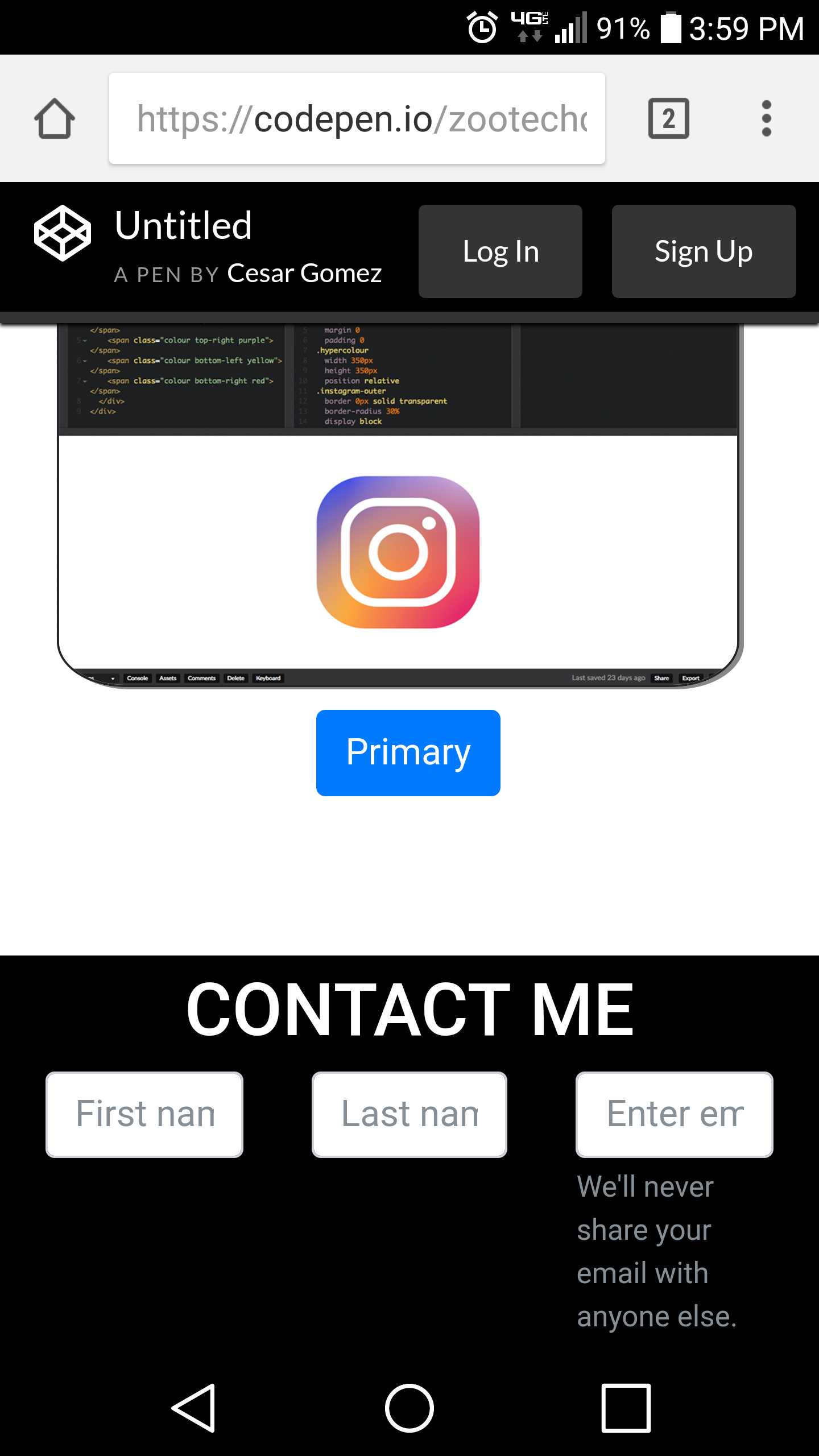
1.When viewed horizontal, profile picture, summary and first project thumbnail need to be seperated(by divs), they are all over lapping.

-
When viewed vertically, first thumbnail still overlap with profile summary.
-
Contact buttons texts is not fully visible when viewed vertically.

Lastly, I recommend linking actual project URL to project thumbnail when image is clicked. This can easily be done with an img tag inside anchor tag. I personally would get rid of the buttons.
Keep on building and happy coding!
Simon