Hello everyone!
I 'm going through Responsive Web Design course and I got stuck on the issue with my 3rd project -landing page.
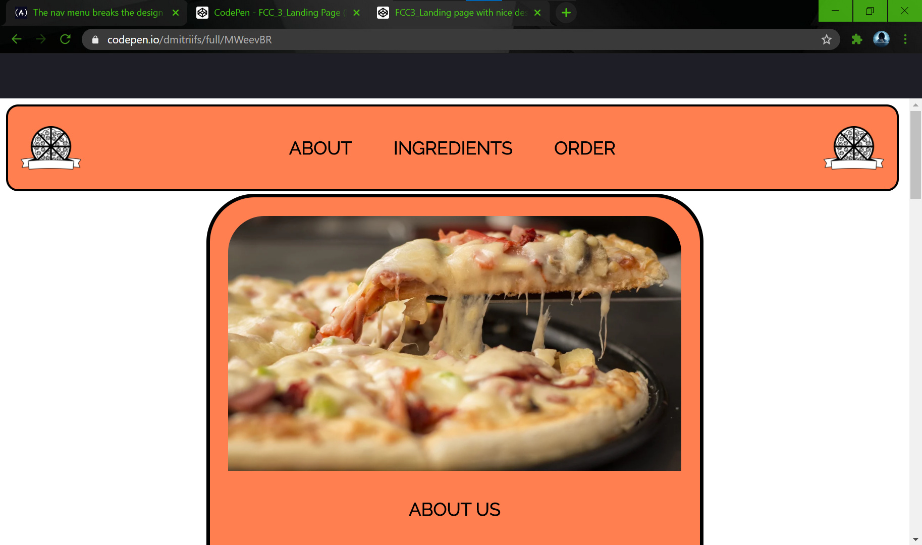
1.So here is the design of my page I’m ok with:
https://codepen.io/dmitriifs/full/yLJJzRO

- When I put my menu-links inside the
navelement, as it required, the design breaks:
>
            <a href="#about" class="nav-link">About</a>
            <a href="#ingredients" class="nav-link">Ingredients</a>
            <a href="#order" class="nav-link">Order</a>
            </nav>

However I tried to fix the issue with css, it didn’t look like I want(like in bullet №1).
#nav-bar>a{
display: flex;
flex-direction: row;
justify-content: space-between;
align-self: center;
So, the question №1 - why doesn’t flexbox work here?
- Then, in order to make navbar always be at the top of the viewport, I added “position: fixed;” to properties of the header and it made an injury to insult:

Why doesn’t css grid work here and design breaks?
Thank you in advance for your help!
In addition:
- The page with design I want but it doesn’t pass some tests:
https://codepen.io/dmitriifs/full/yLJJzRO
2.The page that passes all tests but with broken design: