Tell us what’s happening:
Ok i have been doing great so far, i have 9/10 on the test result with the " img element should responsively resize, relative to the width of its parent element, without exceeding its original size." one being wrong.
I checked the lessons back again because i knew i saw a lesson about responsive images in the responsive web principles, i used what have been taught there and still got an error, i dont know what to do, i even used ‘display:flex’ to try something else like ‘flex-shrink’ but still got the error, i even used media queries to shrink the Div (container) parent when the width of my browser goes small but even when i do that and the img shrinks too, i, still got the error… hope that i can get some help.
(P.D: Have not digged too much on design since the objectives are not accomplished and not a native english person, so, sorry if bad english there)
Your code so far
html:
Steve Jobs tribute
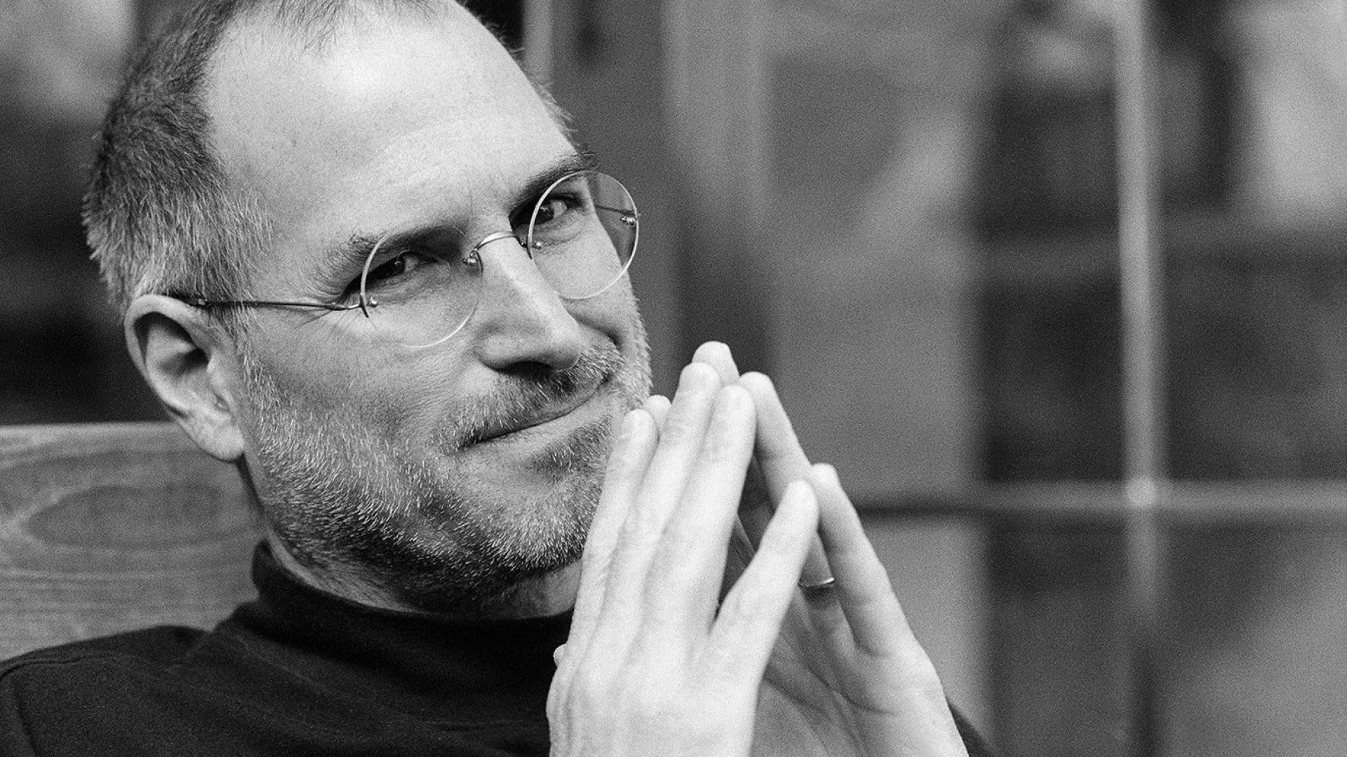
The old king of Apple, you may rest in peace Steve.
</div>
<br>
<div id="separador-linea">
</div>

<br>

<div id="tribute-info">
  <p> say something</p>
</div>
Visit this amazing Wikipedia link to learn more about or good boy Jobs
css:
#img-div {
width: 1150px;
height: 750px;
box-shadow: 0 10px 20px rgba(0,0,0,0.23);
margin: 50px 50px 50px 50px;
border-radius: 25%;
display: flex;
}
#image {
margin: 50px 0 0 0;
box-shadow: 0 10px 20px rgba(0,0,0,0.80);
align-self: center;
max-width: 100%;
height: auto;
border-radius: 25px;
flex: 0 2 1100px;
}
#img-caption {
text-align: center;
margin: 10px 0 0 0;
}
.color {
background-color: #dcdcdc;
}
#title {
box-shadow: 0 10px 20px rgba(0,0,0,0.20);
background-color: #A1A1A1;
border-radius: 25px;
text-align: center;
font-family: bold;
}
#tribute-info {
font-size: 18;
text-align: center;
}
#texto-final{
font-size: 14px;
font-color: black;
font-family: monospace;
margin-left: 100px;
}
Your browser information:
User Agent is: Mozilla/5.0 (Windows NT 6.1; rv:79.0) Gecko/20100101 Firefox/79.0.
Challenge: Build a Tribute Page
Link to the challenge: