Hi folks!
Here’s my Tribute Page to Kitty.
I’m a new camper so any feedback is apreciated.
Thanx!-)
Hi, @StarLord3000. This is cute 
Here are some points:
I find the gray background color of “A Tribute To” awkward. I’d remove the its bg-success class and let it have the same background color.

The buttons links at the bottom are too wide. Removing the btn-block classes will achieve this effect:

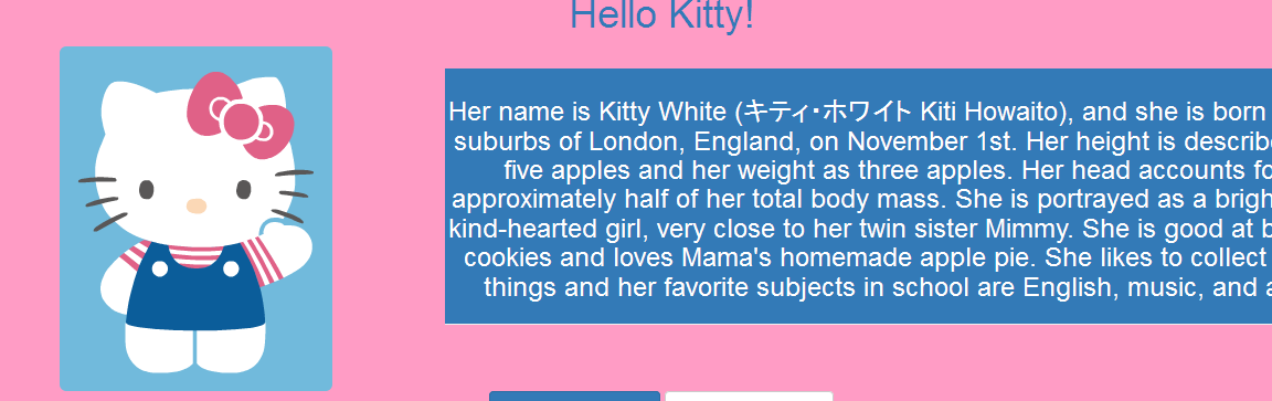
Try playing around with Bootstrap’s grid system. I placed the picture and the text in columns and looks like this:
<div class="row">
  <!-- You can change these numbers, as long as they don't exceed 12. Try playing around. -->
  <div class="col-sm-4">
    <!-- image -->
  </div>
  <div class="col-sm-8">
    <!-- text -->
  </div>
</div>
With that same code this is what it looks like on small sceens:

I also noticed that you used <h3> for your text. The <h*> tags are meant to be used as headings (like article titles, etc.). Use <p> instead. Yes the text is small, but can give it the lead class to enlarge the text (or give it your own CSS).
Hi, Kev!
Thanx for the cute  !
!
Yes, you’re right on all points. It’d look much tidier and more minimal like it was meant to be. I will make those changes.
Thanx 4 for taking the time 2 review my pen, very much appreciated!!!
It’s much better now that changes are made, but now there is white space bellow “Chewie” link, when full page. Any suggestions?
You can add this in the CSS
body {
  background-color: #ff9cc5; /* still the same pink color */
}
I noticed that you used inline styles to make the <div> pink. It’s not really a good idea to use inline styles; use the HTML to structure your content and the CSS to style it.
And since the <body> is now pink, you can safely remove the <div>'s background color (they are transparent by default).
Ah, yeah… CSS. Thanx, budd!