Hello,
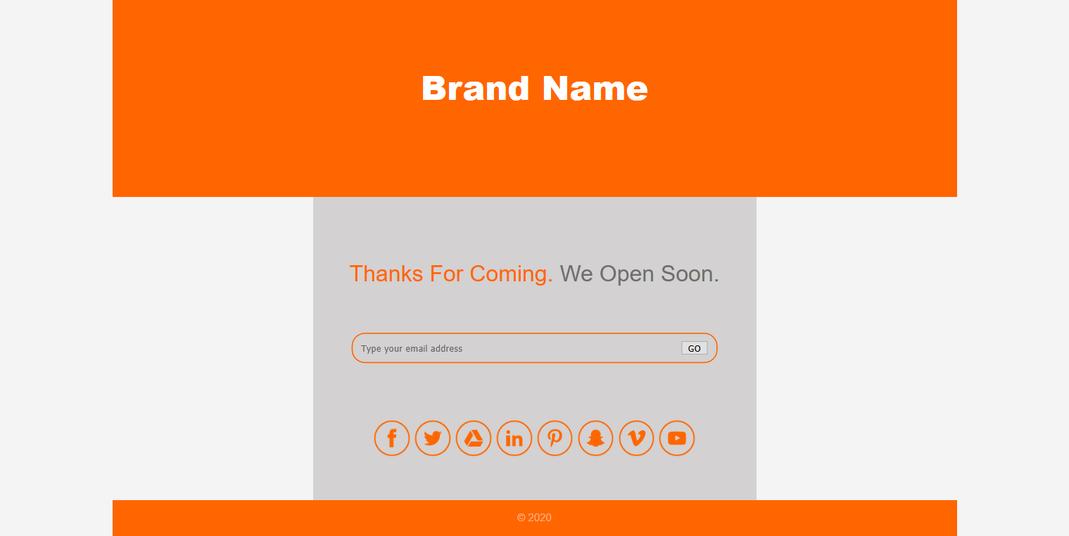
I’m creating single column coming soon page without using flex or grid . And no background image either.
The project is not completed but while I was searching for the ways to make this responsive (having hard times with the form) I noticed that there is white space below footer.
It shows only when I use firefox or chrome in responsive mode - it shows only when I choose devices but not when minimize or maximize the window.
Could anyone please help me to understand the cause of this issue and provide me with solution.
Thanks.
HTML
<!DOCTYPE html>
<html lang="en">
<head>
<meta charset="utf-8">
<title>Humble Coming Soon Page</title>
<link rel="stylesheet" href="css/main.css" type="text/css">
</head>
<body>
<div class="main-container">
<header>
<h1>Brand Name</h1>
</header>
<main>
<div class="container">
<div class="welcome">
<h2>Thanks For Coming. <span class="style-text">We Open Soon.</span></h2>
</div>
<div class="newsletter">
<form class="signup">
<input type="email" placeholder="Type your email address">
<button type="submit">GO</button>
</form>
</div>
<div class="social">
<ul>
<li><a href="https://www.facebook.com"><img src="./assets/facebook.png" alt="facebook logo"></a></li>
<li><a href="https://www.twitter.com"><img src="./assets/twitter.png" alt="twitter logo"></a></li>
<li><a href="https://www.google.com"><img src="./assets/google-drive.png" alt="google drive logo"></a></li>
<li><a href="https://www.linkedin.com"><img src="./assets/linkedin.png" alt="linkedin logo"></a></li>
<li><a href="https://www.pinterest.com"><img src="./assets/pinterest.png" alt="pinterest logo"></a></li>
<li><a href="https://www.snapchat.com"><img src="./assets/snapchat.png" alt="snapchat logo"></a></li>
<li><a href="https://www.vimeo.com"><img src="./assets/vimeo.png" alt="vimeo logo"></a></li>
<li><a href="https://www.youtube.com"><img src="./assets/youtube.png" alt="twitter logo"></a></li>
</ul>
</div>
</div>
</main>
<footer>
<p>© 2020</p>
</footer>
</div>
</body>
</html>
CSS
/**** General ****/
body {
margin: 0;
padding: 0;
font-family: Arial, Helvetica, sans-serif;
font-size: 15px;
line-height: 1.5;
background-color: #f4f4f4;
box-sizing: border-box;
}
html, body {
min-height: 100vh;
}
.main-container {
max-width: 1200px;
margin: 0 auto;
text-align: center;
height: 100vh;
}
.container {
max-width: 600px;
margin: 0 auto;
padding: 1em;
background-color: rgb(211, 209, 209);
}
h1, h2, p, ul {
margin: 0;
padding: 0;
}
/**** Header ****/
header {
background-color: #FF6600;
color: #FFFFFF;
}
header h1 {
min-height: 100px;
padding: 90px 0;
font-size: 3rem;
font-weight: 900;
}
/****** Main *****/
/****** welcome *****/
.welcome {
padding: 70px 0px 20px 0;
}
.welcome h2 {
font-size: 2rem;
font-weight: 500;
color: #FF6600;
}
.style-text {
color: #2b2b2b;
opacity: 60%;
}
/****** newsletter ******/
.newsletter {
padding: 40px 0px;
}
.signup {
border: 2px solid #FF6600;
border-radius: 19px;
margin: 0 40px;
}
.signup input[type="email"] {
border: none;
background: none;
width: 250px;
height: 40px;
padding: 0 200px 0 0;
}
/****** Social ******/
.social {
padding: 40px 0px;
}
.social li {
display: inline;
}
.social img {
width: 3.5vw;
}
/****** Footer ******/
footer {
background-color: #FF6600;
color: #FFFFFF;
min-height: 50px;
}
footer p{
padding: 14px 0px;
opacity: 50%;
}