Sorry for jumping in, but I thought I would mention that your margin doesn’t necessarily have to be in pixels either - it can be a vw unit. “vw” stands for viewport width and the number you put before it is calculated as a percentage of the width of the client’s viewport.
Example:
margin-right: 10vw;
That would give an element a right-margin of 10% of the viewport’s width.
Using these units helps make webpages more responsive.
I meant it as a general idea, but in this case I meant the image. Particularly .about-img. I don’t see a selector for it in your css so I think you’ll have to create it.
That being said, I looked through your code on your last codepen link and it’s quite a mess. It seems like you may have copied and pasted it from somewhere? There are a lot of redundant styles and in general it’s not arranged and sorted. It’s almost impossible to work with at its current state. It’s nothing to worry about though. I would delete most of it and start again - just deal with the image, text and background for now and then, when that is nicely done move on to the next section.
Please let me know if you’re having any difficulty along the way!
I have simplified and removed your code here and created something like a template for you to work with. Sorry - I couldn’t find the same techno background image - feel free to replace the url.
My template solves your margin issue using flexbox instead. There are no margins used, and on regular rectangular screen the design will shape responsively:
How does this work? Please bear with the short explanation below:
I have put the text and image inside a flex container, which is basically just a div with flexbox styling applied. The align-items: center; centers the elements vertically, while the justify-content: space-evenly; makes sure the elements have even space around them horizontally. The width and height of the flex container is equal to the width and height of the client’s screen.
The div containing the image is 30% of the screen in width, and the height I set in 4:3 ratio since there was a weird bit of empty space on the bottom of the picture that I needed to cut off. The hidden overflow ensures anything spilling out of the container’s dimensions is not visible. And I added the box shadow to implement that blue rectangle in the background in the original design.
The text container is also 30% of the screen’s width. As for the actual text styling, I have created separate selectors for them as visible in the updated fiddle below.
.about-us-text {
  width: 30vw;
}
Feel free to mess around with the sizing and just know that this is only a template, something to help you figure out the layout, but not a complete solution in itself.
Let me know if there something in my code you don’t understand!
@nickrg thank you for the input, it nearly made my page almost the same like my design but the image is sticking too close to the image on the left. Also I combined some aspects of your code with another suggestion on stack overflow and it seems to temporarily work but it’s back to its previous error when I tried modifying it
I’m glad it’s getting closer to your design. I looked through your latest fiddle and I must say that it’s quite difficult for me to find the solution very quickly. There’s a lot of code and I’m not exactly sure what is what.
A lot of the styling is unnecessary, unless it’s part of a bigger page that you didn’t post. I highly recommend cleaning up the styling and HTML down to bare necessities and then, with neatly sorted classes and containers, apply flexbox and other css techniques to complete the result. Working with the page as it is is going to be very difficult.
Refer to my fiddle above for the simple version. Really, it’s the best template I can do for you. If you want to tweak somethings from it and don’t know how, feel free to let me know and I’d be more than happy to explain how to do it. But I really can’t quite figure out this latest fiddle - my deepest apologies. I hope you’ll understand.
As for why the image doesn’t have space on the left, it looks like you’re not even applying styling to it.
There’s no styling that I could see in your CSS for .about-us-image or .about-image. Also, the img tag doesn’t need a closing tag.
If you’re struggling with CSS I highly recommend taking a little time to learn it a bit better. It really won’t take a lot of time to get to a level good enough to build pages like this. Do a few fCC project tutorials like the Cafe Menu, Rothko Painting and the Photo Gallery - all found in the Responsive Web Design course. They’re quick, fun and you’ll learn effortlessly.
I had a bit of a hard time figuring out Flexbox, and this resource really helped: https://flexboxfroggy.com . After I finished all the levels it finally clicked with me. Feel free to play iy a few times too. Mastering responsive layout is no easy feat.
Hope that helps and let me know if you have any questions!
i just implemented what you just told me in your previous post and made some slight modifications to the class and it has worked! muchos Gracias. Thank you very much. would it be okay. below is what it looks like now
i want your take, because it is now the same, do you think there’s more that can be done to make it even more identical? if you look at my original design below, what else can be improved?
Can i ask you for further programming help if i’m stuck on a problem? i am trying to make my own website for a retirement and investment page, would you be willing to be go to person to help me solve my programming issues? thank you once again
Well done! It certainly looks great. Of course, you could keep adding things to make it look even more like the original, but what matters is that the basics are there.
Below is the original picture you posted as a template you wanted to build. You can compare the differences and see what you nee to add if you like. Personally, I would do the following:
Enlarge the “Who We Are” font.
Add the “The Road To Financial Freedom” text.
Add the button.
This is best accomplished by putting all of the texts and buttons in a container next to the image, specifying its height and width in terms of vh and vw and then implementing vertical flexbox to sort the texts neatly into their places. Let me know if that made sense to you.
One really good trick when dealing with layouts is to add a border to all of your elements so you can see all of your containers. Add this to the top of your CSS:
* {
  border: 1px solid red !important;
}
This forces a border on all of your elements, making seeing and working with them much easier. Of course you remove this when you’re finished.
Gladly. If I can, I would love to. However, I would highly recommend learning HTML and CSS as much as you can on your own - it’s not terribly difficult and fCC’s Responsive Web Design course is perfect for this. Also, keep in mind that here on the forum, we can’t code for you, but we can give suggestions and help you fix problems if you’re stuck.
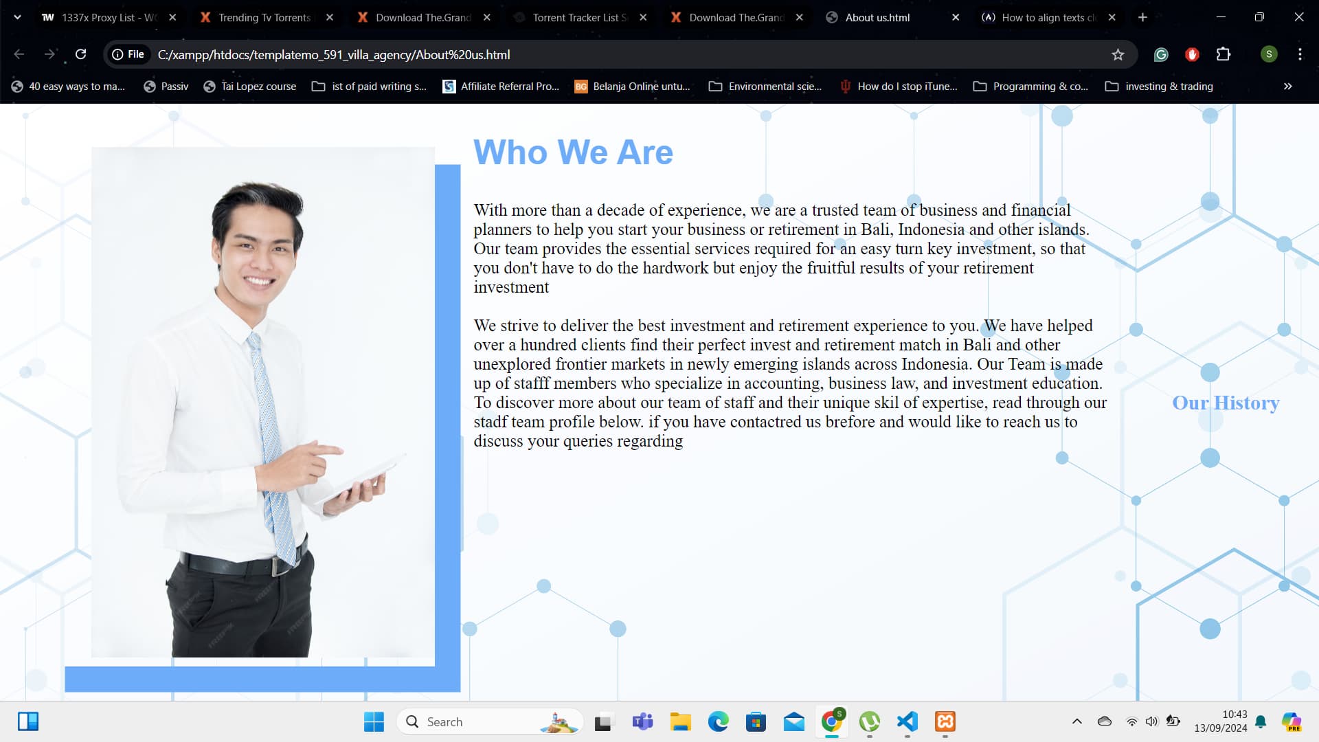
thank you for the advice nick. can i ask you , how do i properly add another content vertically beneath the two containers, about-us-image and about-us-text? i have already incase these two containers and an additional container; .about-history under the parent div, .about-content and i have made it flex with the flex direction set to columm so that the heading that says.’ 'our history would appear beneath the main image and the text next to it but it has appeared on the right side of the text even though i have specified it to appear beneath the image and text, how do i i fix this? below is the image.
i want our history to be beneath the the image and the text next to it, how do i do this? do i need to specify height and width? may be you can look at my codes and see what’s wrong? https://jsfiddle.net/schmueller23/hfxgwpvm/11/
You would like that second paragraph of text to appear below the entire .about-container, right?
First of all, you need to clean up your code. Take a look at your HTML in the fiddle. A lot of it is highlighted in red. This means there are errors. Please clean up the syntax until nothing highlighted in red is remaining.
If you’re not able to figure out what needs to be corrected in your HTML, please let me know - I can help you.
Once your code is error free, it’s time to tidy it. Press the “Tidy the Code” button in the upper left corner of the HTML editor frame and watch your HTML transform into a neat, clean and sorted list of elements.
Really, @Schmueller23, it is absolutely necessary to remove errors and tidy up the code before we move on. Otherwise I cannot even experiment with your code to find solutions.
That being said, the solution does not lie in setting the flex-direction to column, I think, nor will simply adding a certain width and height do the trick. What we’ll do is place the content in the correct containers, only applying flexbox to the ones that need it.
But I cannot know for certain until the code is de-errored and tidied up so that I can test my solution out.
I hope you understand, @Schmueller23! Thank you for your patience.


