Hello,
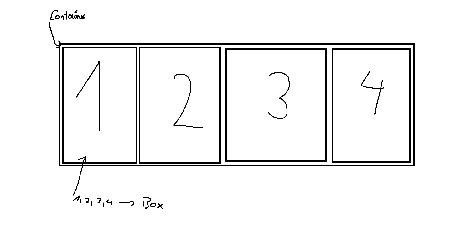
My goal is to creat a container in which are 4 boxes with a certain width and height.
Of course it needs to be responsive but i do not want that the boxes 1,2,3,4 do underline when scaling down.
What i have thought is that i make the boxes “sticky” so they stay in line and make the container-fluid?
I am trying but i kinda fail in the moment.
You can use bootstrap use the class row in the container and then style your boxes with col-md-3 i don’t know if you want something like this. Otherwise you can use flexbox. I don’t know if this is helpful for you, but this is what i can contribute. Good luck
I made a example in this link: https://github.com/Dozom/flexExamples NOTE: Im not a professional.
Thank you for your answers!
For the moment i solved it with boxes i made in photoshop and then using fload-img.
It is not perfect but i will update it soon with a box solution.