Bootstrap grid system not working (portfolio)?

http://codepen.io/tobymeyrick/pen/dOZorX?editors=1000
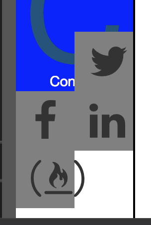
I’ve been working on my portfolio and I have a social media grid at the bottom of my side navigation bar. I want all of the links to be perfectly lined up so I thought it would be a good idea to use the bootstrap grid system.

However, I ran into some problems, for whatever reason, the div’s are all over the place. Please take a look at the code and see if there is anything that can be done??

<div id="socialmedia" class="container"> <!--Section for social media links-->
  <div class="row"> <!--Bootstrap grid system-->
      <div id="facebook" class="col-xs-6">
        <i class="fa fa-facebook"></i>
      </div>
      <div id="twitter" class="col-xs-6">
        <i class="fa fa-twitter"></i>
      </div>
  </div> <!--End of row-->
  <div class="row">
    <div id="fcc" class="col-xs-6">
      <i class="fa fa-free-code-camp" aria-hidden="true"></i>
    </div>
    <div id="linkedin" class="col-xs-6">
    <i class="fa fa-linkedin"></i>
    </div>
  </div>
</div>

Any help would be appreciated!!
http://codepen.io/tobymeyrick/pen/dOZorX?editors=1000

I recommend re-looking at how best to use a grid system and then looking again at your site structure.

Right now you have bootstrap grid mixed in with fixed with columns, containers and rows kind of mixed throughout.

Break down your layout with a grid in mind from the get go - don’t try to bolt it on after the fact. It’s not going to work out so well.

For starters, are you designing this site with mobile in mind? If so, begin there. How do you want the content to layout on extra small* and small devices. As the device gets wider, how do you want layout to change to better make use of the space?

Should your sidebar be a top container at small sizes? Only to be a sidebar when viewports are “medium” or larger? Should it be on the bottom, below the content?

The grid system is very flexible and intuitive once you learn the basics of it.

Start from an idea/design then build. Trying to build HTML and style things in a hodge podge is going to make life very difficult - for you and anyone that is trying to help you. Begin with paper and pencil and start drawing out shapes. Consider what you want to go in them and what other structure you might need to achieve that.

A quick example of a one container, one “row”, two column design. At small sizes, the columns will stack one on top of another. At medium and up, one column will be 3 columns wide (25%) and one will be 9 (75%) width.

<div class="container-fluid">
	<div class="row">
			
		<!-- A CONTAINER WHICH IS FULL WIDTH IN XS/SMALL SIZES AND 3 COLUMNS (25%) IN MD AND UP -->
		<div class="col-xs-12 col-md-3">
		</div>
		
		<!-- A CONTAINER WHICH IS FULL WIDTH IN XS/SMALL SIZES AND 9 COLUMNS (75%) IN MD AND UP -->
		<div class="col-xs-12 col-md-9">
		</div>
		
	</div>
</div>

*When I refer to sizes like extra small, small, medium, etc. I’m thinking with the Bootstrap defined viewport media query breakpoints.

Anyway, I hope that helps!

~Micheal

Thank you, yes I probably should’ve done more planning, I’ve gotten myself in a mess by randomly coding a layout and not really understanding what I’m doing.

I’ve decided to start with a simpler layout that will have a navigation bar at the top of the screen which will have three buttons side by side that will take you to different parts of the page.

I have a few questions:
Would I need to use anything that I haven’t learnt so far on fcc to make it so that whichever part of the page you’re currently on is highlighted/active?
Would I need to use position: fixed to make it so the navbar is fixed or is there a bootstrap alternative?

Hi Tobias,

Bootstrap offers a navigation component.

But, I do recommend playing with making your own first - keeping it simple. Perhaps a <div class="container-fluid"></div> so that it fills the width of the page. Then a <ul></ul> with <a> elements which are laid out horizontally. for your clickable navigation controls.

After you play with that for a while, you could study the Bootstrap navigation bar implementation. It may be a bit advance as of yet.

I would recommend playing with columns in a very simple layout - no content in them to start. Just give each a different background-color and begin playing with column widths. Then resize your browser from very small to very large to see how the grid responds.

This will start to give you an idea of how the grid works.

You could also look into website which offer wireframe tools. This is used to help you sketch out a site structure visually. I’ve never used one, but I am curious about them. I usually use pencil and paper. :slight_smile:

If you haven’t already, you might read up on some of the layout principles behind grid based designs. It’s been used in print media for decades and has proven itself very, very useful.

Regarding navbar - I am just finishing a site I built with Bootstrap 4 and I used their navbar. I used position: fixed; to anchor it to the top of the page.

Regards,
Micheal

Thank You, I’ve planned out what I think is a stylish yet very accomplishable page. I’ll let you know when I’m done!

1 Like