Tell us what’s happening:
Describe your issue in detail here.
Your code so far
<link href="https://fonts.googleapis.com/css?family=Lobster" rel="stylesheet" type="text/css">
<style>
.red-text {
color: red;
}
h2 {
font-family: Lobster, Monospace;
}
p {
font-size: 16px;
font-family: Monospace;
}
.thick-green-border {
border-color: green;
border-width: 10px;
border-style: solid;
border-radius: 50%;
}
.smaller-image {
width: 100px;
}
.img-responsive{
width:100px;
}
</style>
<div class="container-fluid">
<h2 class="red-text">CatPhotoApp</h2>
<p>Click here for <a href="#">cat photos</a>.</p>
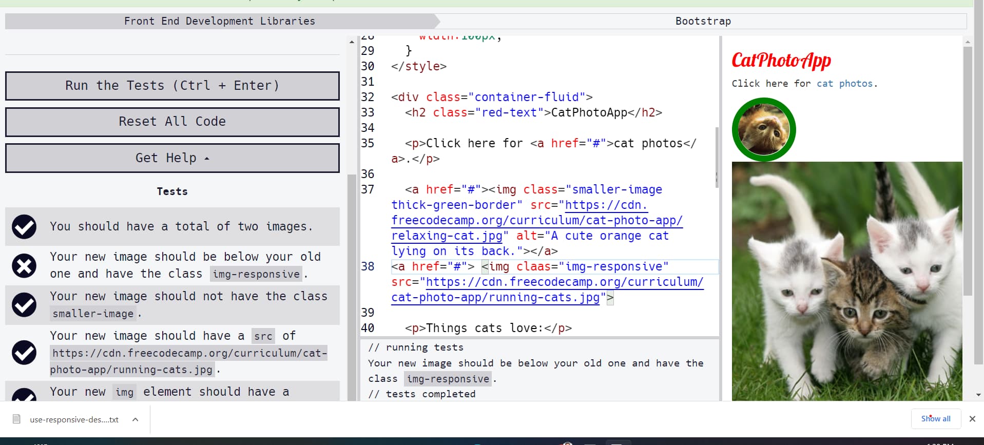
<a href="#"><img class="smaller-image thick-green-border" src="https://cdn.freecodecamp.org/curriculum/cat-photo-app/relaxing-cat.jpg" alt="A cute orange cat lying on its back."></a>
<img claas="img-responsive" src="https://cdn.freecodecamp.org/curriculum/cat-photo-app/running-cats.jpg">
<p>Things cats love:</p>
<ul>
<li>cat nip</li>
<li>laser pointers</li>
<li>lasagna</li>
</ul>
<p>Top 3 things cats hate:</p>
<ol>
<li>flea treatment</li>
<li>thunder</li>
<li>other cats</li>
</ol>
<form action="https://freecatphotoapp.com/submit-cat-photo">
<label><input type="radio" name="indoor-outdoor"> Indoor</label>
<label><input type="radio" name="indoor-outdoor"> Outdoor</label>
<label><input type="checkbox" name="personality"> Loving</label>
<label><input type="checkbox" name="personality"> Lazy</label>
<label><input type="checkbox" name="personality"> Crazy</label>
<input type="text" placeholder="cat photo URL" required>
<button type="submit">Submit</button>
</form>
</div>
Your browser information:
User Agent is: Mozilla/5.0 (Windows NT 10.0; Win64; x64) AppleWebKit/537.36 (KHTML, like Gecko) Chrome/107.0.0.0 Safari/537.36
Challenge: Bootstrap - Make Images Mobile Responsive
Link to the challenge: