If it turns blue then I’ve probably made a wrong assumptions! It may just be as simple as the grid is somehow expanding more than its container with the beige background.  I’ll try it on my tablets and phones when I get a chance and get back to you!
EDIT: @JohnBackUp—I think I have found what the issue is (I was indeed making weird assumptions).
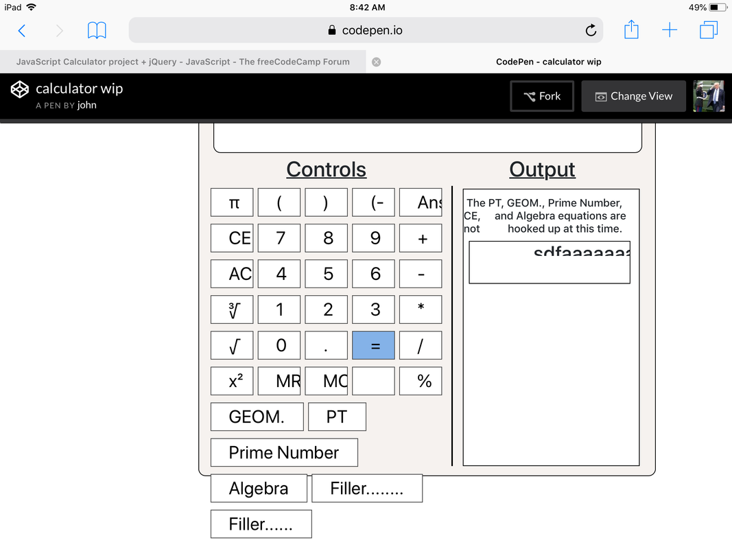
It looks like multiple layout problems is causing this and the reason that some of the buttons are pushed outside the calculate area is most likely because the calculator has a fixed height and width, and a combination of factors such as fixed margin/padding around elements, difference in default font size, difference in viewport sizes… etc.
To begin with, there are issues with how you defined the grid:
.grid {
  display: grid;
  display-template-columns: 200px 1fr 200px;
  grid-template-areas: ". cal .";
}
display-template-columns isn’t a CSS property and you probably meant to type grid-template-columns. If you want things to be responsive, then I think it’s better to do this instead (not tested):
.grid {
  min-height: 100vh;
  display: grid;
  grid-template-columns: 1fr max-content 1fr;
  grid-template-rows: 1fr max-content 1fr;
  grid-template-areas:
    ". . ."
    ". cal ." /* Calculator in the middle */
    "c c c " /* Copyright notice */
}
Then remove all margins around the calculator and add grid-area: cal to its CSS and the calculator, and add grid-area: c; to .copyrite, and you should get a somewhat responsive version of the layout that (I think) you want.
So that button text doesn’t get pushed to the right on mobile devices with smaller viewports, you should also add padding: 0 to the .num class. As for the buttons that get pushed outside of the calculator area, you could either make the calculator’s width responsive and adjusts its with according to the button rows; get rid of some text so that they’re about the same as the other rows; use CSS grid on the rows, apply 100% width the buttons and use grid-gap to space them out; use flex box magic, maybe a combination of flex-grow and flex-basis (sowieee, this is a bit hand-wavey). So… bottom line, there are options!
I personally would make the calculate area responsive, too, because it would not fit on devices with a viewport size of something like the iPhone 5, but this is more for future reference—if you plan to make things work on mobile devices, a mobile-first approach will save you a lot of time spent on (effectively) redesigning the whole thing.
I hope that helps!
