I am going to try to start making the attached page responsive (first time doing this), however I am a bit confused by some things which are probably very obvious to more experienced people (!).
When I try to resize the window as it is, it is restricted by the width of the card (meaning, I can’t make it any smaller than that). However, when i try to do the same in the VS console (in the ‘responsiveness’ window), the window simply gets smaller (with less of the content visible/content ‘cut off’).
My questions are:
Why can I not make the page smaller when not in the console view?
When in the VS code view and as I have used rems and %ages in the CSS, should it not already be responsive to some degree? I.e. should I not be able to see some of the content getting smaller as I reduce the window size, instead of the content just disappearing?
I don’t really understand your question about resizing the page.
rem is not a fluid unit, it is a relative unit. It is relative to the root font size (just as em is relative to the parent(s) font size).
% is a fluid unit, but its computed value depends on its context. A style can be a percentage of something else. For example, a child element width can be a percentage of its parent. However, the outer context must supply values the child can compute the percentage from. The width is usually computed as expected, height and other values not so much. For example, setting the font size to 50% and having it computing to 8px is a matter of knowing the base font size is 16px. That is also why we sometimes use viewport units instead of percentages because we always have access to the viewport size, and it is always relative to some known value.
What I mean about resizing the page is, if I drag the window to make it smaller, the text does not get pushed into a smaller space for example, it just disappears out of view…
I have watched tutorials where the page was created using rem and percentages, then they moved onto applying media queries. But when setting up the media queries, the page windows were resized to see how the page looks in the smaller windows and the appearance is then used to judge which media query to apply (in the examples I saw, the content just got pushed into the smaller space, but you could still see everything).
In my case, the elements are not being pushed into the smaller space - if I resize the window, I can just see less of the card…
I am obviously missing something basic in my understanding of this I think, I just need to find out what that is if anyone would know…
Hope this make some sense.
Some snips below, if that helps…:
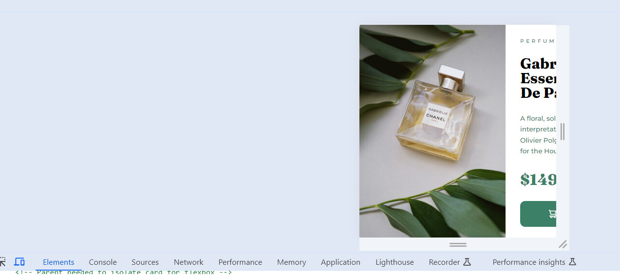
In the ‘elements’ view in the console (it is probably not called that, but hopefully you know what I mean): So in this view, I cannot make the window smaller, but I think that is correct as this is not the view I use to try to make the page responsive?
In the ‘toggle’/responsiveness view (don’t know the correct name again). So, as I have made the window smaller, the content just gets cut off, instead of the image getting smaller say and the text moving closer together, but with the entire card visible…
Please update your Codepen with the exact same code you have locally. Replace the image with something else, like an image from Unsplash (you can use the “Assets” button at the bottom left on Codepen to get images).
It doesn’t really matter if you make the browser window smaller, open the dev tools and drag the divider (with the dev tools placed to the right/left), or use the device mode. The views work the same, to some extent. The device mode adds a bit of extra stuff (like DPI and zoom) but it doesn’t radically change anything. It does do some zooming with overflows, but it is a little random how it works, and the behavior is different between browsers (e.g. Firefox vs Chrome).
If the page is responsive, it should work no matter how you test it. If your elements are getting cut off (overflow the viewport) they are not scaling down.
So I’m trying to figure out what I need to do to make this card responsive.
Not entirely responsive yet (as in, not font sizes etc. which I know needs to be done with media queries etc). I just want the card to shrink as I make the window smaller.
I thought that by applying a max-width property to the card-container, it would shrink as I make the window smaller as I had understood that the max-width property enables to child to respond according to the parent.
I thought this meant that when the width is reduced below max-width, the container should also respond, its max-width then mirroring the parent width below max-width values?