<style>
  .d1{background:LightSkyBlue;}
  .d2{background:LightSalmon;}
  .d3{background:PaleTurquoise;}
  .d4{background:LightPink;}
  .d5{background:PaleGreen;}

  .container {
    font-size: 40px;
    min-height: 300px;
    width: 100%;
    background: LightGray;
    display: grid;

    /*HERE*/
    grid-template-rows: 50px 50px;
  }
</style>

<div class="container">
  <div class="d1">1</div>
  <div class="d2">2</div>
  <div class="d3">3</div>
  <div class="d4">4</div>
  <div class="d5">5</div>
</div>*`strong text`*
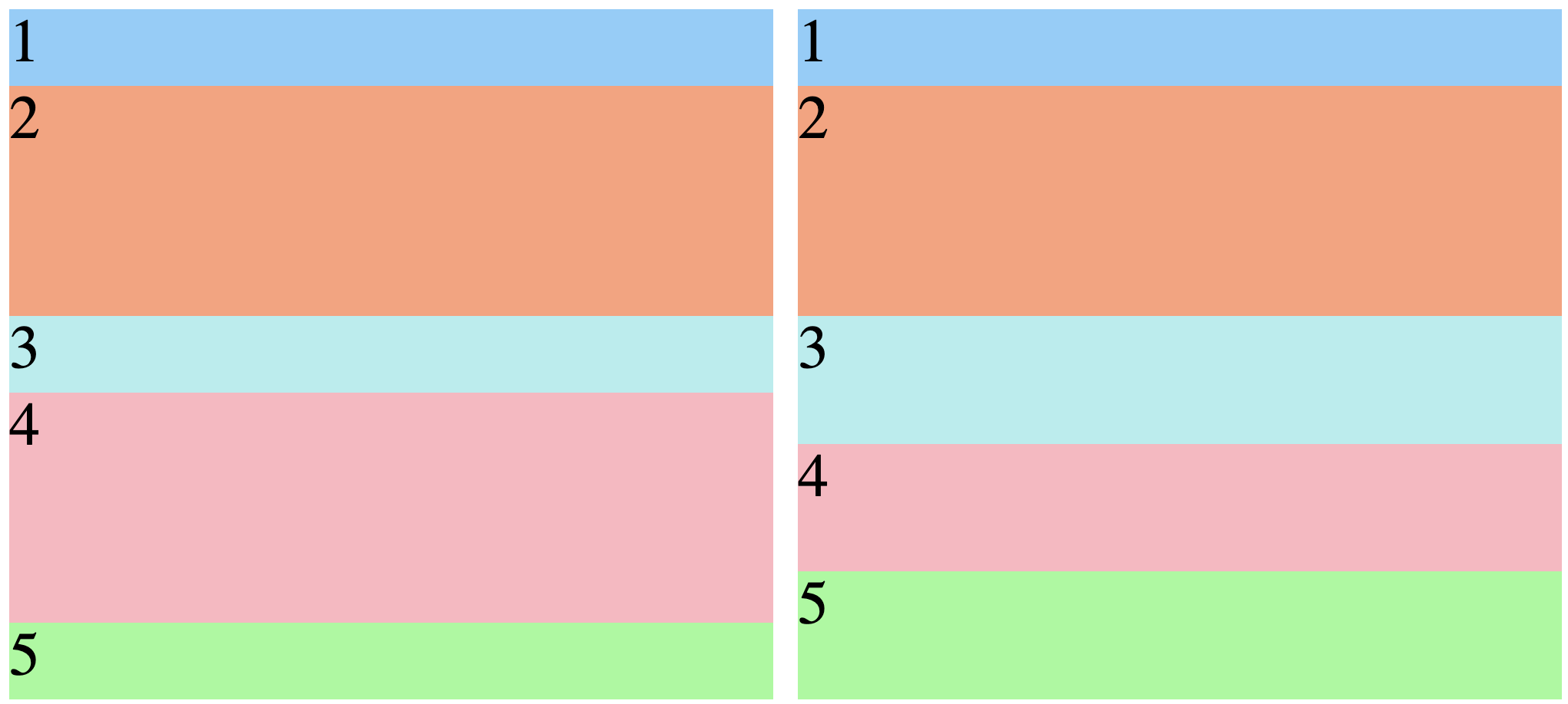
Are you looking to repeat the row pattern every two rows? Right now it’s kind of hard to see in any case because you’re giving the same value for both rows: 50px.
I’ll assume you’re trying to repeat a pattern like small, large; small, large…, like the version on the left below. But your current CSS won’t give you that, it will only apply to the first pair of rows — and you end up with the situation on the right:
One thing that you could do to get the first effect would be to replace grid-template-rows with grid-auto-rows, as per this Stackoverflow post:
  .container {
    font-size: 40px;
    min-height: 300px;
    width: 100%;
    background: LightGray;
    display: grid;

    /*HERE*/
    grid-auto-rows: 50px 50px;
  }
If this in fact solves your problem, you might want to look at this article:
Hope that helps.
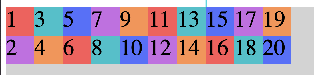
If that’s how it works, I was thinking of this kind of output!

1 Like
Ah, I see. Well then you will need to specify some columns too!
By default a grid that doesn’t have any columns set will just flow into additional implicit rows (ones that you didn’t declare). You need to tell the grid how tall you want your rows to be, and also how wide your want your implicit columns to be:
div {
  grid-auto-columns: 50px;
  grid-template-rows: 50px 50px;
}
One more thing. The CSS will still not solve your problem, because child divs are just flowing on to more implicit rows as necessary — so, they never flow into the second column. You have to tell the grid that you want to do that, which is what this property does:
div {
  grid-auto-flow: column;
}
This behavior will continue no matter how many child divs you add to your container:
This topic was automatically closed 182 days after the last reply. New replies are no longer allowed.