I am re-doing my product landing page challenge
I cannot align the 3rd pricing table and it is also bigger than the first 2 pricing tables.
how to fix these flexbox pricing tables?
I suggest use CSS Grid; it’s easier to place elements at right place just like in jigsaw puzzle.
CSS Grid offers all the features of CSS Flex, I personally don’t see any need to use CSS Flex at all.
Hi @QueenDaenerys
Without actually seeing your code I don’t think you will get useful help. Please, consider updating your post.
Good luck and happy coding!!
@carlosvisator I forgot to post the html and css!
<div class="container">
<h2 id="Features">Our Story - Specialists in the Sale of Original, Rare, Classic and Elite Books</h2>
<p><i class="fa-solid fa-magnifying-glass fa-2x"></i> Lorem ipsum dolor sit amet, consectetur adipiscing elit, sed do eiusmod tempor incididunt ut labore et dolore magna aliqua. Odio tempor orci dapibus ultrices in iaculis nunc sed. Id leo in vitae turpis massa sed. Interdum posuere lorem ipsum dolor sit amet consectetur adipiscing elit. Neque ornare aenean euismod elementum nisi. Egestas integer eget aliquet nibh praesent tristique magna sit amet. </p>
<h2 id="How-It-Works">Our Limited-Time Plans (Valid until XXIV-XXII-MMM)</h2>
<section class="pricing">
<div class="flexbox">
<div class="card-header">
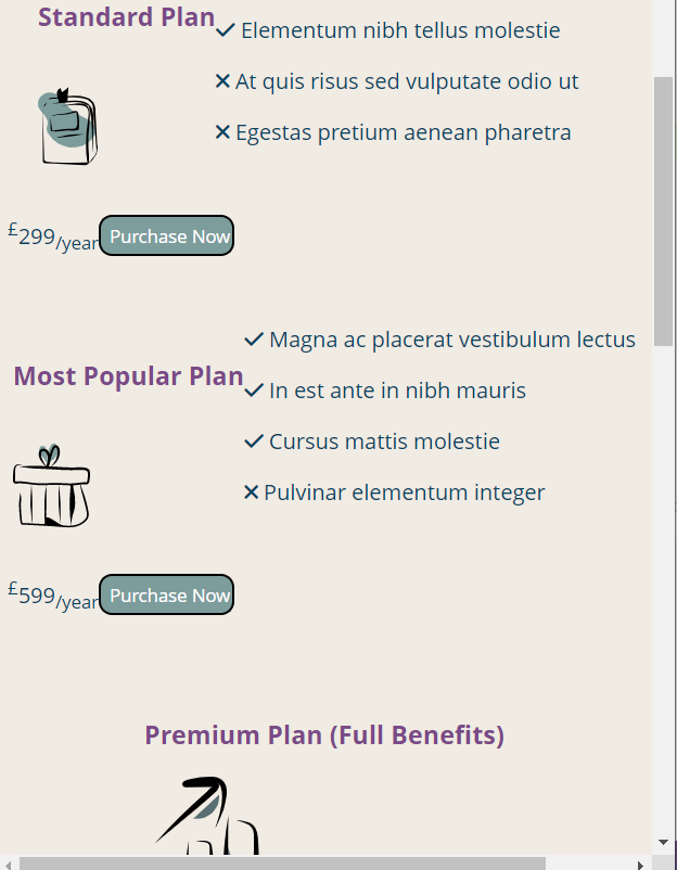
<h3>Standard Plan</h3>
<img src="images/standard-plan.svg"/>
</div>
<div class="card-detail">
<p><span class="fas fa-check check"></span> Magna etiam tempor orci eu lobortis</p>
<p><span class="fas fa-check check"></span> Elementum nibh tellus molestie</p>
<p><span class="fas fa-times nocheck"></span> At quis risus sed vulputate odio ut</p>
<p><span class="fas fa-times nocheck"></span> Egestas pretium aenean pharetra</p>
</div>
<div class="card-price">
<p><sup>£</sup>299<sub>/year</sub></p>
</div>
<input id="submit" type="submit" value="Purchase Now"/>
</div>
<!-- pricing table 2-->
<div class="flexbox">
<div class="card-header">
<h3>Most Popular Plan</h3>
<img src="images/most-popular-plan.svg"/>
</div>
<!--card detail-->
<div class="card-detail">
<p><span class="fas fa-check check"></span> Magna ac placerat vestibulum lectus</p>
<p><span class="fas fa-check check"></span> In est ante in nibh mauris</p>
<p><span class="fas fa-check check"></span> Cursus mattis molestie</p>
<p><span class="fas fa-times nocheck"></span> Pulvinar elementum integer</p>
</div>
<!-- card price -->
<div class="card-price">
<p><sup>£</sup>599<sub>/year</sub></p>
</div>
<!-- button -->
<input id="submit" type="submit" value="Purchase Now"/>
</div>
<!-- pricing table 3 -->
<div class="flexbox">
<div class="card-header">
<h3>Premium Plan (Full Benefits)</h3>
<img src="images/premium-plan.svg"/>
<!-- card detail -->
<div class="card-detail">
<p><span class="fas fa-check check"></span> Enim neque volutpat</p>
<p><span class="fas fa-check check"></span> Ac tincidunt vitae</p>
<p><span class="fas fa-check check"></span> Facilisi nullam vehicula ipsum</p>
<p><span class="fas fa-check check"></span> A arcu cursus vitae</p>
</div>
<div class="card-price">
<p class="plan-price"><sup>£</sup>999<sub>/year</sub></p>
</div>
<input id="dark-color-submit" type="submit" value="Purchase Now"/>
</div>
</section>
CSS code
body {
	padding: 0;
	margin: 0;
    font-family: open sans;
    background-color: #F0EBE3;

}
.container {
	position: relative;
	margin-top: 100px;
    background-color: #F0EBE3;
}
.container img {
	display: block;
	width: 100%;
}
nav {
	position: fixed;
	z-index: 10;
	left: 0;
	right: 0;
	top: 0;
	padding: 0 5%;
	height: 100px;
	background-color: #E4DCCF;
}
nav #header {
	float: left;
	width: 40%;
	height: 100%;
	display: flex;
	align-items: center;
	font-size: 19px;
	color: #576F72;
    font-family: monospace;
    font-style: italic;
}
nav .links {
	float: right;
	padding: 0;
	margin: 0;
	width: 60%;
	height: 100%;
	display: flex;
	justify-content: space-around;
	align-items: center;
}
nav .links li {
	list-style: none;
}
nav .links a {
	display: block;
	padding: 1em;
	font-size: 16px;
	font-weight: bold;
	color: #7D9D9C;
	text-decoration: none;
}
#nav-toggle {
	position: absolute;
	top: -100px;
}
nav .icon-burger {
	display: none;
	position: absolute;
	right: 5%;
	top: 50%;
	transform: translateY(-50%);
}
nav .icon-burger .line {
	width: 30px;
	height: 5px;
	background-color: #7a4988;
	margin: 5px;
	border-radius: 3px;
	transition: all .3s ease-in-out;
}
@media screen and (max-width: 768px) {
	nav #header {
		float: none;
		width: auto;
		justify-content: center;
	}
	nav .links {
		float: none;
		position: fixed;
		z-index: 9;
		left: 0;
		right: 0;
		top: 100px;
		bottom: 100%;
		width: auto;
		height: auto;
		flex-direction: column;
		justify-content: space-evenly;
		background-color: #576F72;
		overflow: hidden;
		box-sizing: border-box;
		transition: all .5s ease-in-out;
	}
	nav .links a {
		font-size: 17px;
	}
	nav :checked ~ .links {
		bottom: 0;
	}
	nav .icon-burger {
		display: block;
	}
	nav :checked ~ .icon-burger .line:nth-child(1) {
		transform: translateY(10px) rotate(225deg);
	}
	nav :checked ~ .icon-burger .line:nth-child(3) {
		transform: translateY(-10px) rotate(-225deg);
	}
	nav :checked ~ .icon-burger .line:nth-child(2) {
		opacity: 0;
	}

}

#header-img {
    width: 80px;
    height: 60px;
    margin-right: 5px;
}

/* container content */

h2 {
	padding-top: 20px;
	color: #7a4988;
}

i {
    font-size: 18px;
    color: #7D9D9C;
    display: block;
}

a {
	color: #7D9D9C;
	text-decoration: none;
	font-weight: bold;
   }

   a:hover {
	   color: #7a4988;
   }

   h2, input, a, p {
	   font-family: open sans;
   }

   footer p {
    font-size: 14px;
    font-style: italic;
    display: flex;
    justify-content: center;
    width: 100%;
}

#submit {
    width: 100px;
    height: 30px;
    background-color: #7D9D9C;
    color: white;
    border-radius: 10px;
    cursor: pointer;
}

#email {
    width: 180px;
    height: 30px;
}

nav ul {
	display: flex;
	justify-content: space-evenly;
	  color: #576F72;
	  flex-wrap: wrap;
	  align-items: center;
	  padding-inline-start: 0;
	  margin-block: 0;
	  height: 100%;
	  margin-right: 10px;
	  padding: 15px;
	  overflow: hidden;
	  list-style-type: none;
  }

  nav ul li {
	  padding-right: 10px;
  }
  p {
	  color: #05445e;
  }

  h2, h3, h4, h5 {
	color: #7a4988;
	  padding-top: 60px;
	  margin-top: 0;
  }

  main {
	  padding-top: 40px;
	  margin: 0 auto 10px auto;
	  max-width: 600px;
  }

  /*FLEXBOX*/

.flexbox img {
	width:33.33%;
	height: 100px;
	max-width: 200px;
  }

  .flexbox {
	display: flex;
	flex-direction: row;
	flex-wrap: wrap;
	justify-content: center;
	align-items: center;
	max-width: 1000px;

	margin: 0 auto;
  }

  .flexbox::after {
	content: "";
	width: 300px;
  }

  #dark-color-submit {
	  width: 100px;
	  height: 30px;
	  background-color: #576F72;
	  color: white;
	  border-radius: 10px;
	  cursor: pointer;
  }


  #plan-price {
	text-align: center;
	display: inline-block;
  }
1 Like
Hi again
I don’t have your images, so not easy to help. Some ideas:
/* carlos */
*,
*::before,
*::after {
  outline: 1px solid red;
/* This line will mark every box in your layout without change your display.
Borders may affect it.
Be aware of some elements cannot use outline.  Just in case you missing a box.
You can use outline in every element to visualizing it better, just changing pxs and color.
*/
 box-sizing: border-box;
/* You can control your elements easily, but is not necessary by default */
}

p {
  max-width: 70ch;
/* Small chunks of text are easier to read for everyone .
You might need  too

`body { line-height: 1.5; }`

, for example to separate
every line of text a bit more. */
  margin: 0 auto;
}

.container img {
  display: block;
  max-width: 100%;
/* min or max width it is what you will use mostly of the time,
BUT it becomes a flex item inside a flexbox.
Wich it means flex-grow = 0, flex-shrink=1 and flex-basis=auto
flex: 1 0 auto;
flex-basis is like your  minimum width or height*/
}

.flexbox {
  display: flex;
  flex-flow: row nowrap;
/* This flex-flow is by default in the flex containers.
It means flex-direction=row and flex-wrap=nowrap */
  gap: 3rem;
/* gap is useful to separate your flex childrens */
  justify-content: center;
  align-items: center;
}

.flexbox > * {
  flex: 0 1 auto;
}

.card-detail > p {
  display: flex;
  flex-flow: row nowrap;
  justify-content: space-between;
  gap: 1rem;
  align-items: center;
}

.card-header {
  min-width: 250px;
  padding: .5rem;
  gap: 1rem;
}
Anyway, before start to code again and after set up outlines and opening the dev tools (you can open it in different window too ;D), I would delete every flex class inside your HTML and think for a few minutes what every box will need (flex-flow, gap, …). You will find very useful think about the design for a few minutes.
I hope this helps, but ask again as you need.
Happy coding!!
system
April 29, 2023, 9:18pm
6
This topic was automatically closed 182 days after the last reply. New replies are no longer allowed.

 here they are