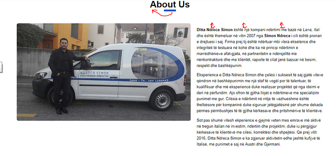
Hey Guys,
I am using flexbox in a project.
I want the image to have an initial width and auto-scale up and down based on the screen sizes.
I have these styles applied to the containers.
#about .wrapper {
  display: flex;
}

#about .ceo {
  flex: 1 2 48%;
  margin-right: 2%;
}

#about p {
  flex: 1 1 50%;
  font-size: 0.65rem;
  margin-top: 0.58rem;
  line-height: 1.009rem;
}

#about .ceo img {
  width: 29rem;
  border-radius: 0.27rem;
  height: auto;
}
- I can use media-queries and set the width of the image properly according to the screen sizes but is there any better solution?
I would like the blue hr to be in the beginning of each word. My first thought was using cals but it can’t be used with auto. What can I do? I have these styles applied to it.
hr {
  background: rgb(19, 90, 198);
  border: 0;
  width: 2rem;
  height: 0.3rem;
  margin: 0 auto;
  margin-bottom: 2rem;
}
And my last issue, what can I do for the space on top at the #about-us section?
Here’s the link to codepen: https://codepen.io/simongjetaj/pen/VrEGMz?editors=1100
Any help is very appreciated.
Thanks!
