I want my title occupying the entire div, as in the figure. I would also like the font size to adjust as the div size changes (when the screen shrinks). I used “clamp” but it doesn’t follow the div as I want (always occupying the entire div), despite increasing and decreasing. How do I do it?
I’m not seeing any obvious errors here. I think you are going to have to give us more information, such as the HTML you are using and any other CSS that might be affecting this. It’s probably best if you just give us a link to the project so we can see the whole thing and do our own testing.
The problem is that I want the font size to always be EXACTLY the size of the container. With clamp I can make it follow more or less the size of the parent, but it doesnt match always.
My code:
There is another problem in my code, as you will see. I’ve been trying to center the header in the center of the screen, but without success, even after using display flex. When I set a height of 100vh it centers for desktop screens but is not fully responsive. Should I do a separete post about it?
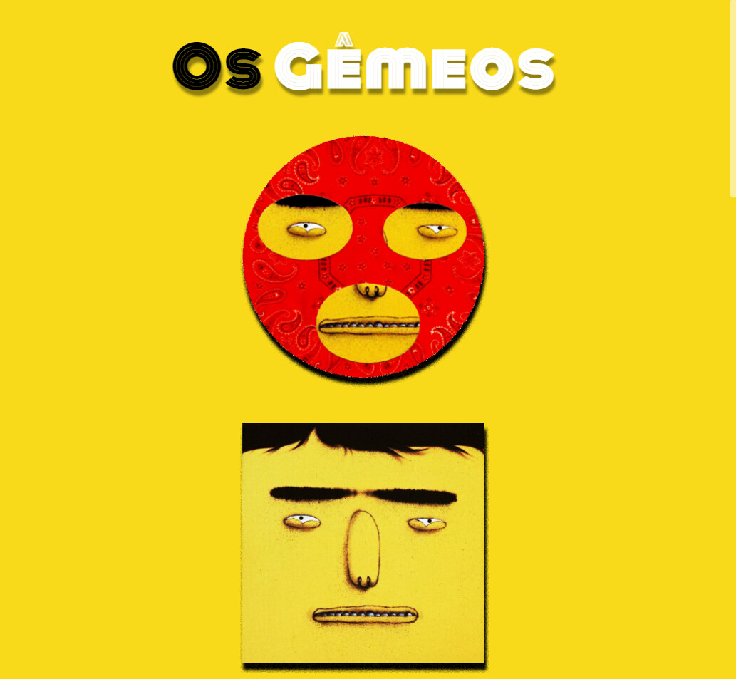
Yeah, i think its like you said :“strecht” I want the title to always start where the first image starts and always end where the second image ends!
About being centered,it is centered horizontally but not vertically. When I try to center it using height 100vh it behaves strangely when the screen shrinks
Did you fix this? Because it looks centered both ways to me.
Ahh, got it. You want the text to scale as needed so that it is always the same width of the two images. I’m not sure there is a single CSS property to do this. I did find the below article which seems to address this.
Yes! I was going to tell you I fixed it! It worked with display grid, but the images are not always 100% centered vertically and horizontally when the width decreases. In this image you can see that there is more space at the top than at the bottom.

 I want the title to always start where the first image starts and always end where the second image ends!