Please be brutal as possible on where I can improve.
Wangari Maathai’s tribute page
Thank you.
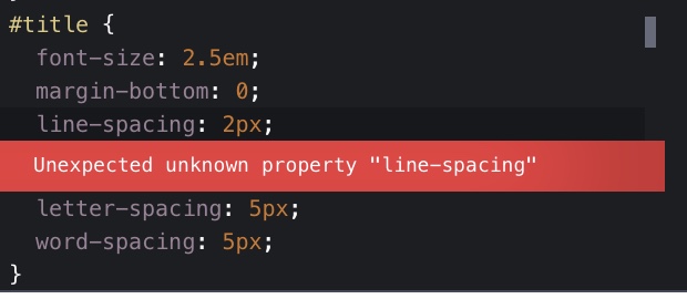
The error
line-space: 2px;
The improvement: use div id’s
It took me some time to understand what you meant, but I eventually figured it out after 10min 
 . Thank you for your feedback,
Good it I fulfilled all your request then. Taking 10 min of your time  for a 9 word answer.
BRUTAL!
1 Like
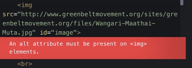
I ran the Analyze HTML and Analyze CSS tools in CodePen
solve these errors
Hello, @ILM
I didn’t know about the tool, went digging and found it. I found the errors and fixed them. I couldn’t fix the one asking for a relative URL. I googled but I was unsuccessful, do you have any clue?
don’t worry about that, as you are importing something from outside you can ignore the fact that it asks for a relative href
1 Like
Ok. Am just going to ignore the error, and also Thank you!
Hi @kylekibet, your page looks good. Something to revisit;
- Not sure if you noticed but even though you’re using the
<strong>tag the text on your page doesn’t render as such. This is because when you imported your font you only selected regular. Go back to Google Fonts and when you select your font it will give you the link. All well and good so far but what you then need to do is click on the ‘customize’ link (next to ‘embed’) and there click the bold checkbox also. Click the ‘embed’ link and put the new link in your page. (Notice it now has weights for 400 & 700). Btw, I did this too with a page I was working on and asked a question about why I wasn’t seeing the font output the way I expected here in the forums and it was explained to me. Here’s the link to my post which includes a quick video the responder made showing how to do what I just explained.
1 Like
Hi, @Roma I didn’t notice the difference even after adding weights of 400, 600 and 800. I am just going to try using different fonts and link the regular intentionally and try making it bold until I notice the difference. (could it be because I am using a low-end laptop(Lenovo 120S-11IAP Winbook (Ideapad) - Type 81A4)?)
Could you please check it one more time?
Hi @kylekibet, I can see the difference now. The dates have a heavier weight than the text that follows.
One thing I did notice in your code. Don’t use the <br> tag to force spacing. Use margin and/or padding in CSS.
Hello @Roma, I removed the <br> tag. It looks much better after I removed the tag.
Thank you.
1 Like