Greetings, I’ve been struggling in this challenge a lot and I get around it by searching but this time I got stuck for real .
(please Note that I will using comments and screenshots to explain this issue).
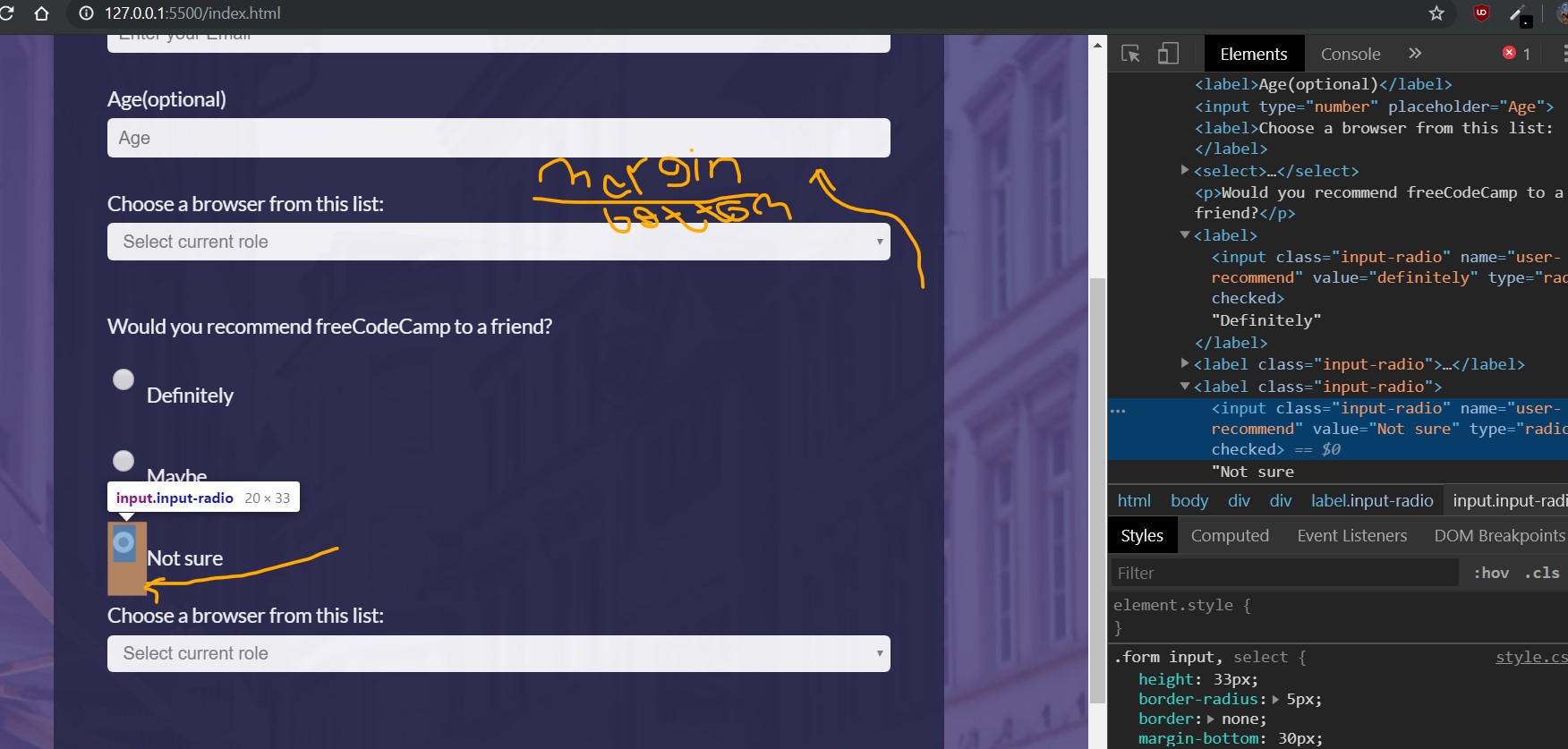
I need to get rid of margin-bottom for radio buttons so the text next to it showed probably.
But that will effect inputs above and will make them stick to each other, then I need to add margin top to the input below but something prevent me from achieve this particular need I know that I need to reform a lot of CSS style but I completely got lost.
Here’s a screenshot to overall sight of the issue:
And here’s the codepen link I write comments where the issue caused both in HTML:
<!-- This's the beginning of the radio Buttons -->
And CSS:
/* This Effect radio buttons and inputs */
/* I need to get rid of margin-bottom for the radio buttons
    and keep it for the input above then add margin top for the input below
    (What is your favorite feature of freeCodeCamp?)*/
Codepen link where you can investigate:
https://codepen.io/BrokenDynamo/pen/OJJKXYp
I was thinking a lot that programming isn’t for me but I don’t want to give up just yet
Appreciate your attempt to solve this issue for me!
Don’t give up yet! You are too early into learning to give up
I’m no where near a professional and still pound my head over ‘simple things.’ But, that is the BEST way to learn. Anyone can copy-paste stuff from a forum or make a WordPress website.
For me, breaking everything down into ‘containers’ has helped me out greatly for designing. It took me a while to understand but after you practice more it makes life simple. I sketch out what I want on a pad with a pencil first then build everything with a background color in CSS. It starts out really ugly, but gets amazing at the end. I made a quick paint-up of your site with how I would do my first sketch and how I would approach it: (*edit: removed your margin-bottom)
Red: ‘Main’; flex-column;
Blue: class A: flex-row;
Green: class B: flex-column;
You want to make as many things the same as possible when you can (you will learn why much later on).
Keep going! It’s worth the journey and in a few months you’ll look back at your early projects and laugh.
 .
.