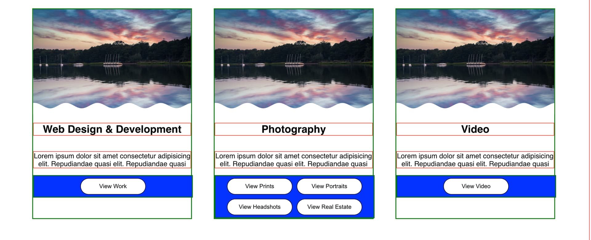
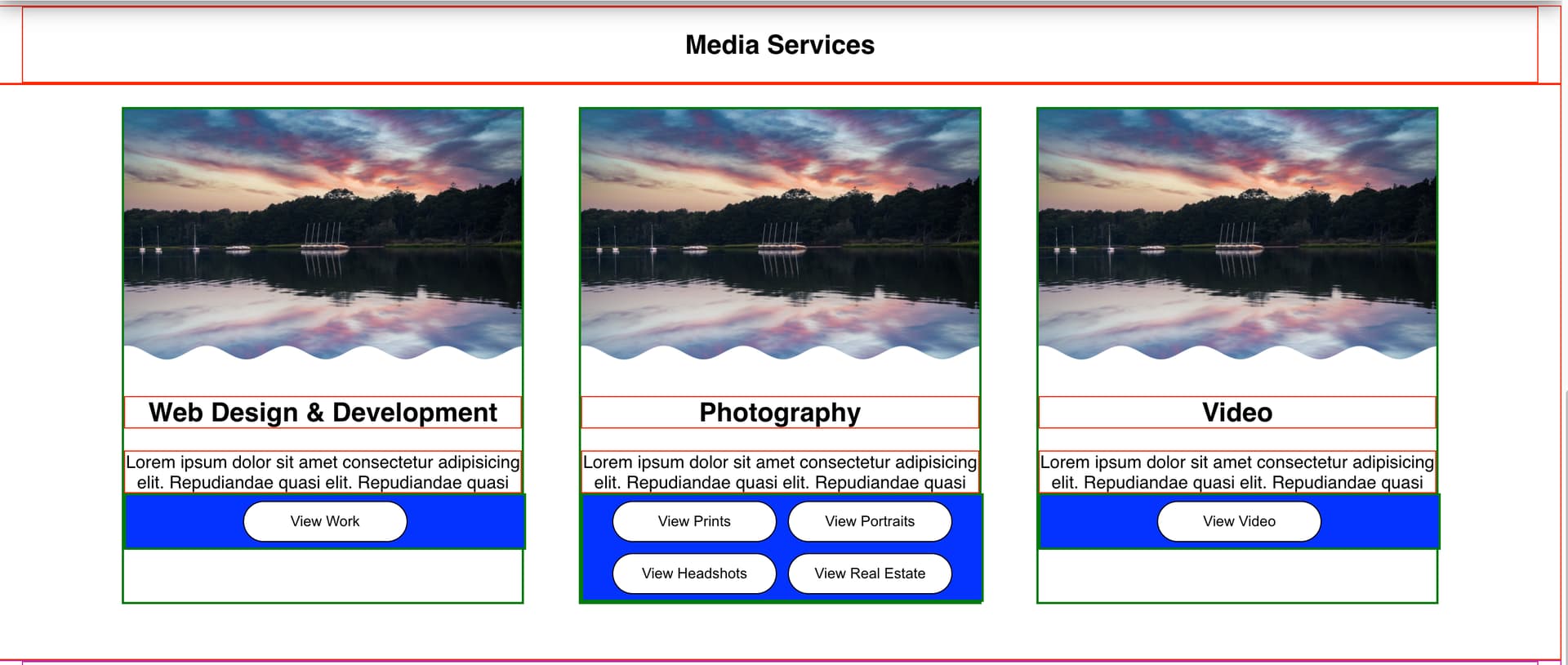
I have tried everything ranging from flex end, self end, etc, but no luck. Can anyone please help me? Code and image below
HTML
<div>
    <img src={capeCod} alt="" srcset="" />
    <h2>Photography</h2>
    <p>Lorem ipsum dolor sit amet consectetur adipisicing elit. Repudiandae quasi elit. Repudiandae quasi</p>
    <div>
        <button>View Prints</button>
        <button>View Portraits</button>
        <button>View Headshots</button>
        <button>View Real Estate</button>
    </div>
</div>
CSS
/* SERVICE CONTENT ----------------> */
.serviceContent {
    display: flex;
    justify-content: space-evenly;
    max-width: 1200px;
    gap: 50px;
}
.serviceContent div {
    border: 2px rgb(4, 123, 12) solid;
    width: 100%;
    text-align: center;
    padding-bottom: 0;
    display: flex;
    flex-direction: column;
}
.serviceContent div img {
    width: 100%;
}
.serviceContent div h2 {
    border: 1px red solid;
}
.serviceContent p {
    border: 1px red solid;
}
.serviceContent div div {
    background-color: blue;
    display: inline;
}
.serviceContent div button {
    width: 150px;
    margin: 5px;
}
Post the entire html and css code here. You have posted the css rules for many html elements that are not visible in your html code.
Ok, I have attached below along with updated image.
// IMGS:
import aboutPhoto from '../../imgs/aboutPhoto.png'
import capeCod from '../../imgs/morningMode.png'

// CSS:
import styles from './Service.module.css'

// ABOUT ME:
export default function Service() {
return (
<div>

  <div className={styles.serviceHeaderBox}>
      <h1 id="about">Media Services</h1> {/*AUTO SCROLL ON CLICK FROM NAVABAR*/}
  </div>

  <section className={styles.serviceBackground}>
      <div className={styles.serviceContent}>
          <div>
              <img src={capeCod} alt="" srcset="" />
              <h2>Web Design & Development</h2>
              <p>Lorem ipsum dolor sit amet consectetur adipisicing elit. Repudiandae quasi elit. Repudiandae quasi</p>
              <div className={styles.buttonBox}>
                  <button>View Work</button>
              </div>
          </div>
          <div>
              <img src={capeCod} alt="" srcset="" />
              <h2>Photography</h2>
              <p>Lorem ipsum dolor sit amet consectetur adipisicing elit. Repudiandae quasi elit. Repudiandae quasi</p>
              <div>
                  <button>View Prints</button>
                  <button>View Portraits</button>
                  <button>View Headshots</button>
                  <button>View Real Estate</button>
              </div>
          </div>
          <div>
              <img src={capeCod} alt="" srcset="" />
              <h2>Video</h2>
              <p>Lorem ipsum dolor sit amet consectetur adipisicing elit. Repudiandae quasi elit. Repudiandae quasi  </p>
              <div>
                  <button className={styles.buttonBox}>View Video</button>
              </div>
          </div>
      </div>
  </section>

</div>
)
}
CSS
/* SERVICE HEADER ----------------> */
.serviceHeaderBox {
    background-color: rgb(255, 255, 255);
    border: 1px red solid;
}
.serviceHeaderBox h1 {
    color:#000000;
    background-color: rgb(255, 255, 255);
    margin: 0;
    padding: 20px 40px;
    margin: 0 auto;
    max-width: 1300px;
    border: 1px red solid;
    text-align: center;
}

/* SERVICE BACKGROUND ----------------> */
.serviceBackground {
    background-color: rgb(255, 255, 255);
    margin: 0 0 0 0;
    padding: 20px 0 50px 0px;
    display: flex;
    justify-content: space-evenly;
    border: 1px red solid;
}

/* SERVICE CONTENT ----------------> */
.serviceContent {
    display: flex;
    justify-content: space-evenly;
    max-width: 1200px;
    gap: 50px;
    margin: 0 10px 0 10px;
}
.serviceContent div {
    border: 2px rgb(4, 123, 12) solid;
    width: 100%;
    text-align: center;
    padding-bottom: 0;
    display: flex;
    flex-direction: column;
}
.serviceContent div img {
    width: 100%;
}
.serviceContent div h2 {
    border: 1px red solid;
}
.serviceContent p {
    border: 1px red solid;
    margin: 0 0 0 0;
}
.serviceContent div div {
    background-color: blue;
    display: inline;
    margin: 0 0 0 0;
}
.serviceContent div button {
    width: 150px;
    margin: 5px;
}


@media only screen and (min-width: 280px) and (max-width: 1103px) {

    .serviceContent {
        display: flex;
        justify-content: center;
        margin: 0 50px;
        flex-direction: column;
    }
}

@media only screen and (min-width: 280px) and (max-width: 528px) {
    .servicePortrait img {
        width: 250px;
        display: flex;
        justify-content: center;
        margin: auto;
    }
}

@media only screen and (min-width: 280px) and (max-width: 467px) {
    .serviceHeader {
        text-align: center;
    }
}

@media only screen and (min-width: 280px) and (max-width: 467px) {
    .servicePortrait img {
        width: 200px;
        display: flex;
        justify-content: center;
        margin: auto;
    }
}
I have tried everything ranging from flex end, self end, etc, but no luck. Can anyone please help me? Code and image below
HTML
// IMGS:
import aboutPhoto from '../../imgs/aboutPhoto.png'
import capeCod from '../../imgs/morningMode.png'

// CSS:
import styles from './Service.module.css'

// ABOUT ME:
export default function Service() {
return (
<div>

  <div className={styles.serviceHeaderBox}>
      <h1 id="about">Media Services</h1> {/*AUTO SCROLL ON CLICK FROM NAVABAR*/}
  </div>

  <section className={styles.serviceBackground}>
      <div className={styles.serviceContent}>
          <div>
              <img src={capeCod} alt="" srcset="" />
              <h2>Web Design & Development</h2>
              <p>Lorem ipsum dolor sit amet consectetur adipisicing elit. Repudiandae quasi elit. Repudiandae quasi</p>
              <div className={styles.buttonBox}>
                  <button>View Work</button>
              </div>
          </div>
          <div>
              <img src={capeCod} alt="" srcset="" />
              <h2>Photography</h2>
              <p>Lorem ipsum dolor sit amet consectetur adipisicing elit. Repudiandae quasi elit. Repudiandae quasi</p>
              <div>
                  <button>View Prints</button>
                  <button>View Portraits</button>
                  <button>View Headshots</button>
                  <button>View Real Estate</button>
              </div>
          </div>
          <div>
              <img src={capeCod} alt="" srcset="" />
              <h2>Video</h2>
              <p>Lorem ipsum dolor sit amet consectetur adipisicing elit. Repudiandae quasi elit. Repudiandae quasi  </p>
              <div>
                  <button className={styles.buttonBox}>View Video</button>
              </div>
          </div>
      </div>
  </section>

</div>
)
}
CSS
/* SERVICE HEADER ----------------> */
.serviceHeaderBox {
    background-color: rgb(255, 255, 255);
    border: 1px red solid;
}
.serviceHeaderBox h1 {
    color:#000000;
    background-color: rgb(255, 255, 255);
    margin: 0;
    padding: 20px 40px;
    margin: 0 auto;
    max-width: 1300px;
    border: 1px red solid;
    text-align: center;
}

/* SERVICE BACKGROUND ----------------> */
.serviceBackground {
    background-color: rgb(255, 255, 255);
    margin: 0 0 0 0;
    padding: 20px 0 50px 0px;
    display: flex;
    justify-content: space-evenly;
    border: 1px red solid;
}

/* SERVICE CONTENT ----------------> */
.serviceContent {
    display: flex;
    justify-content: space-evenly;
    max-width: 1200px;
    gap: 50px;
    margin: 0 10px 0 10px;
}
.serviceContent div {
    border: 2px rgb(4, 123, 12) solid;
    width: 100%;
    text-align: center;
    padding-bottom: 0;
    display: flex;
    flex-direction: column;
}
.serviceContent div img {
    width: 100%;
}
.serviceContent div h2 {
    border: 1px red solid;
}
.serviceContent p {
    border: 1px red solid;
    margin: 0 0 0 0;
}
.serviceContent div div {
    background-color: blue;
    display: inline;
    margin: 0 0 0 0;
}
.serviceContent div button {
    width: 150px;
    margin: 5px;
}


@media only screen and (min-width: 280px) and (max-width: 1103px) {

    .serviceContent {
        display: flex;
        justify-content: center;
        margin: 0 50px;
        flex-direction: column;
    }
}

@media only screen and (min-width: 280px) and (max-width: 528px) {
    .servicePortrait img {
        width: 250px;
        display: flex;
        justify-content: center;
        margin: auto;
    }
}

@media only screen and (min-width: 280px) and (max-width: 467px) {
    .serviceHeader {
        text-align: center;
    }
}

@media only screen and (min-width: 280px) and (max-width: 467px) {
    .servicePortrait img {
        width: 200px;
        display: flex;
        justify-content: center;
        margin: auto;
    }
}