My alignment
and I want to align like this

have you tried adding some padding around the icon?
no, I didn’t have tried padding
that should fix your problem bro 
I tried but it didn’t helped check this 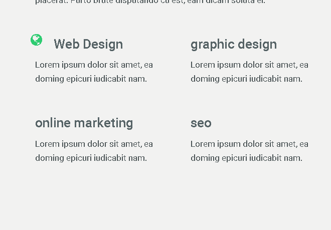
try just adding padding-right
i tried its not working

Please put your code here - both html and css
For such purposes I suggest to use flex grid for both favicons and text, provides better flexibility and auto adjust with content width and size.
@sumeetsvaidya i am using css custom grid here is my code
 <div class="col-1-of-2">
<h2 class="secondry-heading u-margin-bottom-small"><i class="fa fa-globe icon-green"></i>Web Design</h2>
 <p class="normal-text">Lorem ipsum dolor sit amet, ea doming epicuri iudicabit nam.</p>
    </div>


  .icon-green{
  font-size: 2.6rem !important;
  color: $secondry-color-2 !important;
  float: left;
  @include clearfix;
  margin-top: 2rem;
  margin-left: -3rem !important;
  padding-right: 2rem;
}@sumeetsvaidya here is the output

In the example you are trying to emulate, the icon looks like it is separate from the H2 tag. Is the example you are trying to copy a website that you can examine the page on (right click > view source)?
Otherwise, consider the layout something like this:
--------------------------------
|             |                |
|             |      <h2>      |
|      I      |                |
|      C      -----------------
|      O      |                |
|      N      |      <p>       |
|             |                |
|             |                |
|             |                |
---------------------------------
So what is the problem? Responsive issues across multiple devices?
you can try using absolute position with negative value for left.
You need to make a container that holds the content and adjusts depending on the device like so:
‘#contentWrapper { width : 100vw; height:auto;}’
all the children will fit in the container as long as you use vw and vh. Your image should be a background image with the following code:
‘#yourimage {background-image:url(…/Images/yourimage.jpg); background-size: cover;}’
Like this it will scale to whatever screen resolution you have.
And you can use CSS flex-direction to align your div’s within the container.
Replace yourimage with your div/image
You will have to use media queries though to make content fit though. A design is usually not fool proof across devices. You will have to tinker with your breakpoints to reach a consistent view across al devices.
You can setup your HTML to load CSS files depending on devices. It is f*&cking annoying but there is no way around it. You never know on what device or on what browser a end user is viewing your content.
The only thing you can do to avoid excessive coding is to make your design work on multiple devices. Adobe XD really works for me because it shows the flaws in your design which makes coding easier.
i am converting psd to html i don’t have source anyway i fixed by using flex-box and by you’r layout example thanks bro