Hi everyone,
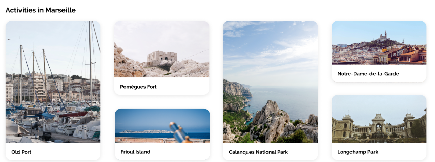
For a project, I need to create the following layout. I managed to create it, but I have some problem with my pictures. I can’t make them fit inside their respective figure tag. Here, I would like the image to re-size itself together when my screen size increase and/or decrease. And to do that, the biggest problem lays in their width.
At first, I tried to apply % on the width of .activity-picture, so it could create the responsive design that I wanted, however it doesn’t really work since the container size grows at once and the picture appears at full size. I assume there is a conflict with the flex-basis of my .*-activity-card. Afterwards, I also tried to apply fit-content, max-content and min-content, but I had basically the same results.
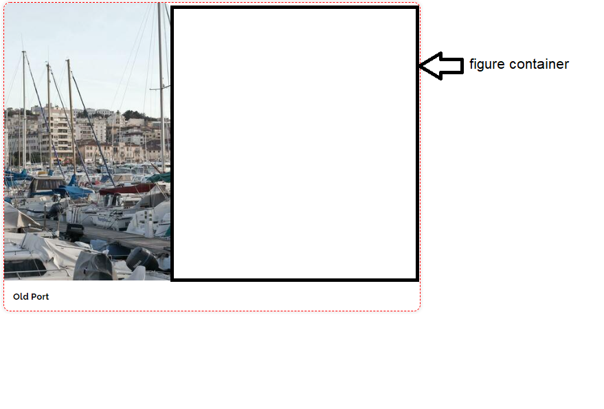
Then, I tried to work with the max-width of .activity-picture. This time, the problem was that my figure container wasn’t ‘filled’ but put aside like illustrated here.
I also tried other methods like not putting the article tags and directly applying flex-basis and other stylings on the figure tags, but I had the same problems of sizing…
Here is my code:
figure {
  margin: 0px;
}

#activities-nav {
  display: flex;
  flex-flow: column wrap;
  justify-content: center;
  gap: 3%;
  height: 450px;
  padding: 5px;
  margin: 0px 16px 0px 16px;
}

.activity-picture {
  border-radius: 10px 10px 0px 0px;
  width: 100px;
  height: 100%;
  object-fit: cover;
}

.long-activity-card {
  border: 1px dashed red;
  flex-basis: 100%;
  border-radius: 10px;
  box-shadow: 0px 0px 3px 3px #F2F2F2;
  cursor: pointer;
}

.medium-activity-card {
  border: 1px dashed blue;
  flex-basis: 55%;
  border-radius: 10px;
  box-shadow: 0px 0px 3px 3px #F2F2F2;
  cursor: pointer;
}

.small-activity-card {
  border: 1px dashed green;
  flex-basis: 40%;
  border-radius: 10px;
  box-shadow: 0px 0px 3px 3px #F2F2F2;
  cursor: pointer;
}

.long-activity-card figure {
  height: 90%;
}

.medium-activity-card figure {
  height: 85%;
}

.small-activity-card figure {
  height: 80%;
}
<nav id="activities-nav">
  <article class="long-activity-card">
    <figure>
      <img class="activity-picture"
           src="https://i.stack.imgur.com/zjxgC.jpg">
    </figure>
  </article>

  <article class="medium-activity-card">
    <figure>
      <img class="activity-picture"
           src="https://i.stack.imgur.com/cUTh0.jpg">
    </figure>
  </article>

  <article class="small-activity-card">
    <figure>
      <img class="activity-picture"
           src="https://i.stack.imgur.com/jJXeq.jpg">
    </figure>
  </article>

  <article class="long-activity-card">
    <figure>
      <img class="activity-picture"
           src="https://i.stack.imgur.com/kFKES.jpg">
    </figure>
  </article>

  <article class="small-activity-card">
    <figure>
      <img class="activity-picture"
           src="https://i.stack.imgur.com/L1XzJ.jpg">
    </figure>
  </article>

  <article class="medium-activity-card">
    <figure>
      <img class="activity-picture"
           src="https://i.stack.imgur.com/FDI4i.jpg">
    </figure>
  </article>

</nav>
I thank in advance anyone who will take the time to help me.