How to get rid of right margin from bootstrap form label

Hi guys,

I have a horizontal bootstrap form with a label and text input side by side however there is some space between the two which I am trying to reduce without much success.

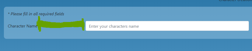
Here is the HTML. I haven’t used any custom css.

<!DOCTYPE html>
<html lang="en">

<head>
    <link rel="stylesheet" href="https://stackpath.bootstrapcdn.com/bootstrap/4.3.1/css/bootstrap.min.css"
        integrity="sha384-ggOyR0iXCbMQv3Xipma34MD+dH/1fQ784/j6cY/iJTQUOhcWr7x9JvoRxT2MZw1T" crossorigin="anonymous">
    <link rel="stylesheet" href="Style.css">
    <meta charset="UTF-8">
    <meta name="viewport" content="width=device-width, initial-scale=1, shrink-to-fit=no">
    <meta http-equiv="X-UA-Compatible" content="ie=edge">
    <title>Document</title>
</head>

<body>

    <div class="container-fluid">


        <form id="survey-form">
            <p><em>* Please fill in all required fields</em></p>
            <div class="form-group row">
                <label id="name-label" class="col-sm-2 col-form-label">Character Name</label>
                <input type="text" class="form-control col-sm-4" id="name" placeholder="Enter your characters name">
            </div>
        </form>


    </div>

    <!---BootStrap Shiznittzle-->
    <script src="https://code.jquery.com/jquery-3.3.1.slim.min.js"
        integrity="sha384-q8i/X+965DzO0rT7abK41JStQIAqVgRVzpbzo5smXKp4YfRvH+8abtTE1Pi6jizo"
        crossorigin="anonymous"></script>
    <script src="https://cdnjs.cloudflare.com/ajax/libs/popper.js/1.14.7/umd/popper.min.js"
        integrity="sha384-UO2eT0CpHqdSJQ6hJty5KVphtPhzWj9WO1clHTMGa3JDZwrnQq4sF86dIHNDz0W1"
        crossorigin="anonymous"></script>
    <script src="https://stackpath.bootstrapcdn.com/bootstrap/4.3.1/js/bootstrap.min.js"
        integrity="sha384-JjSmVgyd0p3pXB1rRibZUAYoIIy6OrQ6VrjIEaFf/nJGzIxFDsf4x0xIM+B07jRM"
        crossorigin="anonymous"></script>
</body>

</html>

Ignore me! I am a fool! I wasn’t using the bootstrap classes properly. Had to change the column size.

        <form id="survey-form">
            <p><em>* Please fill in all required fields</em></p>
            <div class="form-group row">
                <label id="name-label" class="col-sm-1 col-form-label-sm"><strong>Character Name</strong></label>
                <input type="text" class="form-control col-sm-5" id="name" placeholder="Enter your characters name">
            </div>
        </form>

Ok I’ve got the same issue after getting the grid lay out i wanted for the form.

e.g. The form will hold 2 columns that will span full width of the form.

Each column will contain multiple rows for different form elements.

When viewed on a small device, column 2 will stack below column 1 which means all form elements in column 2 will fall under column 1.

So far I’ve been using just 1 form element to play around with how it’d look and if it gets the desired affect when i make the screen smaller (col 2 stack below col 1)

Alls good here but the the label and the input box has space between it, like before i reduced the col size for the label but when i do that the labels text goes on to become 2 lines instead of 1. Help is much appreciated. I’ve created a fiddle for this:

https://jsfiddle.net/Mrqk92/dpk2w1xj/4/

@mrqk92, next time it’d be better if you started your own thread since your issues is different than the OP and others can find it easier.

That being said, I don’t think you’re using the label element correctly. Change it to a div, like this;
<div id="name-label"><strong>Character Name</strong></div>

Take a look at the pen I created. On the left is using the div, on the right I left yours with the label. See if that’s that you wanted