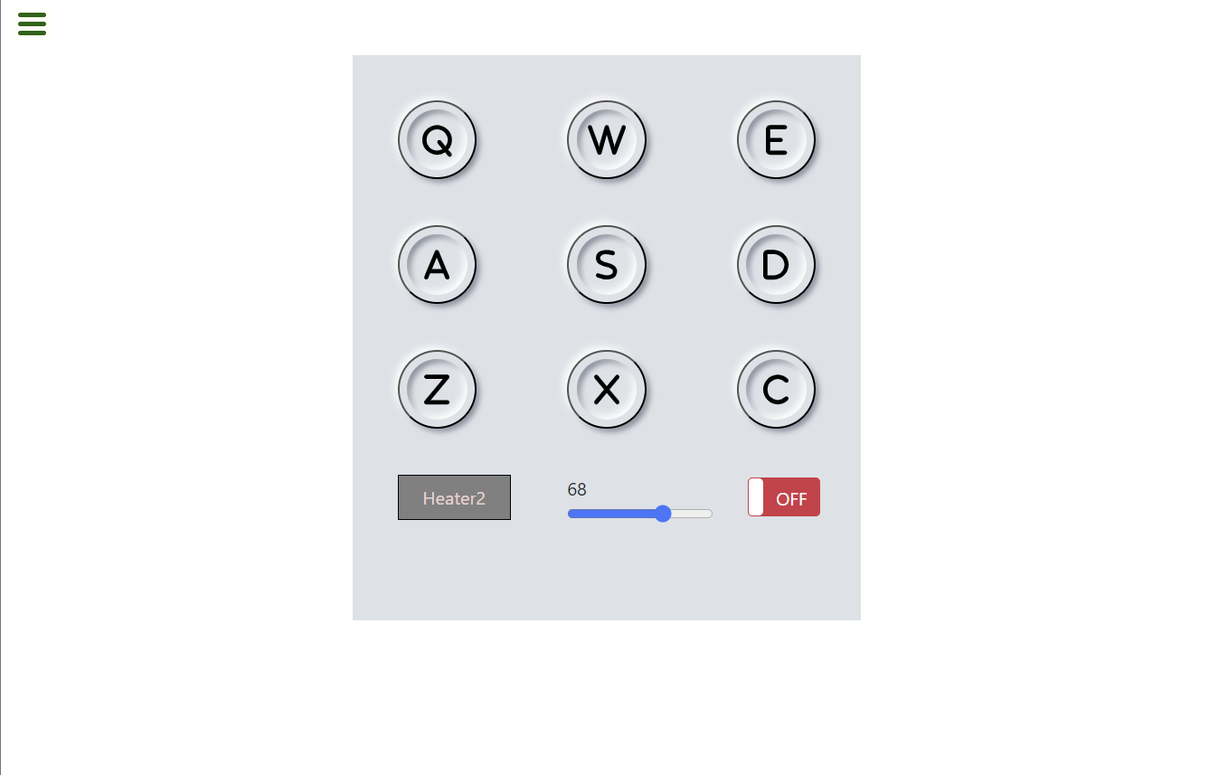
I’m building drum machine. I want to simulate a hover effect on the button when I press the key. I tried different things like adding “.playing” class to the audio element and use toggle / add/ remove “.playing” class from classList to have the same effect as I hover and unhover the button but that doesn’t work. I tried dispatchEvent but it doesn’t work. Someone said that event generate like that can’t be trusted. Maybe I didn’t do things right.
Here is my react project. I’m having different components here.
This is my App.jsx
import { useState } from "react";
import "./App.css";
import Display from "./Display";

function App() {
  const [keyName, setKeyName] = useState("");
  const [volume, setVolume] = useState(".5");

  const drumKeys = [
    {
      key: "Q",
      name: "Heater1",
      source: "https://s3.amazonaws.com/freecodecamp/drums/Heater-1.mp3",
    },
    {
      key: "W",
      name: "Heater2",
      source: "https://s3.amazonaws.com/freecodecamp/drums/Heater-2.mp3",
    },
    {
      key: "E",
      name: "Heater3",
      source: "https://s3.amazonaws.com/freecodecamp/drums/Heater-3.mp3",
    },
    {
      key: "A",
      name: "Heater4",
      source: "https://s3.amazonaws.com/freecodecamp/drums/Heater-4_1.mp3",
    },
    {
      key: "S",
      name: "Clap",
      source: "https://s3.amazonaws.com/freecodecamp/drums/Heater-6.mp3",
    },
    {
      key: "D",
      name: "Open-HH",
      source: "https://s3.amazonaws.com/freecodecamp/drums/Dsc_Oh.mp3",
    },
    {
      key: "Z",
      name: "Kick-n'-Hat",
      source: "https://s3.amazonaws.com/freecodecamp/drums/Kick_n_Hat.mp3",
    },
    {
      key: "X",
      name: "Kick",
      source: "https://s3.amazonaws.com/freecodecamp/drums/RP4_KICK_1.mp3",
    },
    {
      key: "C",
      name: "Closed-HH",
      source: "https://s3.amazonaws.com/freecodecamp/drums/Cev_H2.mp3",
    },
  ];

  const keyArr = drumKeys.map((each) => each.key);

  //handle button click
  const handleClick = (e) => {
    if ($("#power-btn").prop("checked")) {
      if (e.target.value !== null) {
        setKeyName(e.target.id);
        document.getElementById(e.target.value).volume = volume;
        document.getElementById(e.target.value).currentTime = 0;
        document.getElementById(e.target.value).play();
      }
    }
  };
  //handle key press event
  const handleKeyDown = (event) => {
    if ($("#power-btn").prop("checked")) {
      const keyPressed = event.key.toUpperCase();
      if (keyArr.includes(keyPressed)) {
        let keyObject = [];
        keyObject = drumKeys.filter((each) => each.key === keyPressed);

        setKeyName(keyObject[0].name);
        document.getElementById(keyPressed).classList.toggle("playing");
        document.getElementById(keyPressed).volume = volume;
        document.getElementById(keyPressed).currentTime = 0;
        document.getElementById(keyPressed).play();
      }
    }
  };
  const handleVolumeChange = (e) => {
    setVolume(e.target.value);
  };
  window.addEventListener("keydown", handleKeyDown);

  return (
    <div id="drum-machine">
      <Display
        allKeys={drumKeys}
        onClick={handleClick}
        displayName={keyName}
        handleVolumeChange={handleVolumeChange}
        volumeDisplay={volume}
      />
    </div>
  );
}

export default App;
This is Display
import React, { useState } from "react";
import DrumPad from "./DrumPad";
import PowerBtn from "./PowerBtn";

function Display({
  onClick,
  allKeys,
  displayName,
  handleVolumeChange,
  volumeDisplay,
}) {
  const keyPads = allKeys.map((each) => {
    return (
      <DrumPad
        key={each.key}
        id={each.name}
        keyVal={each.key}
        source={each.source}
        onClick={onClick}
      ></DrumPad>
    );
  });
  /*

*/
  return (
    <section className="d-flex ">
      <div id="display" className="wrapper row">
        {keyPads}

        <div className="name-box">{displayName}</div>
        <div>
          <div>{Math.floor(volumeDisplay * 100)}</div>
          <input
            type="range"
            min="0"
            max="1"
            step="0.01"
            defaultValue=".5"
            onChange={handleVolumeChange}
          ></input>
        </div>
        <PowerBtn></PowerBtn>
      </div>
    </section>
  );
}

export default Display;
This is DrumPad
import React from "react";

function DrumPad({ id, keyVal, source, onClick }) {
  return (
    <button
      type="button"
      className="drum-pad box"
      id={id}
      value={keyVal}
      onClick={onClick}
    >
      {keyVal}
      <audio id={keyVal} src={source} className="clip"></audio>
    </button>
  );
}

export default DrumPad;
This is my CSS. I have the bootstrap template for each drum key.
* {
  margin: 0;
  padding: 0;
  box-sizing: border-box;
}

.wrapper {
  display: grid;
  grid-auto-flow: row;
  grid-template-columns: repeat(3, 150px);
  height: 500px;
  width: 100vw;

  background: #dde1e7;
  padding: 30px;
}

.box {
  display: flex;
  justify-content: center;
  align-items: center;
  width: 70px;
  height: 70px;
  background: #dde1e7;
  border-radius: 50%;
  margin: 20px 100px;
  box-shadow: -3px -3px 7px #fff, 3px 3px 5px rgba(94, 104, 121, 0.712);
  position: relative;
}
.box::after{
  content: "";
  position: absolute;
  width: 80%;
  height: 80%;
  border-radius: 50%;
  background: transparent;
  box-shadow: inset -3px -3px 7px #fff,
    inset 3px 3px 5px rgba(94, 104, 121, 0.712);
}

.box:hover::after {
  box-shadow: -3px -3px 7px #fff, 3px 3px 5px rgba(94, 104, 121, 0.712);
}

.box:has(.playing)::after{
  box-shadow: -3px -3px 7px #fff, 3px 3px 5px rgba(94, 104, 121, 0.712);
}


.name-box{
  display: grid;
	align-items: center;
  height: 40px;
  width:100px;
  background-color: gray;
  color: rgb(236, 210, 210);
  border: 1px solid black;

  text-align: center;


}

/*
.box i {
  cursor: pointer;
  background: #dde1e7;
  font-size: 50px;
  text-shadow: -3px -3px 7px #fff, 3px 3px 5px rgba(94, 104, 121, 0.712);
  transition: 1s ease;
}
.box:hover i {
  color: dodgerblue;
  transform: rotate(360deg);
}