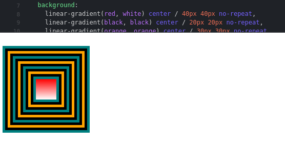
Shouldn’t they look different?
Can someone explain how this is possible?
The images are the same, there is no difference between them, why?
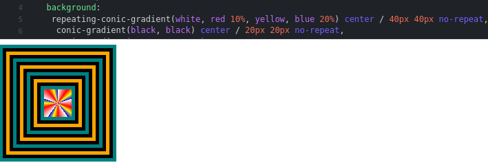
https://jsfiddle.net/5yxhqw91/
.conic {
  height: 170px;
  width: 170px;
  background:
    conic-gradient(teal, teal) center / 10px 10px no-repeat,
    conic-gradient(black, black) center / 20px 20px no-repeat,
    conic-gradient(orange, orange) center / 30px 30px no-repeat,
    conic-gradient(black, black) center / 40px 40px no-repeat,
    conic-gradient(teal, teal) center / 50px 50px no-repeat,
    conic-gradient(black, black) center / 60px 60px no-repeat,
    conic-gradient(orange, orange) center / 70px 70px no-repeat,
    conic-gradient(black, black) center / 80px 80px no-repeat,
    conic-gradient(teal, teal) center / 90px 90px no-repeat,
    conic-gradient(black, black) center / 100px 100px no-repeat,
    conic-gradient(orange, orange) center / 110px 110px no-repeat,
    conic-gradient(black, black) center / 120px 120px no-repeat,
    conic-gradient(teal, teal) center / 130px 130px no-repeat,
    conic-gradient(black, black) center / 140px 140px no-repeat,
    conic-gradient(orange, orange) center / 150px 150px no-repeat,
    conic-gradient(black, black) center / 160px 160px no-repeat,
    conic-gradient(teal, teal) center / 170px 170px no-repeat;
  background-repeat: no-repeat;
}
.linear {
  float: top;
  height: 170px;
  width: 170px;
  background:
    linear-gradient(teal, teal) center / 10px 10px no-repeat,
    linear-gradient(black, black) center / 20px 20px no-repeat,
    linear-gradient(orange, orange) center / 30px 30px no-repeat,
    linear-gradient(black, black) center / 40px 40px no-repeat,
    linear-gradient(teal, teal) center / 50px 50px no-repeat,
    linear-gradient(black, black) center / 60px 60px no-repeat,
    linear-gradient(orange, orange) center / 70px 70px no-repeat,
    linear-gradient(black, black) center / 80px 80px no-repeat,
    linear-gradient(teal, teal) center / 90px 90px no-repeat,
    linear-gradient(black, black) center / 100px 100px no-repeat,
    linear-gradient(orange, orange) center / 110px 110px no-repeat,
    linear-gradient(black, black) center / 120px 120px no-repeat,
    linear-gradient(teal, teal) center / 130px 130px no-repeat,
    linear-gradient(black, black) center / 140px 140px no-repeat,
    linear-gradient(orange, orange) center / 150px 150px no-repeat,
    linear-gradient(black, black) center / 160px 160px no-repeat,
    linear-gradient(teal, teal) center / 170px 170px no-repeat;
  background-repeat: no-repeat;
}