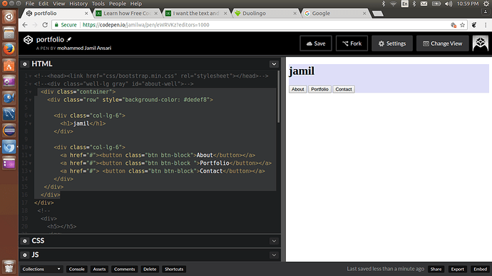
  <div class="col-lg-6">
    <h1>jamil</h1>
  </div>

  <div class="col-lg-6">
    <a href="#"><button class="btn btn-block">About</button></a>
    <a href="#"><button class="btn btn-block ">Portfolio</button></a>
    <a href="#"> <button class="btn btn-block">Contact</button></a>
  </div>
Works for me with Bootstrap 3, so maybe this is the issue:
I think you should enclose it with a div with a “row” class.
Do you also get this behaviour when the preview is full screen? Since you use .col-lg-6 it will default to full width on md, sm and xs.
i was talking about preview of question posting.
and yeah…i get this behaviour when the preview is full screen…this is about the project
If you remove the “btn-block” class, all three buttons will be on a single row. That’s what you want?
You forgot to add Bootstrap CSS in your pen.
how to add that css?
Settings > CSS > quick add: Bootstrap
And if you want to use Bootstrap 3 (the version fCC uses) you need to change 4.0.0-alpha.6 to 3.3.7.
thank you so much ben…it’s working:

