My code so far:
<!DOCTYPE html>
<html lang="en">
  <head>
    <meta charset="UTF-8" />
    <link rel="stylesheet" href="./styles.css" />
    <title>Penguin</title>
    <meta name="viewport" content="width=device-width, initial-scale=1.0" />
  </head>

  <body>
    <div class="left-mountain"></div>
    <div class="back-mountain"></div>
    <div class="sun"></div>
    <div class="penguin">
      <div class="penguin-head">
        <div class="face left"></div>
        <div class="face right"></div>
        <div class="chin"></div>
        <div class="eye left">
          <div class="eye-lid"></div>
        </div>
        <div class="eye right">
          <div class="eye-lid"></div>
        </div>
        <div class="blush left"></div>
        <div class="blush right"></div>
        <div class="beak top"></div>
        <div class="beak bottom"></div>
      </div>
      <div class="shirt">
        <div>💜</div>
        <p>I CSS</p>
      </div>
      <div class="penguin-body">
        <div class="arm left"></div>
        <div class="arm right"></div>
        <div class="foot left"></div>
        <div class="foot right"></div>
      </div>
    </div>

    <div class="ground"></div>
  </body>
</html>
:root {
  --penguin-face: white;
  --penguin-picorna: orange;
  --penguin-skin: gray;
}

body {
  background: linear-gradient(45deg, rgb(118, 201, 255), rgb(247, 255, 222));
  margin: 0;
  padding: 0;
  width: 100%;
  height: 100vh;
  overflow: clip;
}

.left-mountain {
  width: 300px;
  height: 300px;
  background: linear-gradient(rgb(203, 241, 228), rgb(80, 183, 255));
  position: absolute;
  transform: skew(0deg, 44deg);
  z-index: 2;
  margin-top: 100px;
}

.back-mountain {
  width: 300px;
  height: 300px;
  background: linear-gradient(rgb(203, 241, 228), rgb(47, 170, 255));
  position: absolute;
  z-index: 1;
  transform: rotate(45deg);
  left: 110px;
  top: 225px;
}

.sun {
  width: 200px;
  height: 200px;
  background-color: yellow;
  position: absolute;
  border-radius: 50%;
  top: -75px;
  right: -75px;
}

.penguin {
  width: 300px;
  height: 300px;
  margin: auto;
  margin-top: 75px;
  z-index: 4;
  position: relative;
}

.penguin * {
  position: absolute;
}

.penguin-head {
  width: 50%;
	height: 45%;
  background: linear-gradient(
    45deg,
		var(--penguin-skin),
		rgb(239, 240, 228)
	);
	border-radius: 70% 70% 65% 65%;
  top: 10%;
  left: 25%;
  z-index: 1;
}

.face {
  width: 60%;
  height: 70%;
  background-color: var(--penguin-face);
  border-radius: 70% 70% 60% 60%;
  top: 15%;
}

.face.left {
  left: 5%;
}

.face.right {
  right: 5%;
}

.chin {
  width: 90%;
  height: 70%;
  background-color: var(--penguin-face);
  top: 25%;
  left: 5%;
  border-radius: 70% 70% 100% 100%;
}

.eye {
  width: 15%;
  height: 17%;
  background-color: black;
  top: 45%;
  border-radius: 50%;
}

.eye.left {
  left: 25%;
}

.eye.right {
  right: 25%;
}

.eye-lid {
  width: 150%;
  height: 100%;
  background-color: var(--penguin-face);
  top: 25%;
  left: -23%;
  border-radius: 50%;
}

.blush {
  width: 15%;
  height: 10%;
  background-color: pink;
  top: 65%;
  border-radius: 50%;
}

.blush.left {
  left: 15%;
}

.blush.right {
  right: 15%;
}

.beak {
  height: 10%;
  background-color: var(--penguin-picorna);
  border-radius: 50%;
}

.beak.top {
  width: 20%;
	top: 60%;
	left: 40%;
}

.beak.bottom {
  width: 16%;
  top: 65%;
  left: 42%;
}

.shirt {
  font: bold 25px Helvetica, sans-serif;
  top: 165px;
  left: 127.5px;
  z-index: 1;
  color: #6a6969;
}

.shirt div {
  font-weight:  initial;
  top: 22.5px;
  left: 12px;
}

.penguin-body {
  width: 53%;
  height: 45%;
  background: linear-gradient(
    45deg,
		rgb(134, 133, 133) 0%,
		rgb(234, 231, 231) 25%,
		white 67%
	);
  border-radius: 80% 80% 100% 100%;
  top: 40%;
  left: 23.5%;
}

.penguin-body::before {
  content: "";
  position: absolute;
  width: 50%;
  height: 45%;
  background-color: var(--penguin-skin);
  top: 10%;
  left: 25%;
  border-radius: 0% 0% 100% 100%;
  opacity: 70%;
}

.arm {
  width: 30%;
  height: 60%;
  background: linear-gradient(
    90deg,
    var(--penguin-skin),
    rgb(209, 210, 199)
  );
}

.arm.left {
  top: 35%;
  left: 5%;
  transform-origin: -50%, 50%;
}

.arm.right {
  top: 0%;
  right: -5%;
}

.foot {
  width:  15%;
  height: 30%;
  background-color: var(--penguin-picorna);
  top: 85%;
  border-radius: 50%;
  z-index: -1;
}

.foot.left {
  left: 25%;
  transform: rotate(80deg);
}

.foot.right {
  right: 25%;
  transform: rotate(-80deg);
}

.ground {
  width: 100vw;
  height: 400px;
  background: linear-gradient(90deg, rgb(88, 175, 236), rgb(182, 255, 255));
  z-index: 3;
  position: absolute;
  margin-top: -58px;
}
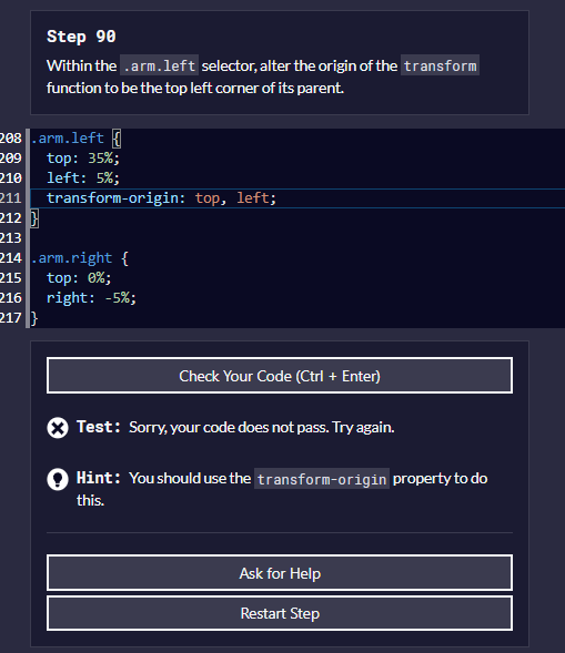
I can’t figure out the transform-origin ask of step 90:

I’m just trying different numbers at this point and nothing online helps w/ what percentages I should use only “transform-origin: top, left;”
Link to lesson: https://www.freecodecamp.org/learn/2022/responsive-web-design/learn-css-transforms-by-building-a-penguin/step-90