Learn Responsive Web Design by Building a Piano - Step 2

Tell us what’s happening:
Describe your issue in detail here.
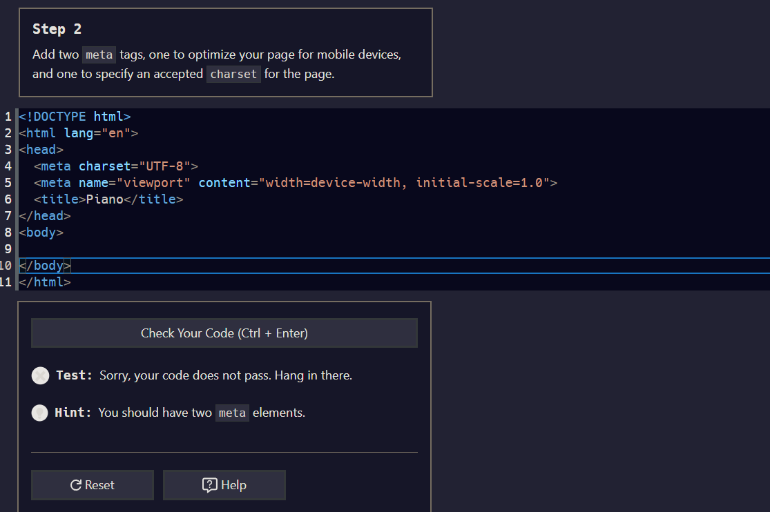
I’ve tried like everything, i dont know what is wrong with my code?
Your code so far

<!-- file: index.html -->
<!DOCTYPE html>
<html lang="en">
  <head>
    <title>Piano</title>

<!-- User Editable Region -->

    <meta charset="UTF-8"/>
    <meta name="viewport" content="width=device-width,initial-scale= 1.0"/>

<!-- User Editable Region -->

  </head>
  <body></body>
</html>
/* file: styles.css */

Your browser information:

User Agent is: Mozilla/5.0 (Windows NT 10.0; Win64; x64) AppleWebKit/537.36 (KHTML, like Gecko) Chrome/114.0.0.0 Safari/537.36

Challenge: Learn Responsive Web Design by Building a Piano - Step 2

Link to the challenge:

Welcome to our community!

  • Make a blank space after the comma between the words “…-width,” and the “initial…”
  • Also, delete the blank space before the 1.0
1 Like

Thank you, tried that and it still doesnt work! :frowning:


^ the new code (that still isnt working)

I think its some system error, bc i copies and pasted the starting code for the next part (which should be exactly what youre looking for) and it apparently isnt correct?

Thanks for any help!


after doing nothing different, other than wiggling it around, it now works? thanks all

1 Like

This topic was automatically closed 182 days after the last reply. New replies are no longer allowed.